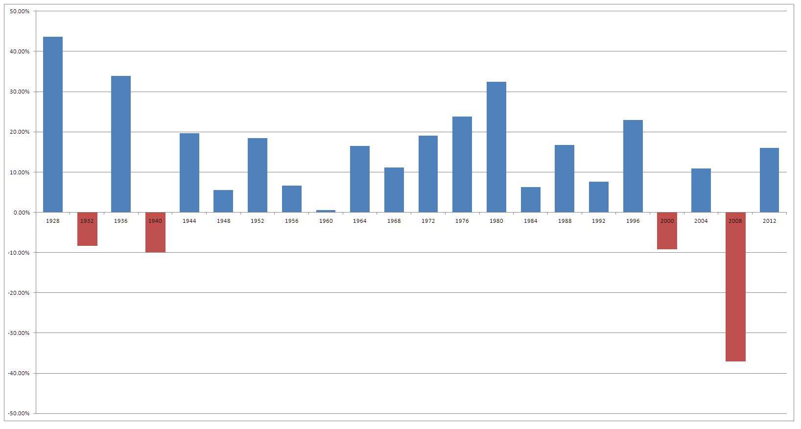
With the circus that American laughingly call an election year in full swing I wondered what the had happened to the market during previous election years. So with a rainy Friday afternoon, Google, and a truck load of historical data it was time for some dodgy excel. The chart below looks at the return of the S&P 500 during an election year.
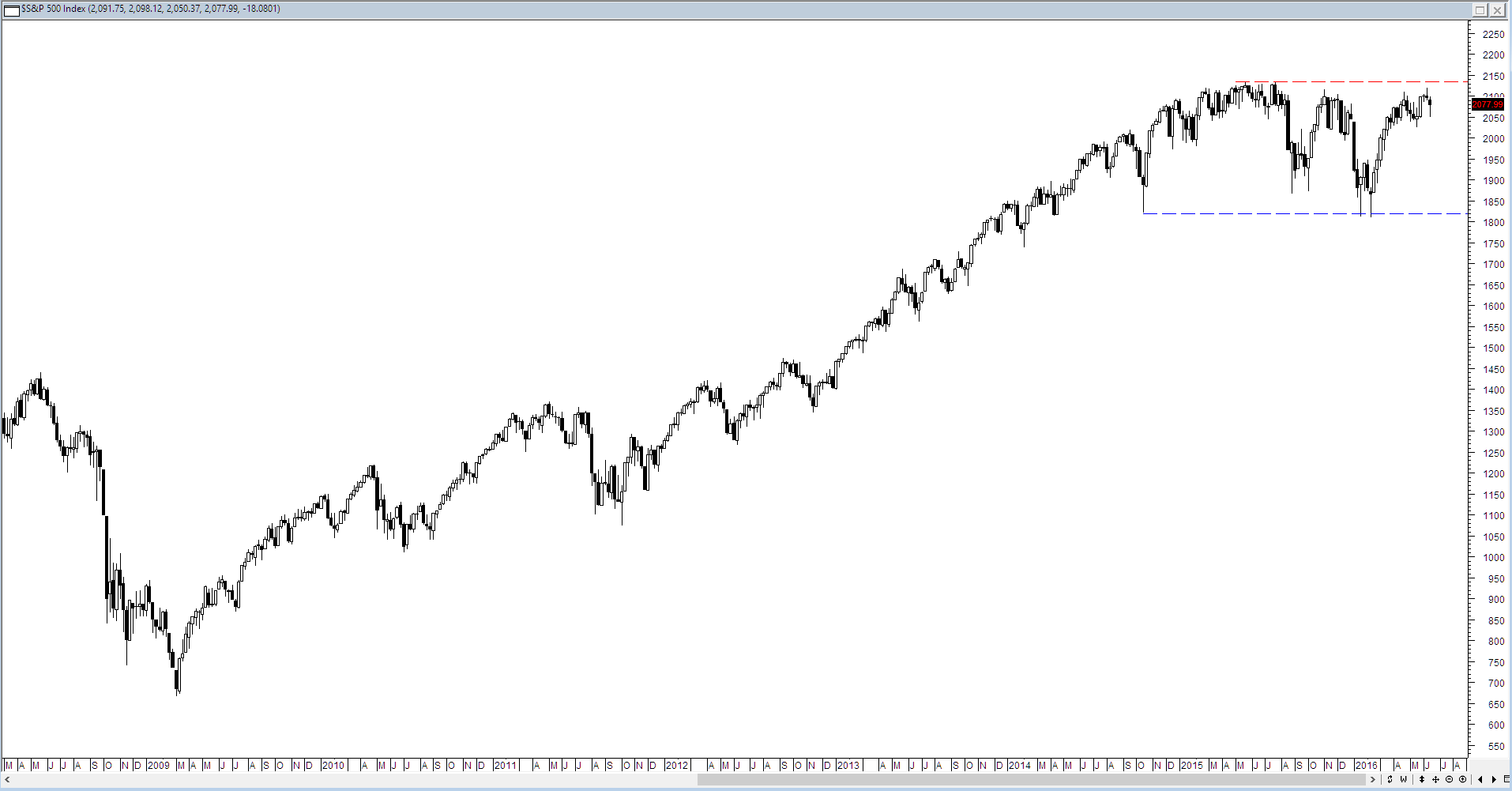
As to its relevance and importance beyond curiosity I have no idea since the current market is constrained by the wide channel that was established in mid 2015. Until price moves higher than the 2130 mark then nothing good is going to happen for long sided stock traders.


Next time you feel like doing some dodgy excel, would you mind checking the year post election?!
Sam Weinstein has a small section on it and says it’s not usually very good – Page 69 for his dodgy chart – yours is better. Lol.
And they are both better than mine…
“Circus” is a kind word for it.
I’m curious to see what happens after the Brexit vote as well. Just curious.
Thanks for this analysis.
Now we need an Economist to make something up to suit the facts.