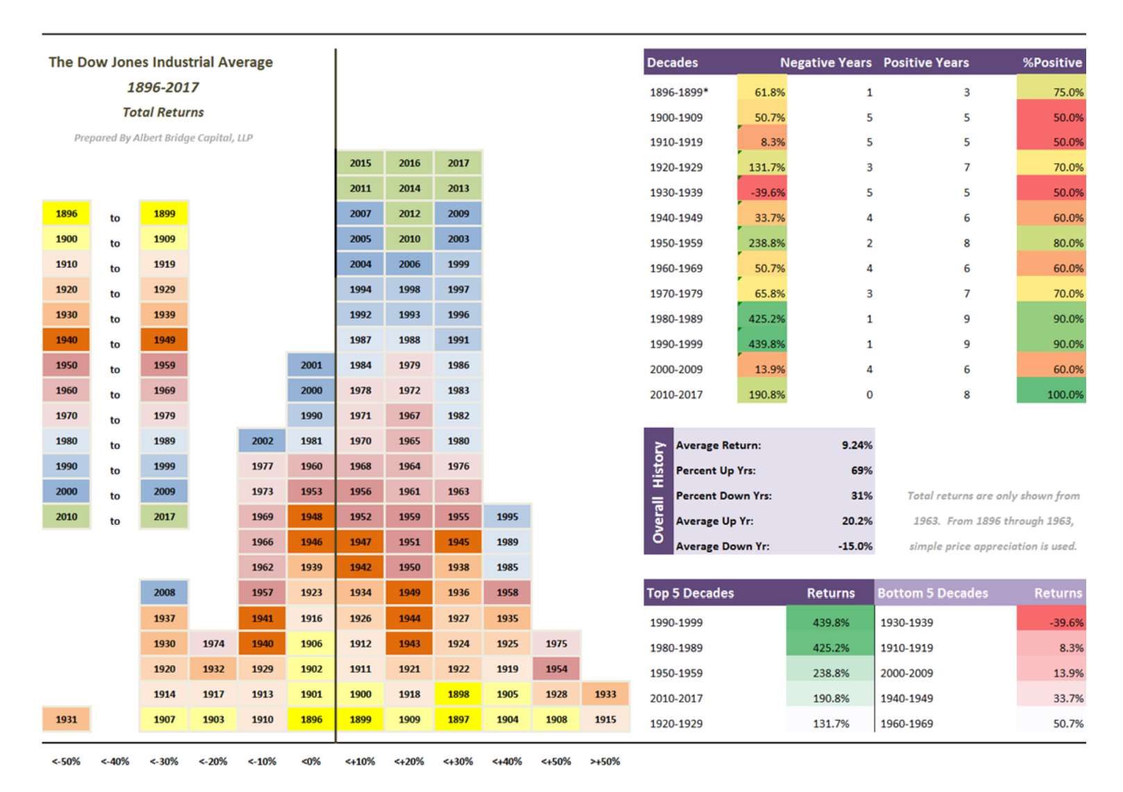
The following graphic looks at 122 years of Dow Returns. You can find the original here at Albert Bridge Capital.

Initially it looks like another infographic that looks pretty but doesn’t say much. However, there are are some interesting points to be drawn from spending a bit of time simply looking at the data.
- The thing that is immediately apparent to me is that there is a right shift to the curve. In simple terms more good than bad – this is probably a reflection of the narrow idiosyncratic nature of the Dow and its construction. It would be interesting to see whether such a distribution was repeated a wider index such as the Russel 2000.
- As expected there is a bias towards good years – 69% of years are up years compared to 31%.
- There is persistence in the outsized returns as evidence by the returns for the winning decades. Persistence within returns is an interesting phenomena as indicates that momentum is a true phenomena.
- True negative decades are rare.
I have similar data for the All Ordinaries so I must investigate how hard it is to present it in the same format as above.


