Every time I have the misfortune to accidentally be within earshot of a US news broadcast regarding markets it seems I am assailed by the magic 52 week high. The thinking behind this metric is quite sound – if stocks are making new yearly highs then the market is sound. Being a cumulative index it avoids the issues of being weighted and a small number of stocks unduly influencing the direction of the index. It is s simple count, if more stocks are marking new 52 weeks highs rather than 52 week lows then you could make the determination that the market is overall bullish.
What has caused me to come back and examine this metric is not so much the correctness of this notion but rather its utility as an indicator of either a bull or bear market. the extension of this is does any change in the absolute number of stocks making new 52 week highs versus new 52 week lows tell us anything about shifting market dynamics.
Consider the chart below –
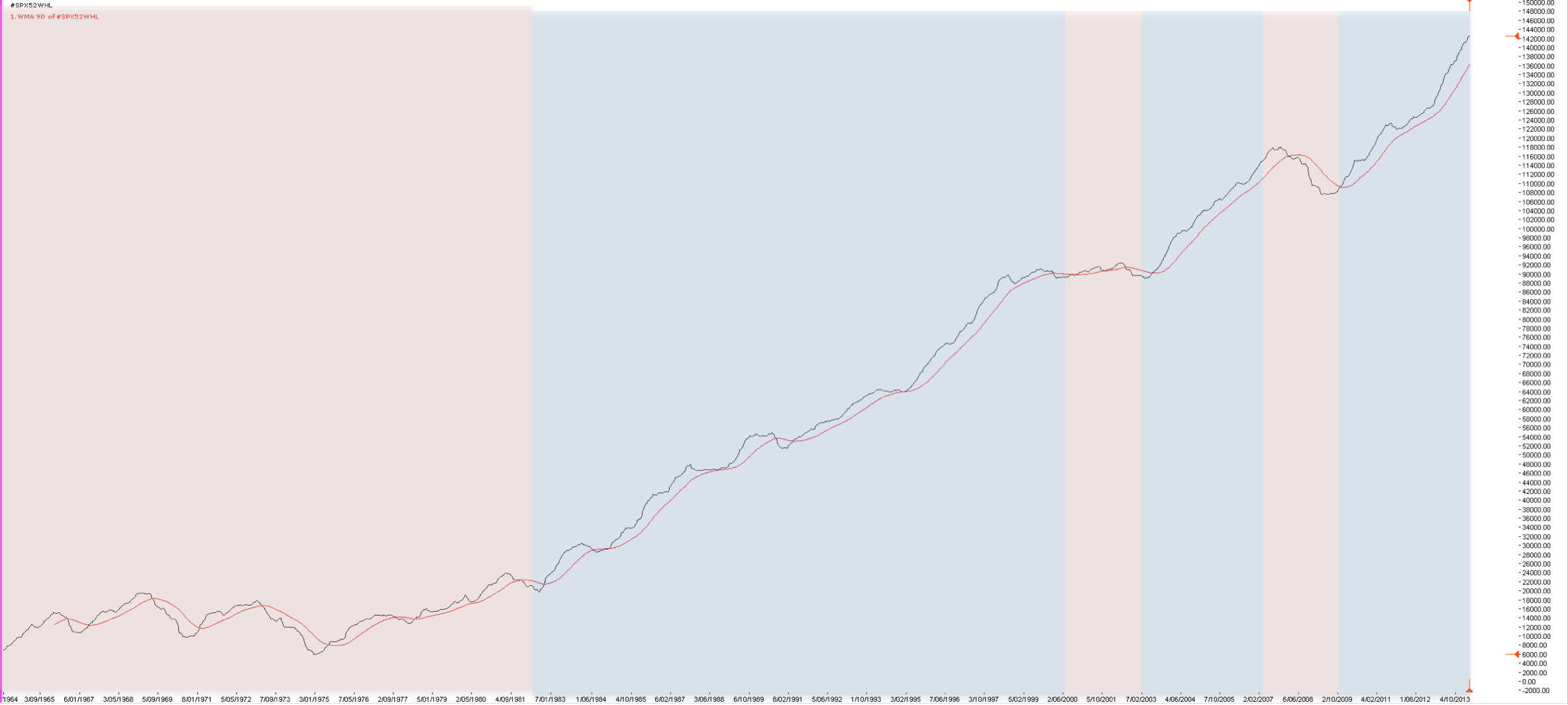
This is a chart of the Dow 52 week high-lows over which I have superimposed the officially recognised bull and bear markets for the underlying index during this period. I have also added a 90 week moving average to provide a degree of smoothing. Whenever looking at market metrics the central question traders should ask is does the adding of additional information increase the fidelity of decision making. Does it tell a story that adds value or does it simply confuse matters even more. If we ask this question of this chart the answer is – sort of.
We can see the multi decade bear market that beset the Dow in the 1960’s, 70’s and the early 1980’s delineated by a failure of the metric to move to new highs. We can see the move in 1982 into the bull market of the 1980’s. However, the crash of 1987 barely registers as a blip on the chart. We then have the tech wreck, the bull market before the GFC, the GFC and then the recovery into todays continuing bull market.
Superficially, it seems as if this metric tells us a story. However, just as I wrote earlier about the failure of narrative we need to be careful about the failure of our desire for pattern recognition. The bear market of the 1960’s and 70’s was clearly a painful time to be involved in markets but on several occasions this indicator gave what could be a bullish signal. The one that get my attention is 1975 where the Dow was recovering from losing 45% to be at the bottom of a 20 year range. If you were trading during this period and saw this signal post this crash you might be forgiven for thinking that the good times were back. However the market continued to meander for the better part of a decade.
Likewise, the GFC was pretty much in full swing before this metric signalled a downturn.
This raises the issue of do metrics such as this have true value when confined to a small very idiosyncratic index such as the Dow. The only way to answer this is to look at larger indices and see if a different picture appears. The chart below is of the S&P500
The interesting thing about the S&P500 is that its not that much different to the Dow – the move from a sample size of 30 to a sample size of 500 has not really added anything to the story.
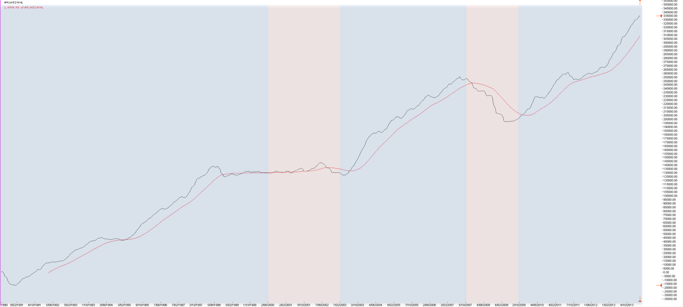
The above chart of the Russell 3000 offers a slightly different picture. Unfortunately, the Russell does not have the longevity of its two counterparts therefore, we have a more limited data set. There are two points that interest me. Firstly, the flattening of the market before the tech wreck. This is to be expected since in a rampant bull market fewer and fewer issues are moving higher within the broader market. Secondly, the indication of the GFC is more closely aligned with the official occurrence of the bear market.
So we have a bunch of charts with different colours and different lines on them and we are back to the question of does it tell us anything worth knowing and the answer is again – sort of. From my perspective, if I am trading a market I want to know what the broad health of the market is, not just the health of a narrow data set. Looking further afield at something like the Russell 3000 does achieve this. It is very much a case of the more data the better when using this sort of tool. However, the mistake traders make is in looking for high fidelity predictive tools within this sort of metric and that is a fools errand. These tools like every other market metric I have examined are all after the fact, as they have to be because all their data is historical. they look backwards not forwards.
If I were to take a positive point from this little exploration it would be that it once again reaffirms that there is a time to be in the market and a time to be out. My observation has been that both professional and amateur suffer the most damage when they are participating in markets that simply offer not opportunities – you cannot force opportunities you will only get what the market gives. And if this tool in some way convinces you that there are times to be in the market and times to be out of the market then it does a serve a purpose. The problem is that it will not tell you in advance when these times are.


