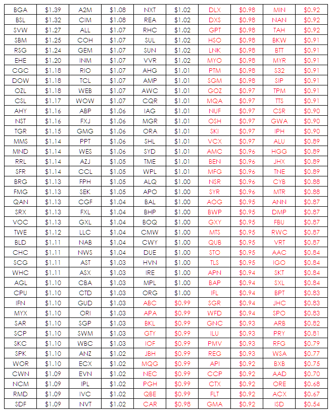
With a free afternoon I decided to look at the individual performance of stocks that make up the ASX 200 since the beginning of the year. What I did was assume that you invested $1.00 into each on the first trading day of the year and then see what their current valuation was. The table below maps them from highest to lowest.
It doesnt take a genius to work out that you will get a spectrum of values ranging from the very good – BGA to the very bad – ISD. The count is mildly positive with 109 stocks being at breakeven or above for the period. You can get a better sense of the distribution by looking at the frequency distribution of values below.
As you would expect there is a fat hump in the middles and two reasonably even tails. Some did really well, some did really badly and most didnt really do much However, this once again raises the question of the value of this sort of analysis and I would say outside of curiosity there is none. But it passed the afternoon and satisfied my curiosity.


Except that the XJO now is about where it was at the start of January. The resemblance to a normal distribution might reflect this. The XJO has gone nowhere in that time frame (including what looks very much like a double top on the daily chart) and neither is there any significant skew in the frequency distribution of its components to suggest otherwise.