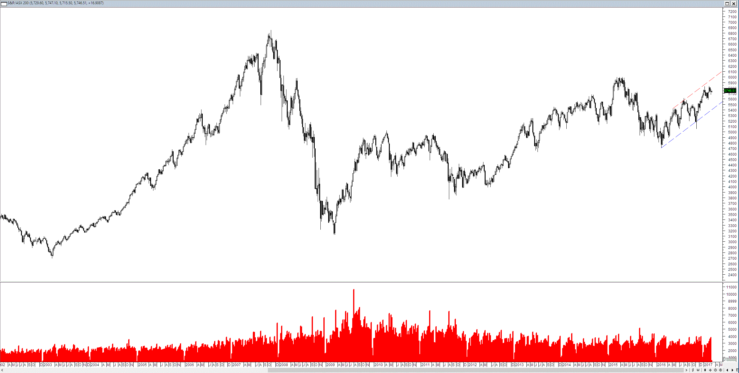
I was looking at the chart below of the ASX 200 and its volume. As you can see below the chart whilst looking reasonably standard has two points of interest for me.
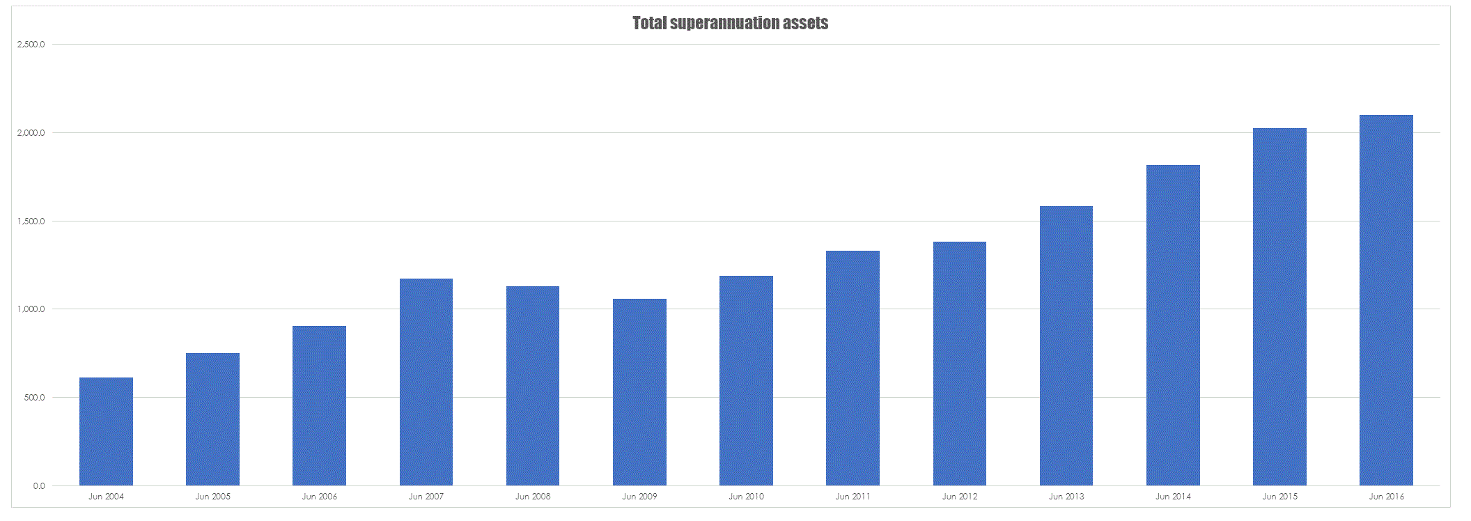
Firstly, the trace of volume by coincidence looks like a nice little bell curve, with the peak occurring as we initially bounced out the GFC slump. However, what interested me more was the level of volume since the GFC. Average volume is presently higher than it was in the run up to the GFC. This run up was a widely supported popular bull market, yet at present we have a market that is grinding up but is doing so on historically relatively high volumes. My initial guess is that you have a host of institutions trading with one another no doubt driven in part by the ever increasing glut of superannuation money. To see whether this was true I dug up some figures on total super assets and stuck them in a chart.
Total superannuation assets have almost doubled since the GFC. More people in work and higher contribution rates means more money for funds to try and drop into the small local market. The key question is what does this mean for the average trader and my initial guess is not a lot. Bull markets such as the one the US is experiencing require a wide degree of investor support not just institutional interest. So whilst the market will remain liquid in certain aspects whilst other areas will suffer. Bull markets locally have traditionally been driven by second and third tier stocks, particularly special situations such as technology or commodity stocks – these stocks are too small and illiquid for institutions to bother with. If you are running a find why would you bother with Teds Dodgy Technology Company with 20M issued shares when you can buy Apple or some equivalent.
What is also apparent from the volume on the ASX is that ETF’s have not eaten the market like many suggested they would – the growth in the ETF market has been explosive with a nearly 100 fold increase in the number of ETF’s available since the turn of the century. Granted most local ETFs are rubbish but the market continues to motor along.


Hi Chris,
What became more interesting during today, using the same parameters to look at the 20 year monthly Charts for the International Markets and the ASX Sectors. Cutting out the noise, correlation and performing markets and sectors became clear. Standouts include IT – flat consolidation since 2004 (with reverse volume Bell curve) and the consistently rising sectors since 2012 – Health Care and Utilities. In international sector – US, UK, Germany, Japan and Canada have now surpassed their 2007 highs. Not surprisingly – having lived in Korea for 4+ 7 years – their market is in tight consolidation since 2012,