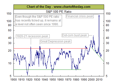
Not mine….someone else’s. The chart below dropped into one of my junk email accounts.
 This is a chart of the S&P500 PE ratio – I can see what people are attempting to do when they construct such charts. My interpretation is that they are looking for signs of mania – that is a distortion in pricing and therefore increasing risk. Accompanying this is the observation that you might use such a tool to look at periods where shares have been depressed courtesy of extreme pessimism and therefore investing might present an opportunity.
The question I would pose is, how does such a tool enable you to avoid 1987/2001/2007?
The answer is that it doesn’t because what you are looking at is an interesting piece of market history – it is the sort of tool used for postdictive analysis of an event that has by definition passed.
My feeling has always been that there are two better questions to ask at any point in the market cycle.
1. Do I understand what is happening at this point in time?
2. Based upon the answer to Point 1 can you manage the risks involved in the market at present.
Speculation involves risk and their must be a return for that risk. If you are better off sitting on the sidelines because market action is hard to define then your risk management strategy is to hold onto your money. The trader starting with the most money wins – there is no way around this because a 10% loss cannot be made up by a 10% gain. It requires 11.1% to recover your capital.


