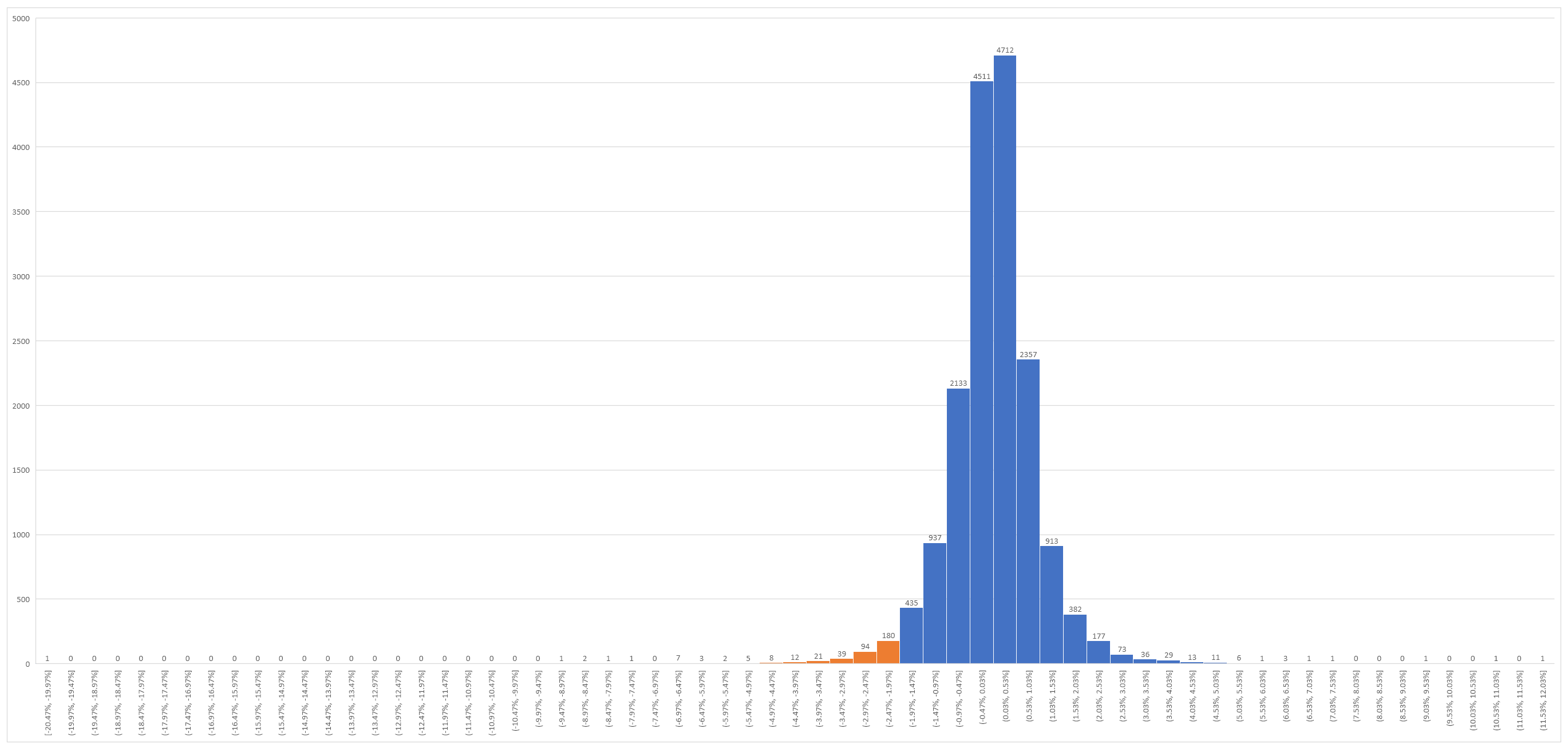
With the US market having a conniption overnight I thought I would play with excel at look at those periods where the market had fallen by 2% or more in a session. The first thing I noticed was how few falls there are of this magnitude or greater even going back to 1950.
As you would expect the majority of returns full in the middle with tails tapering off to either side.
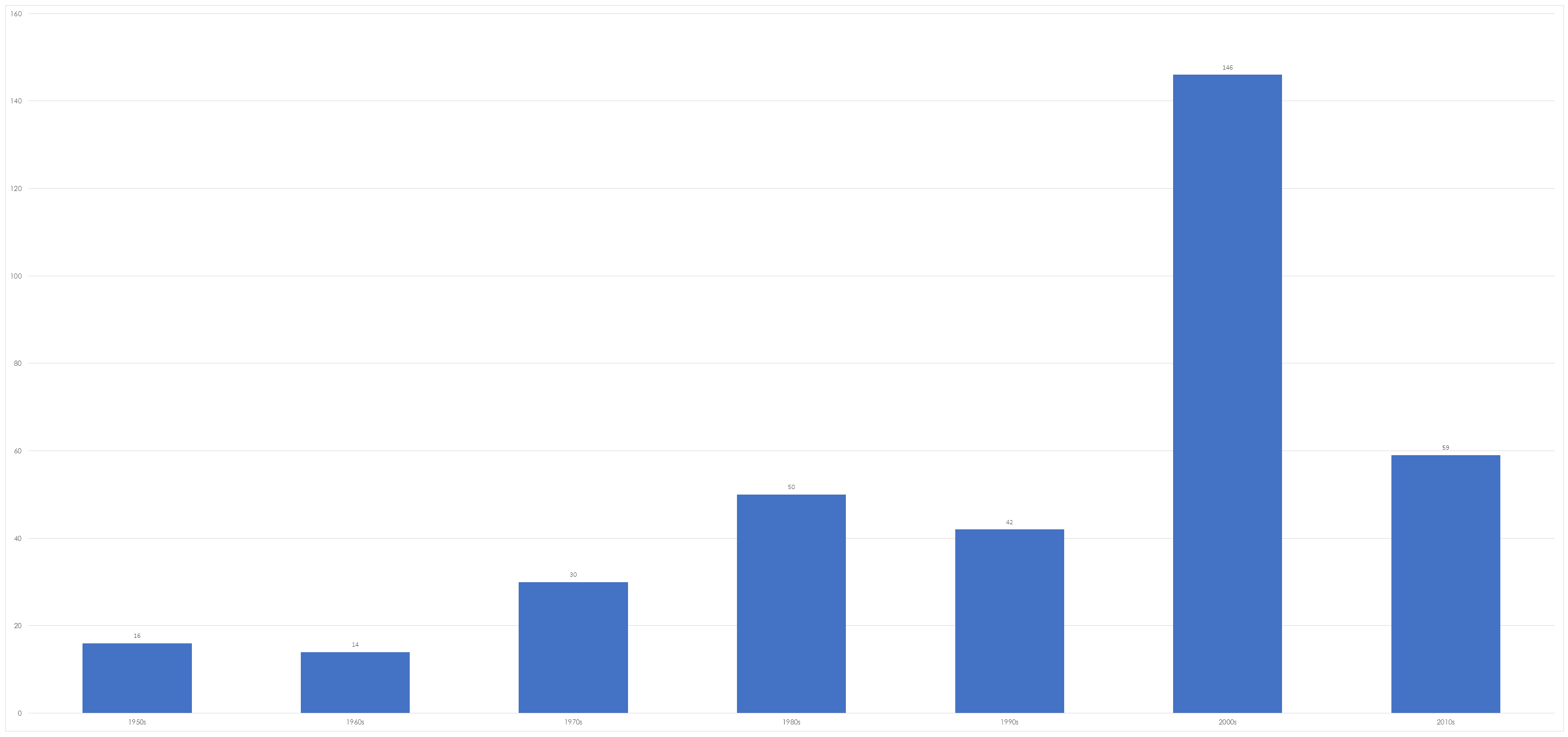
What was a little surprising was the increasing frequency of such falls.
The 2000’s were particularly bumpy but this is not surprising when you remember your history and realise that it was a decade that contained the fallout from the dot com boom and the GFC.
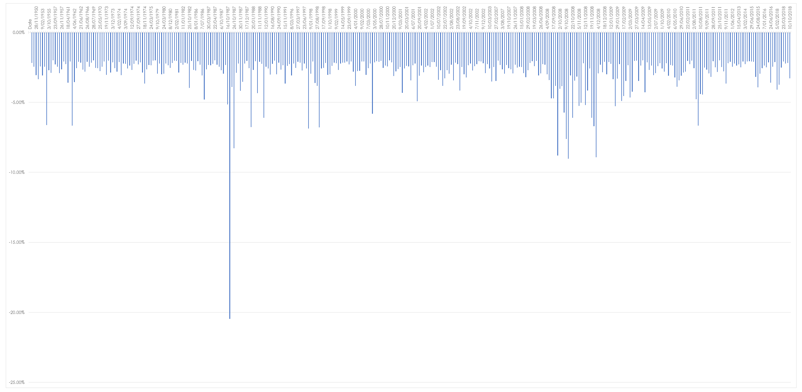
Likewise there is not that much clustering, one drop of 2% or more is not necessarily followed by another. The chart below graphs on those falls and you can see from the X axis that the falls are often widely spaced with the exception of October and November 2008 when the GFC was in full flight.
So whats the take home message?
Markets go up and markets go down. Sometimes they go up a lot and sometimes they go down a lot.


