Technical analysis is a broad church that runs from high powered quants who scan reams of data looking patterns and anomalies to the near religious zealotry of Gann followers to simpletons like me who merely want to know if the trend appears to be up or down. Unfortunately, this broadness brings with it problems as it allows technical analysis’s version of the flat earther to have a voice and to be encouraged. As a case in point consider the rather poorly rendered image below which popped up on my LinkedIn feed. It is from a presentation given the Society of Technical Analysts in the UK

I had to blow the image up to get a sense of what it was conveying. It purports to show regularity of cycles in the appearance of global viral pandemics. These pandemics are supposed to occur every 100 years – you are then supposed to use this mythical cycle to make financial decisions.
From blowing it up I was able to define that the following dates were used.
1618 – Smallpox
1717 – Measles
1817 – Cholera
1918 – Influenza
2019 – Covid-19
So where do I begin? I could begin by saying that the dates mentioned do not tally with official records.
For example, the only smallpox epidemic I can find mentioned around the date of 1618 was an outbreak in North America that killed 90% of Massachusetts Bay Indians serious though this is it is not a global pandemic. However, there is some debate over the infectious agent responsible for this incident. The measles outbreak of 1717 is officially dated as occurring between the years of 1713 and 1715, not 1717. There was cholera pandemic between 1817 and 1824 – this was termed the first cholera pandemic as the second pandemics occurred in 1826 to 1837. The astute will notice that’s not a 100-year gap. The influenza pandemic of 1918 is well known but what we see with this attempt at cycle analysis is the cherry-picking of data.
Fortunately, some clever clogs have already generated a list of global pandemics data back to the earliest known instances. Below I have summarised their data by only including those pandemics with a death toll greater than 50,000. I chose this number as an arbitrary cut off but it does convey the seriousness of each outbreak.
As can be seen, there is no magic 100-year cycle rather the random wanderings of a natural chaotic system. There are a few things that concern about this sort of “analysis” Firstly, it is utter rubbish and should be regarded as such. Secondly, it is surprising that professional bodies give a platform to such material and are not more discriminating. It is akin to the Royal Observatory allowing a flat earther to speak at one of their events. It does no one in the industry any good.
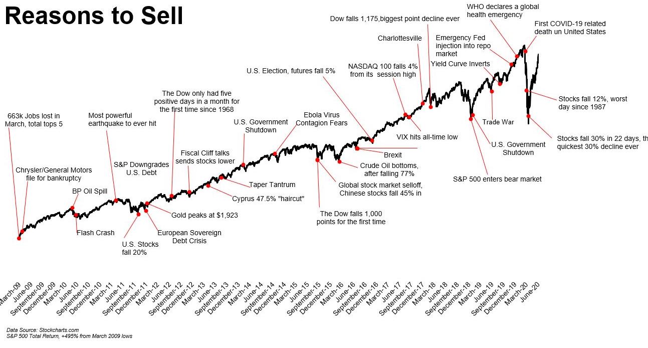
My second example is somewhat more mundane and is something I just regard as lazy and it comes from an unexpected source. The chart below featured on The Big Picture site which is the home of the insightful Barry Ritzhotlz.
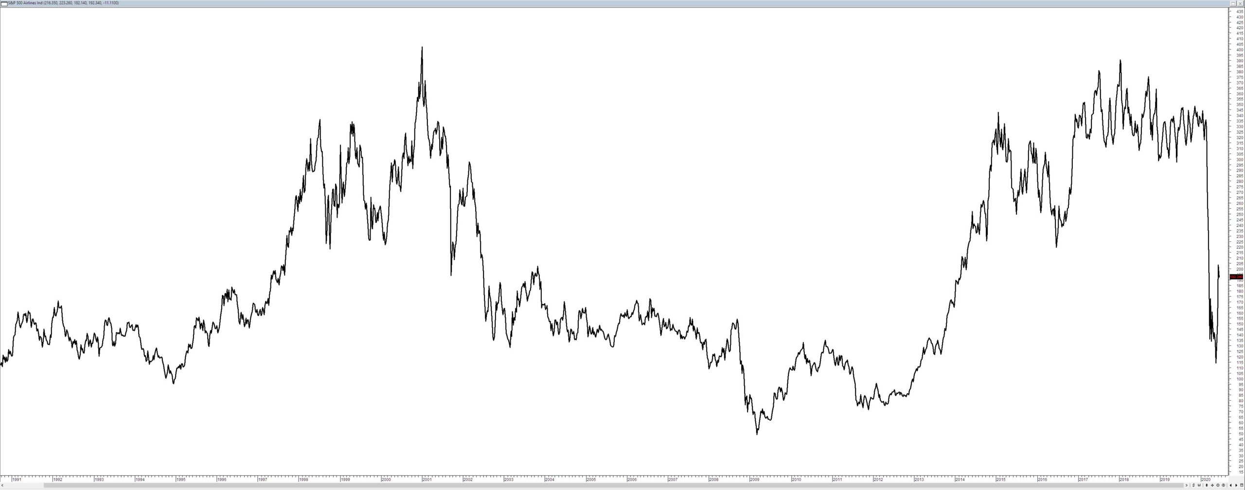
I understand the intent – the notion that there are always moments of transition and panic in markets and that these are often overblown and should not be used as an impetus to make emotional decisions. However, the use of a broad index as a mechanism to give advice on individual portfolios is just lazy because it fails to take into account the inherent survivor bias of such indices. Broad market indices are designed to go up – individual portfolios are not. To present an extreme counterpoint. below is a chart of the S$P500 Airline industry index. If your portfolio had a large number of airline stocks in it – what would be a good reason to sell?


Stock survivor bias explains why the indexes trend up longer-term. The strongest stocks stay in, while the weakest are removed. Sector relative strength analysis is also important. Simple technical analysis identifies the very strongest stocks in outperforming sectors like Internet Services, Computer Software, IT Services, and Computer Hardware.
Chris you seem to have this unrealistic view of gann which implies gann traders can look at any chart and come up with a time and price for a top or bottom. What gann traders can do is watch the market action and at certain times know their is a high probability of a top or bottom. Once all the rules are met they put an order in for a trade to be entered if certain conditions are met. How does this vary from what you do ????
Gann is based upon the notion that markets are –
1. Rigidly cyclical – they are not
2. Geometric – they are not
3. That you can actually use angles in charts when simply changing the scale changes the angle.
4. Gann is predictive – every Gann analyst I have ever met is constantly talking about what price point markets will go to.
None of these is consistent in any way with what I do