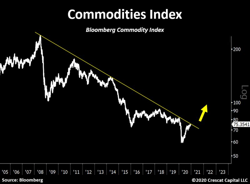
Recently some commodities have been on a bit of a tear as a consequence any index that tracks commodities has been showing signs of life. A day or so ago the chart below appeared on my LinkedIn feed. It is the Bloomberg Commodities Index with a trendline and an arrow is drawn on it because if you draw a trendline and an arrow it definitely makes it real. The chart itself is designed as the centerpiece of a short narrative regarding the current move in commodities and that all investors should move to buy hard assets – whatever they may be. But as you will see I have a few problems with the basic facts behind the narrative.

The first thing to note is that it is a log chart – it is designed to tell a certain story. If I replot the index as a simple chart and draw the same initial trendline I get a much different look. You will note I have not gone to the trouble of drawing a yellow arrow because I like everyone else in the world have no idea where prices will be tomorrow, next week, next month, or next year. And drawing an arrow in no way grants me the power of telling the future. It does however mean that I can open a graphics package and find where the yellow arrows are stored and then drop one of those on a chart. Thats the extent of the ability there. But there will be people who see a chart like this and say to themselves it’s got a yellow arrow on it therefore it must be true.

My second point of concern revolves around the index itself – the Bloomberg Commodity Index is a weighted index so you are seeing a distorted picture of what is happening within commodity markets. This distortion is created by the differential weighting of various commodities so what you are seeing is a lift in some commodities – not all. The table below shows the current weightings of the index.

As can be seen from this table the energy sector dominates the index followed by grains. These two groups make up over 50% of the index – therefore it is quite possible that any uptick in the index is simply due to a lift in this particular sector and not all commodities.
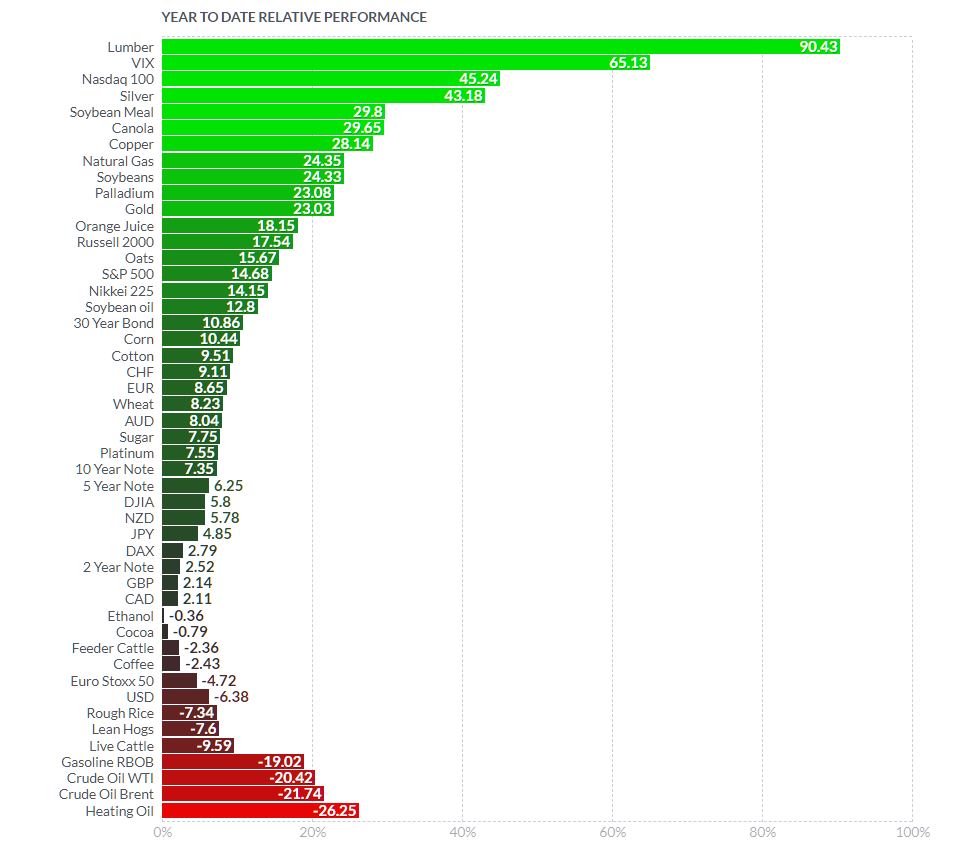
This becomes apparent when we look at the YTD performance of the major commodities.

Not all commodities are created equal – the gib mover for the year has been umber and bringing up the rear is the energy sector. The heavy lifting has been done by a small group of precious metals accompanied by some of the soft. This is not a broad base rally by any stretch of the imagination.


I see the problem. The arrow is pointing in the wrong direction.
Does the weight of evidence suggest shorting the retrace?
That would depend on what your trading plan says to do. You do have a trading plan don’t you?
Thanks Chris,
Gotta me some of them yellow arrows!