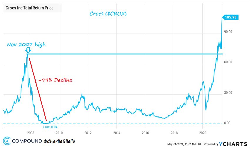
The chart below popped up on one of my feeds this morning and I have to admit I am confused as to the message it is trying to convey.

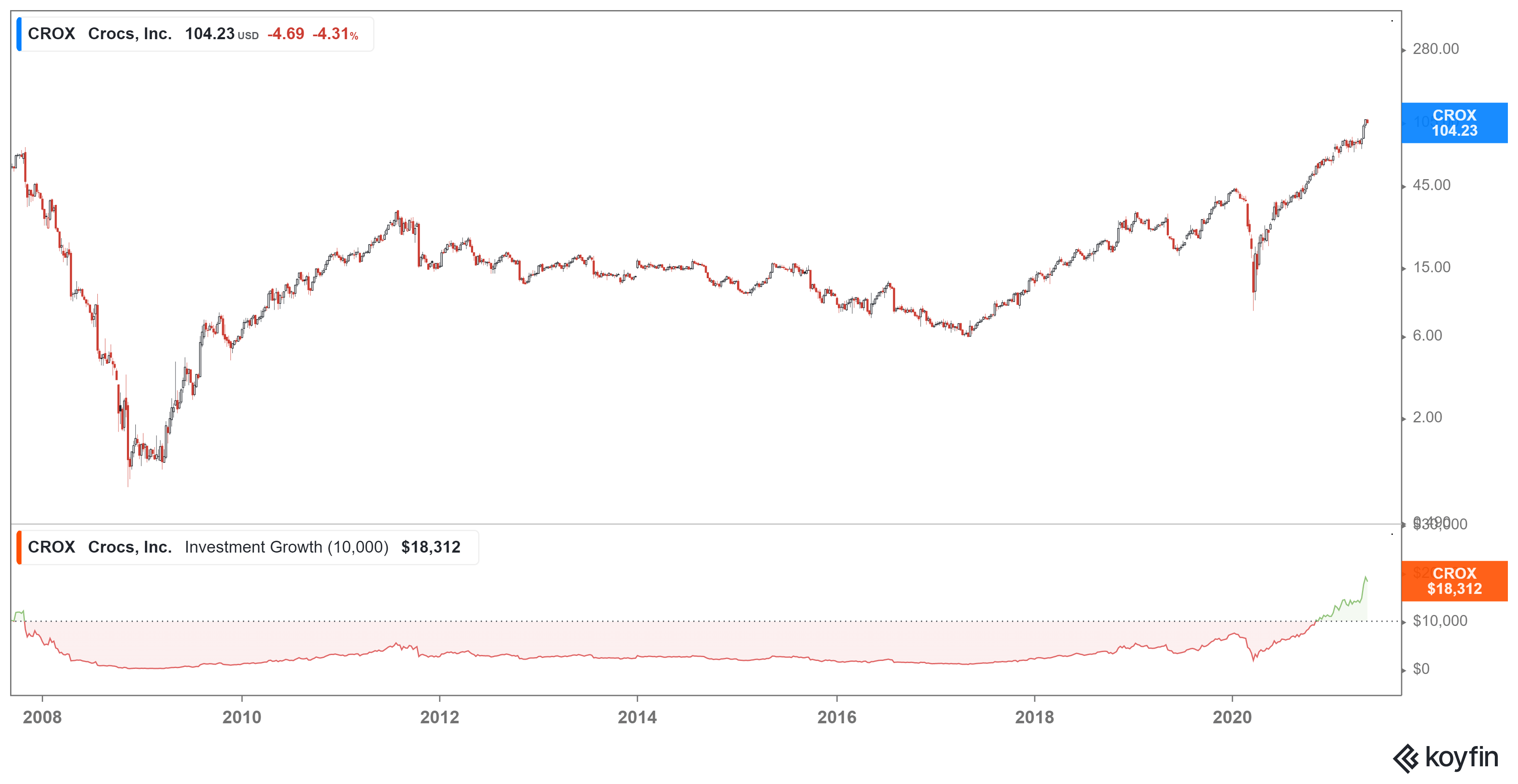
The theme is that CROX has made one of the great comebacks in the history of the universe. However, there is always more than one way of looking at things. However, if we add in a metric that shows the time spent underwater post the 2007 high you get a slightly different slant on things.
 If you had bought CROX at or near its 2007 high you would have spent some 13 years underwater, in fact you would have lost some 99% of your investment. I understand that many of the buy and hod crowd will cite this as evidence that all you have to do is to hold but that raises the question of who holds on to a losing investment for 13 years when you could have done much better simply investing in the index.
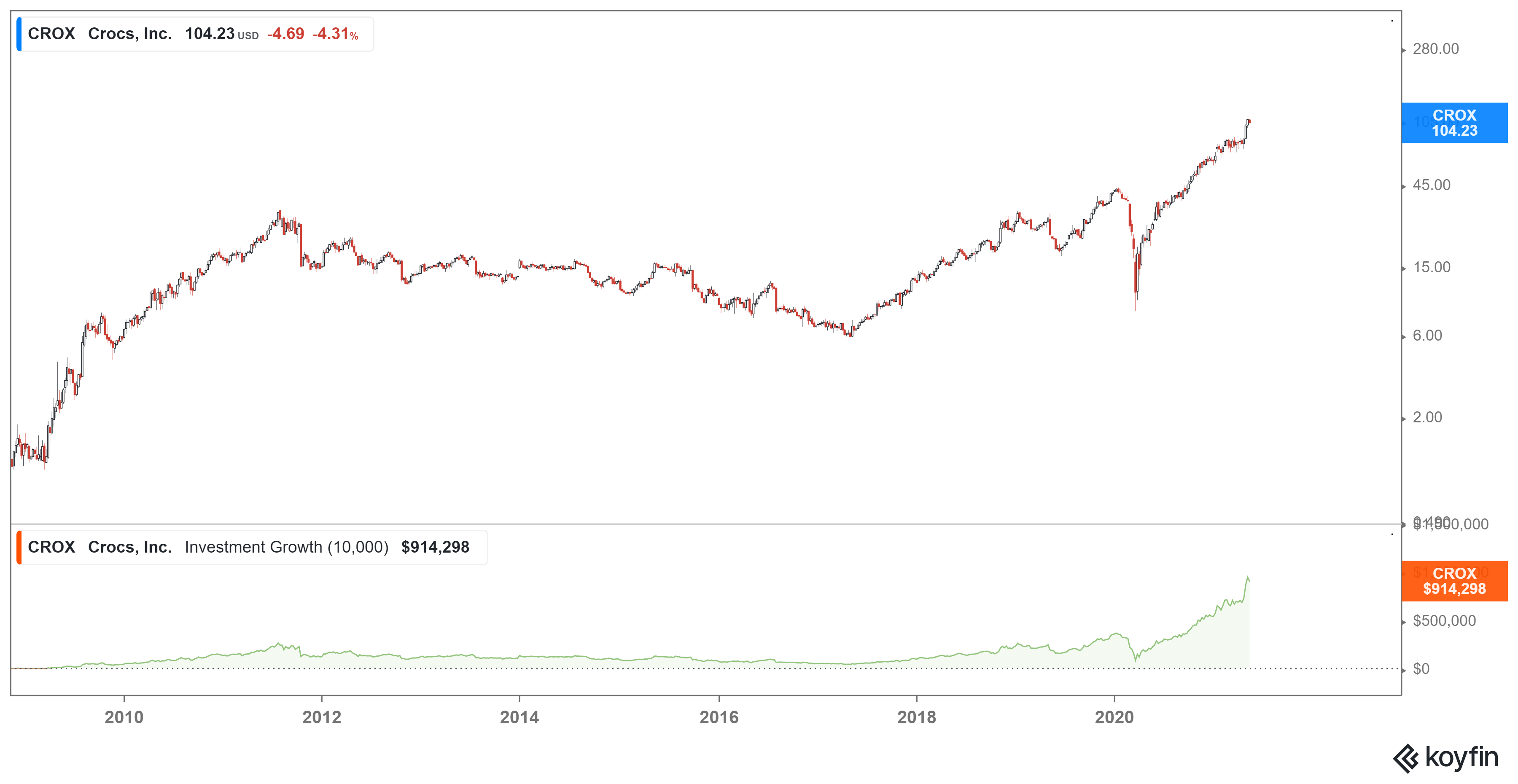
However, timing is everything, and if I move the dates slightly to reflect purchase at the nadir of CROX share price we see something different.
 What is a modest gain now becomes a staggering return. however, we are back to the same problem with buying and holding you would have to be able to stomach a 73% drawdown during this journey.


