Quite rightly much of the chatter regarding currencies this week has centred around the goings on in crypto clown land. In the real world away from the land of magic beans and disappearing accounts The US Dollar Index has been breaking down. It looks as if at least in the short term that the exceptional run of the US dollar has come to an end. This is to be expected given that the short term perception is that the inflation demon has to some degree been tamed which does in turn imply a cap on further interest rate rises.
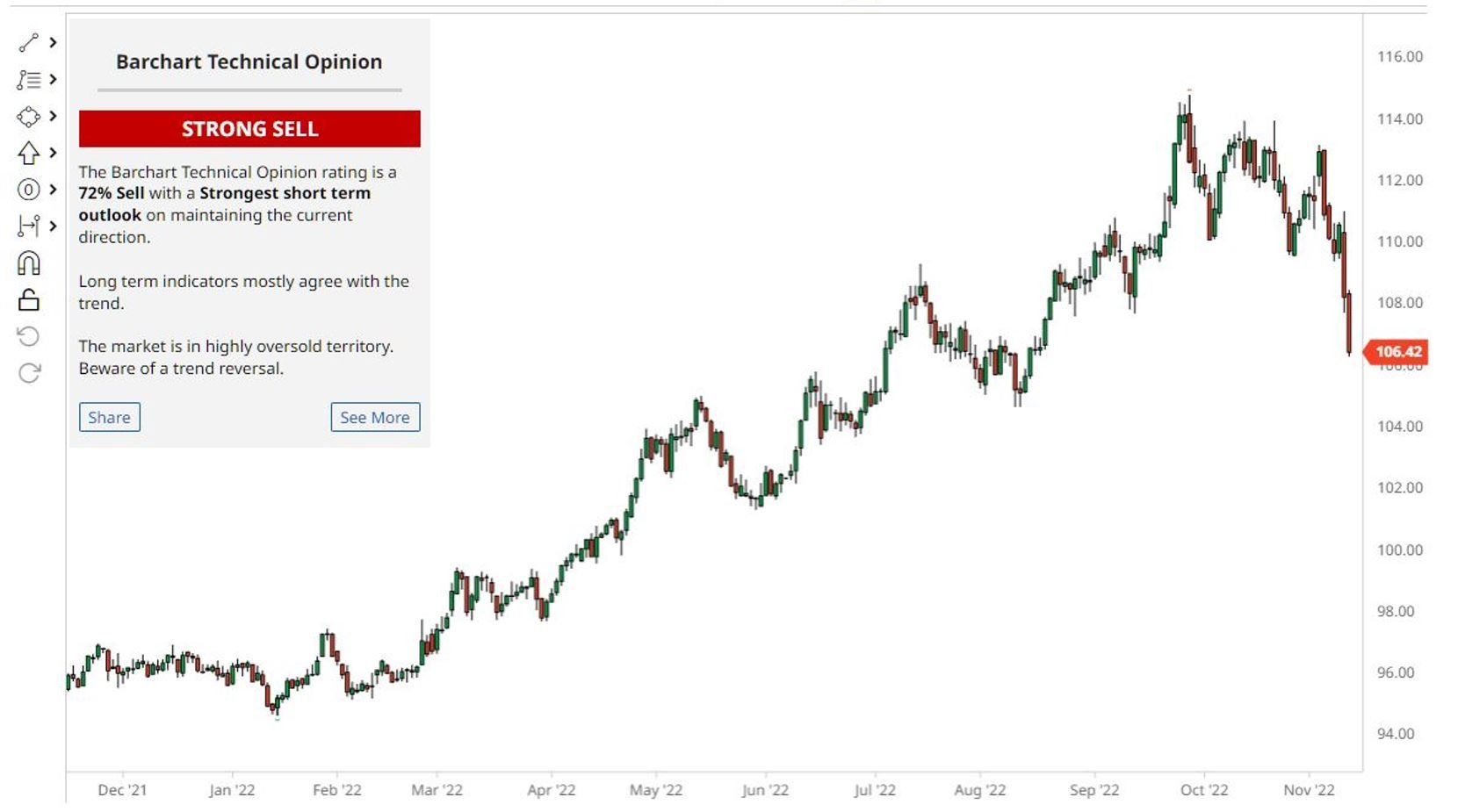
The chart below tracks this collapse in price but what I’ve also done with this chart is I’ve superimposed the current technical recommendation from barchart.com where I sourced the price chart.
 You can see that barchart.com recommendation is that the US dollar index is a strong sell.
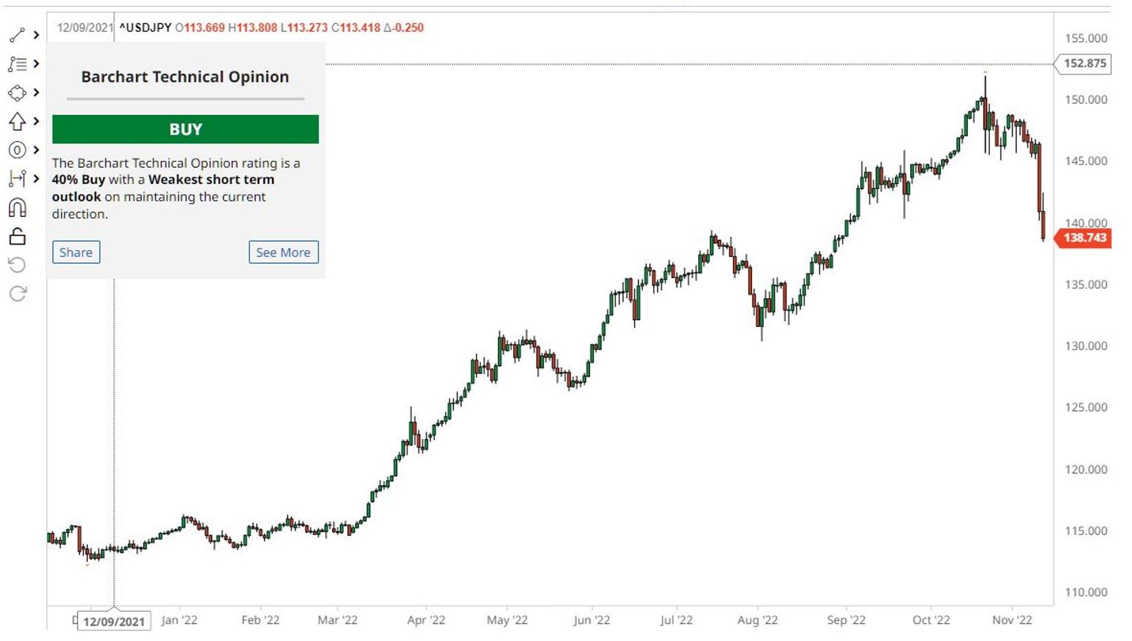
Contrast this recommendation with the chart of the USD/JPY. The recommendation for this particular pair is that it is a buy despite the chart looking very much like the US Dollar Index chart. This is to be expected since the US dollar index is a composite Index made up of various currency pairs one of which is the USD/JPY.
 It is intriguing that two charts that look almost identical can have diametrically opposed technical views. As to why this might be is anybody’s guess but what it does highlight is the danger of blindly following someone else’s opinion without having in place the necessary skills to critically evaluate what you’re being told.


