Every quarter JP Morgan Chase put out what they call a Guide to the Markets. The report itself is largely noise and is the sort of thing that research departments like to show to clients in an attempt to convince them that they are more than the sum of their convictions and misdemeanours. Generally I ignore this sort of thing but there are two charts within the report making the rounds and these deserve comment and the third is one that doesn’t get much attention but which is perhaps the most useful chart in the report.
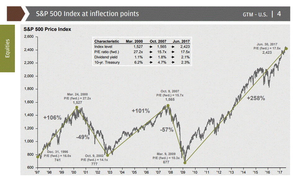
The first chart I want to look at is the one titled S&P 500 at Inflection Points –
To be honest I have never known what they mean by the term inflection point. Inflection simply means a change in the form of a word although I do think they might be trying to be a little bit clever and use the meaning that is derived from differential calculus which is the point at which a curve changes from being convex to concave and vice versa. So the implication for the average punter seeing this is that the S&P 500 is at a point of instability or change when in fact all you are seeing is a series of straight lines drawn with the benefit of hindsight. I have been receiving these reports for some time and the terminal point of the final line has been creeping up as the market has moved up. Whatever predictive value they think is has is eroded by this simple fact of self correction. The other point that concerns me about this sort of thing is the small call out box in the middle of the chart which offers a series of metrics which are designed to offer a comparison between the present day and two points of previous reversal. Again the implication is to convey the notion that the market is at some sort of tipping point.
One of the things that amazes me most about trading is that the longer I do it the more I admit that I dont know. For a very long time I have been convinced that I have no idea where the price of instrument is going. I certainly know a lot about market dynamics, the history of markets (which is something everyone should study) and about my own reactions to events. But I have sod all idea about where the market is going. Granted I can create a narrative in my own head to justify my own positions but at the end of the day I simply make a bet on the direction of an instrument and I am consciously aware of my own behavioural short comings. Charts such as the one above try to convey a form of pseudo scientific form of prediction that does little more than seek to appeal to the various biases of the reader. Readers viewing this sort of thing will anchor on the two highlighted points and use them as a reference for their decision making when they are probably little more than a Ludic fallacy.
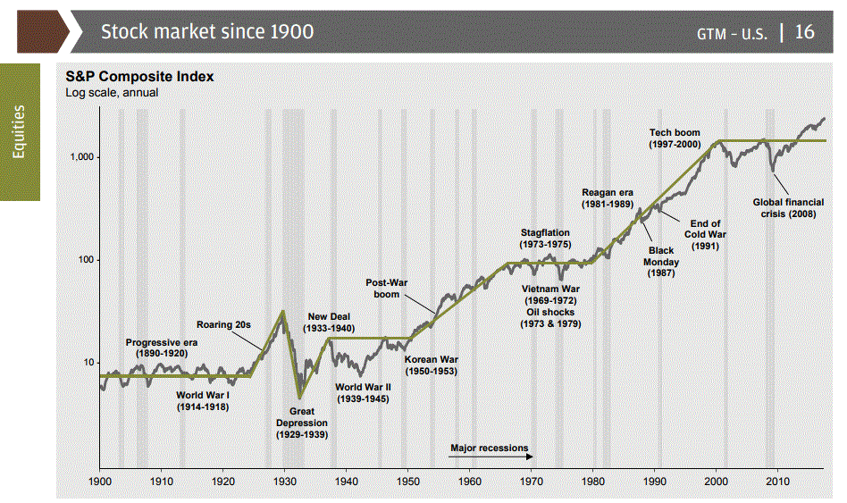
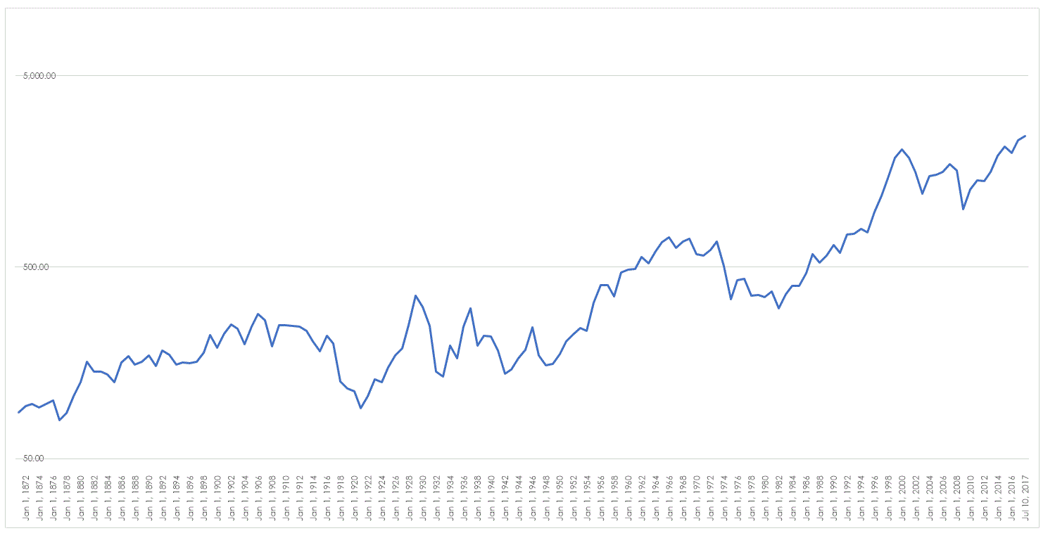
This second chart only tells us one thing – an index go up over time. But even that is not as obvious as it seems. Firstly, the S&P 500 is a relatively new index it certainly was not around in the early 1900’s. So what you are seeing is an artefact, something that is not real. Secondly, the chart doesn’t show the real changes in the index when adjusted for inflation. Accepting that the index did not exist for the majority of the period under investigation and using as much historical data as I could find I have adjusted the index below for inflation. You will also note that even though I have adopted the same log scaling the scaling of the data is different – this is what happens when you are plotting a made up version of the index.
As you can see the almost linear climb of the last few decades is not as pronounced when the data is adjusted. Whilst I dont want to overstate the impact of adjusting the data it is important to understand that the reality of investing over the very long term as opposed to the rosy picture presented by simple price data.
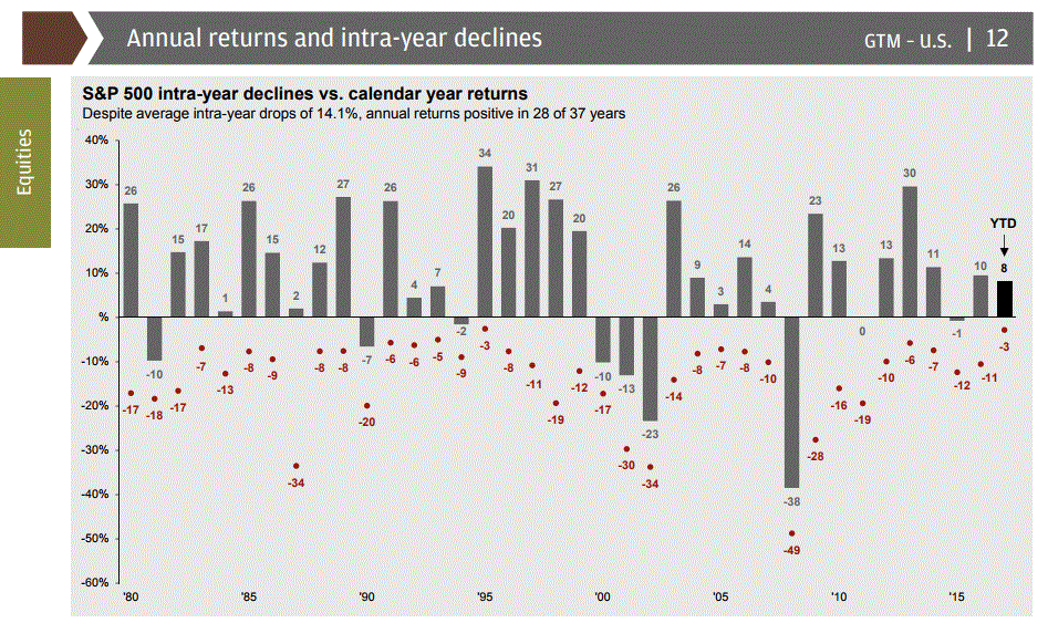
The final chart is actually what I would consider to be the only useful chart in the entire report because it documents the extreme rebound that equity markets are capable of.
As you can see despite some deep falls within the year the index has in the majority of cases managed to finish positive for the year. However, it doesn’t man that the index has an ever upward trajectory – it can still go nowhere for periods of time which is what catches the buy and hold brigade. They misinterpret this chart as indicating that markets always get better and markets or more correctly indices do climb over time of their upward bias but that doesn’t mean your stock or collection of stocks will follow. The usefulness in this final chart is that it reminds us that markets change and they change over a variety of periods – change offers us the potential for involvement and therefore profit.


I find this blog to be full of wonderful perspectives, both graphical and narrative.
But I have been truly blown away reading the article at the link to “convictions and misdemeanours” which is a daunting historical and current review of the activities of JP Morgan. It is quite easy to see how conspiracy theorists can create a very plausible narrative when one witnesses the astonishingly uncontrolled power held by such preeminent institutions (not really belonging to any nation state), of which the world is now cursed with an untold number.
Good blog Chris.
Whenever I see charts that have the appearance of vertical trajectory. And cause me to think they are due for a correction. I click on the chart and change the scale to semi log. Sometimes that allows me to reconsider and stay with the trade. But if the trajectory is still very steep then I bail out or do not enter. Maybe I have been lucky but it has worked for me.
I think the aim of such charts is actually to induce the emotion you feel when you see them. They are what I call holy shit charts – designed to generate an emotional response and not necessarily to convey information. It is part of the analysts attempt to generate an emotional and not intellectual narrative.