ASX 200 Shares Distribution Of Returns
Recently I had a look at the distribution of returns for a system I run – the aim of this was to give a sense of how systems trading works. The rules of systems trading are very simple and are based around the concept of ride the losses, pump the winners and allow time to do its thing. Following on from this I thought it might be interesting to have a look at how the individual returns for shares that make up the ASX 200 were arranged and to see if this had any lessons hidden in the data. From my perspective it did prove to be interesting but then again I find the structural data of the market interesting. The first thing I needed to do was to calculate the 10 year annualised return of each stock. There are a few caveats with this sort of exercise and they need to be understood before interpreting the data.
1.This is the S&P/ASX 200 as it stands not the S&P/ASX 200 since inception. As a result survivor bias is an issue.
2. Annualised returns can be misleading. It is possible for a stock to do nothing and then have an explosive single year. This single year distorts the data upwards.
3.Likewise it is possible for a stock have an appalling year and have the average result dragged down.
4.Some stocks in the S&PASX 200 have very limited data with some trading for less than 2 years – this gives a distorted appearance to their returns.
5.Do not assume that this is the return generated by the instrument every year. Pay attention to points 2 and 3.
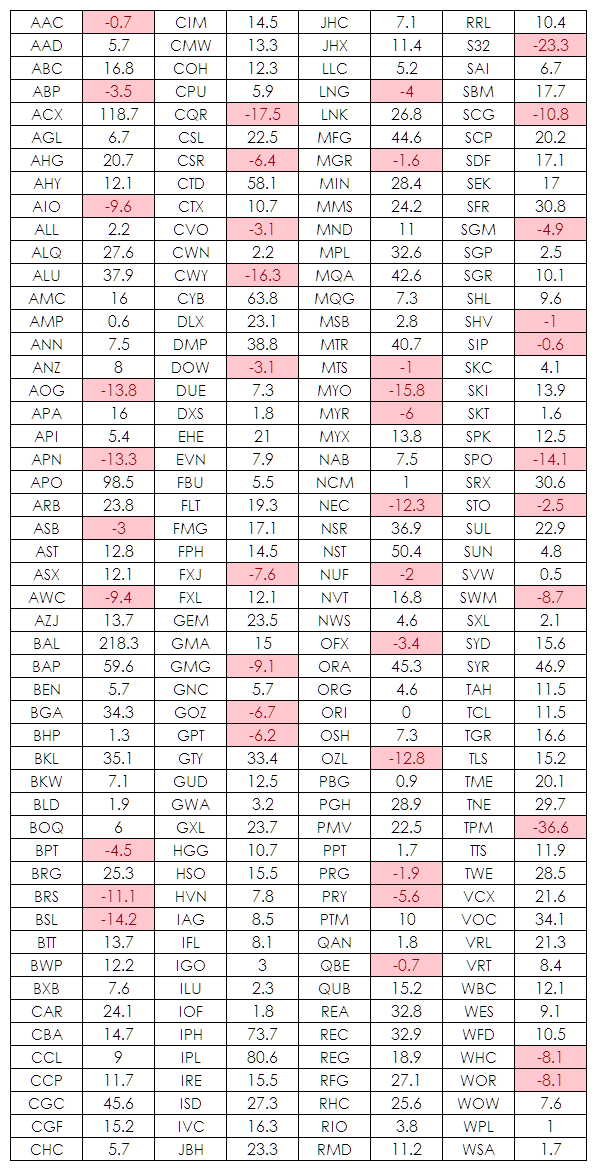
When I tabulated the data I got the following –
Upon initially viewing the data in this raw format the thing that struck me was the amount of rubbish that is listed locally and which for some reason qualifies to be in the markets benchmark index. Several of these companies have limited price history and some have applying price discovery as evidenced by how illiquid they appear. What is also obvious is that many listings have a long term negative pay-off. However, as stated we need to be a little bit careful when making this statement because of the way this data has been calculated. What did surprise me was that I thought that more stocks would have a long term negative return and then I remembered my own warning about survivor bias. The S&P/ASX 200 is turned over regularly so the dogs are flushed from the system and new stocks are added in an attempt to pump the index. My guess is that only a handful of stocks from the original listing of the S&P/ASX 200 still exist (note to self – research project for later) This is why indices have an upward bias.
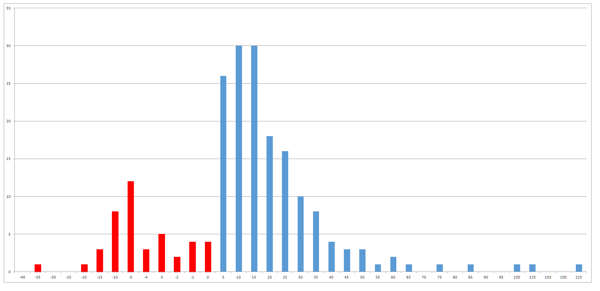
This data by itself is interesting but doesn’t really convey much information so I decided to have a look at the frequency of returns for the index and this yielded the chart below.
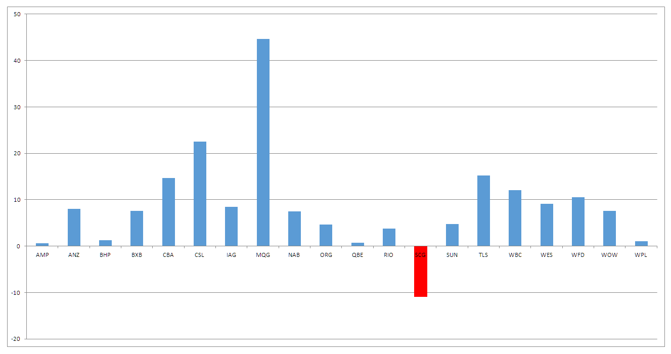
Interestingly, there are more positive returns than negative returns – my explanation for this is once again its a problem associated with survivor bias. However, it is always interesting to see the clustering of results around a given point. In this set of data the mean return is 13.65% with the median being 10.25%. I then started to segment the data into various bins to see how different segments looked. The S&P/ASX 20 showed me an interesting pattern. I did this because I made the assumption that the S&P/ASX 20 would be the most relatively stable collection of stocks and it gave the following distribution of returns.
What is interesting to me is how average the returns for the major banks are over this period. Granted the starting point of the data does include pre-GFC highs but this is also a problem for all stocks in this sample. It is also important because with the failing of BHP and RIO advisor’s tend to overweight portfolios with these stocks. Breaking the data into segments lead me to splitting the data into the top 100 of the index and the bottom 100 in terms of market capitalisation. Doing so confirmed something I already knew. Larger cap issues have less room for outsized returns. The top 100 generated an average return of 11.81% whereas the second tranche generated a return of 15.56%.
This is a significant difference and leads me postulate if given the various assumptions inherent in the data if it is not better for investors/traders to hunt outsized the major index components. I know this to be true from my own systems testing and stock selection criteria. The reasons for this are many but my assumption is that it is a function of leverage and stagnation. Smaller issues have a lower market cap and make up the bottom tier of stocks. This leverage enables larger gains. The stagnation element is related to something I wrote last week. Companies have periods of explosive growth and then they begin to stagnate. Larger companies that have extended history are largely moribund in their thinking and business strategy. For example, if you ran one of the big four banks you would know that you would make extraordinary profits by being ordinary. Given that this is your default setting why would you do anything to change this. It is not in your interest as a senior executive or company director to do anything out of the ordinary. If by some whim of fate you were suddenly made CEO of one of the major banks your instruction ot your staff every Monday morning would be to do exactly the same things you did lat week, the week before that and the week before that. You could then collect your $18,000,000 plus salary and bugger off and play golf for the remaining four and half days of the week safe in the knowledge that the money would simply roll in.
From the perspective of the average trader this data does convey some lessons, most prominent of these is that size matters in limiting returns. This data merely confirms what systems traders have known for decades. However, I think there is something more important in being granular in your view of data such as this. It actually tells a lot about the structure of the market you are trading in. Too often both investors and traders merely look an index and assume that its components are probably homogeneous and therefore not worthy of further examination. In fact I have come across many in the advisory index who were unaware that stocks were dropped from and index and then replaced hence the upward drift of an index. They just merely assumed that the index always went up because of some magical reason. What is worse is they also assumed that every stock in that index went up as well. Looking deeply at data removes these preconceptions and puts you int touch with what the nature of the market is. It also and most importantly makes certain that your trading system is performing optimally by giving you an edge in the stocks you look at.


Nice analysis Chris.
So are you going to play golf after that great analysis? Thankyou and well done.