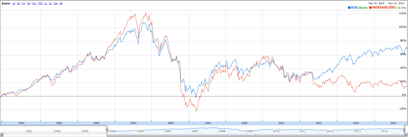
Looking at returns for the top 20 got me thinking about the notion of indices primarily dominated by large caps (top20) and those that were made up of smaller issues.
This in some ways confirms my notion that the performance of the local market has been extremely secular and does not have broad support. You can go to Google Finance and generate this sort of chart quite easily.


Hi Chris
This is actually one of my favourite charts, so much so that my homepage displays it as the primary feature. Sometimes it really feels like there are two completely different markets operating in Australia. Being WA based, we definitely felt the strong flee to quality / dividends in 2012 away from the small caps that Perth based brokers love so much. Many of the brokers specialising in small caps have burnt a lot of people and their turnover has dropped considerably.
Last Monday I tweeted an image showing an intraday difference in movement of almost 1% between the ASX 20 and the Small Ords. Although an intraday difference that large is somewhat unusual, it certainly helps reinforce your point about lack of broad support / cohesion, and it makes me a little hesitant at the moment.
All the best. Matthew.
Managed to create chart, copied link to email but it copied as a line of code rather than a chart.
Any clues on this Chris?
Cheers
Bruce
Hi Bruce
i am not certain what you are trying to do – are you trying to make a copy of the chart you generated to send to someone?
Hey Chris,
Just trying stuff out.
Would be good to be able to save a chart, print it and email it.
Cheers
Bruce