Bank Stocks Set For Further Volatility
So there I was firing up the toaster for the evenings nosh fest of beans on toast when I saw the above headline track across the bottom of the idiot box.
My first thought was bullshit – if its on the idiot box and it has the expression analysts predict in front of it it is generally rubbish. But not being one to rush to judgment (note the sarcasm) I thought I would track down the basis for the story and see what it actually said.
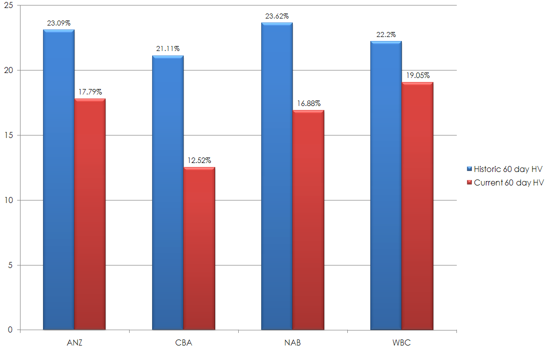
The background to the headline can be found on the ABC’s site and it is actually titled Bank Stocks Set For Further Volatility so before I read any further I thought I would have a look at the current volatility of the banks and see what was happening. To do this I simply tracked the current 60 day historical volatility and then compared it to the average 60 volatility of the banks over the past 11 years years and I found something very interesting. The level of current volatility is well below what one would expect when looking at 11 years worth of data.

As you can see by the above graphic bank stocks are experiencing a period of low volatility and in the case of CBA the current historical volatility is almost 50% less than the long term average 60 day historical volatility.
Seeing this I pondered hos the hell could they come up with a headline that talked about higher volatility and an article that gave the impression that bank stocks were experiencing a period of volatility. I initially thought that merely the journo Elysse Morgan had cocked it up and had simply over egged the pudding in an attempt to make it sound as if something was actually happening in the domestic equities market.
However, this is not so since the story contains a direct quote from Martin North who is credited as being Fujitsu industry director. The quote is –
He says, as a result, financial stocks will remain volatile.
This presumes that financial issues and banks are currently experiencing a period of volatility and they are not – what is happening is that that prices in the short term are going down. So I suspect what has happened is the age old error of making the assumption that because prices are going down that this is somehow indicative of price being more volatile. This is a fairly amateurish mistake since trend is not volatility – trend is the direction of price action whereas volatility is the speed and magnitude of price movement. They are not the same.


Not sure if I’m misreading this graph CT (or the bars are mislabeled) but the blue bars (current volatility) are greater than the red bars (historic volatility)?
In your graph isn’t the current volatility (the blue bars) about 50% higher than the historical volatility?
Correct – fixed now.