Imagine we have a way back machine and we wander into your broker or financial planners office in 2007 and ask them to generate a portfolio for us. I can guarantee you that your portfolio will have at least two of the local big four banks in it. The argument for including them will include all sorts of rationalisations such as dominant market share, virtual monopoly, licence to print money and don’t forget the dividend. All you have to do is sit back and collect the dividend and watch them go up in price.
So how did that work out?
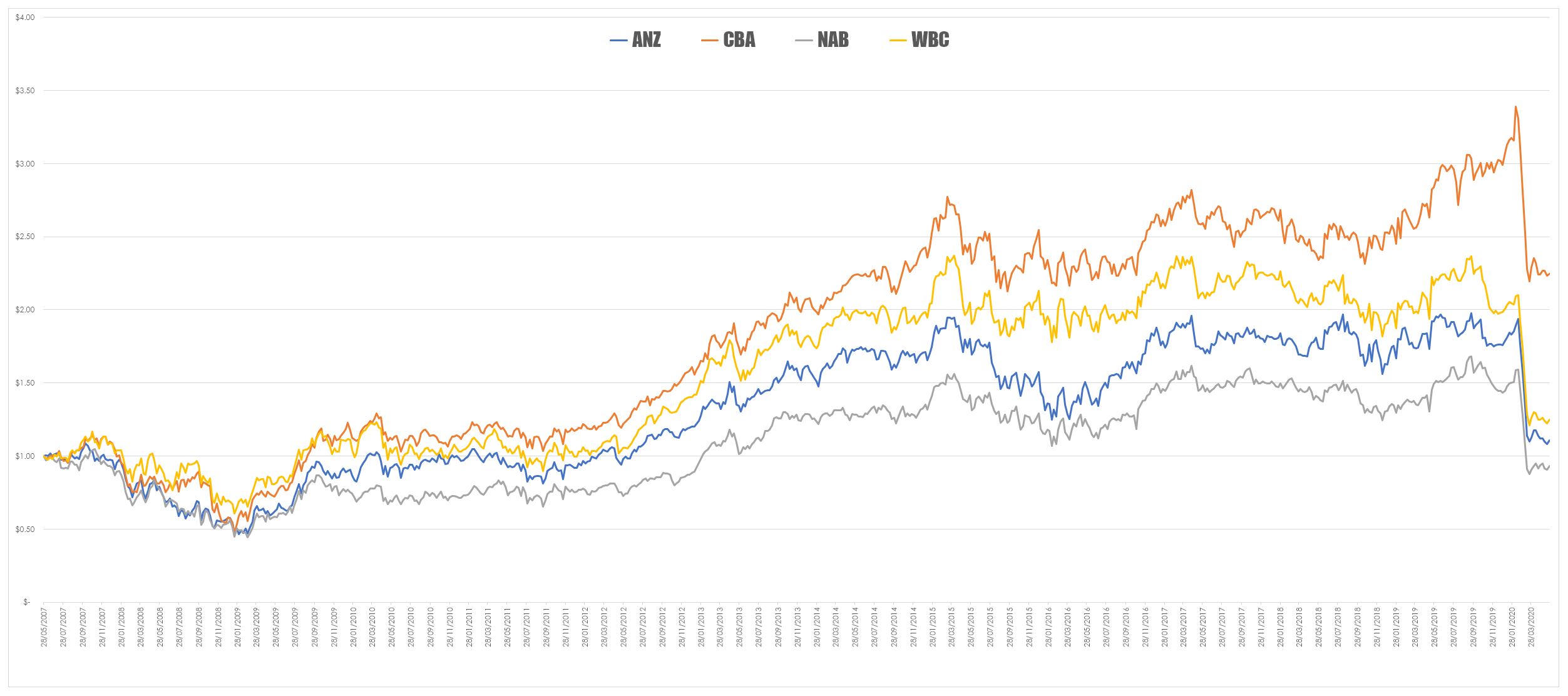
The chart below looks at the value of $1 invested in the banks 13 years ago – as you can see it didn’t work out too well. This data has also been adjusted for dividends so this is the total return.

To get a better sense of how poor an investment the big four have been I generated the table below which looks at the terminal value of your $1 invested and the rate of return for the period invested.

So for your 4747 days invested with the exception of CBA, you have returned less than bank interest for ANZ and WBC and for NAB you have gone backwards.
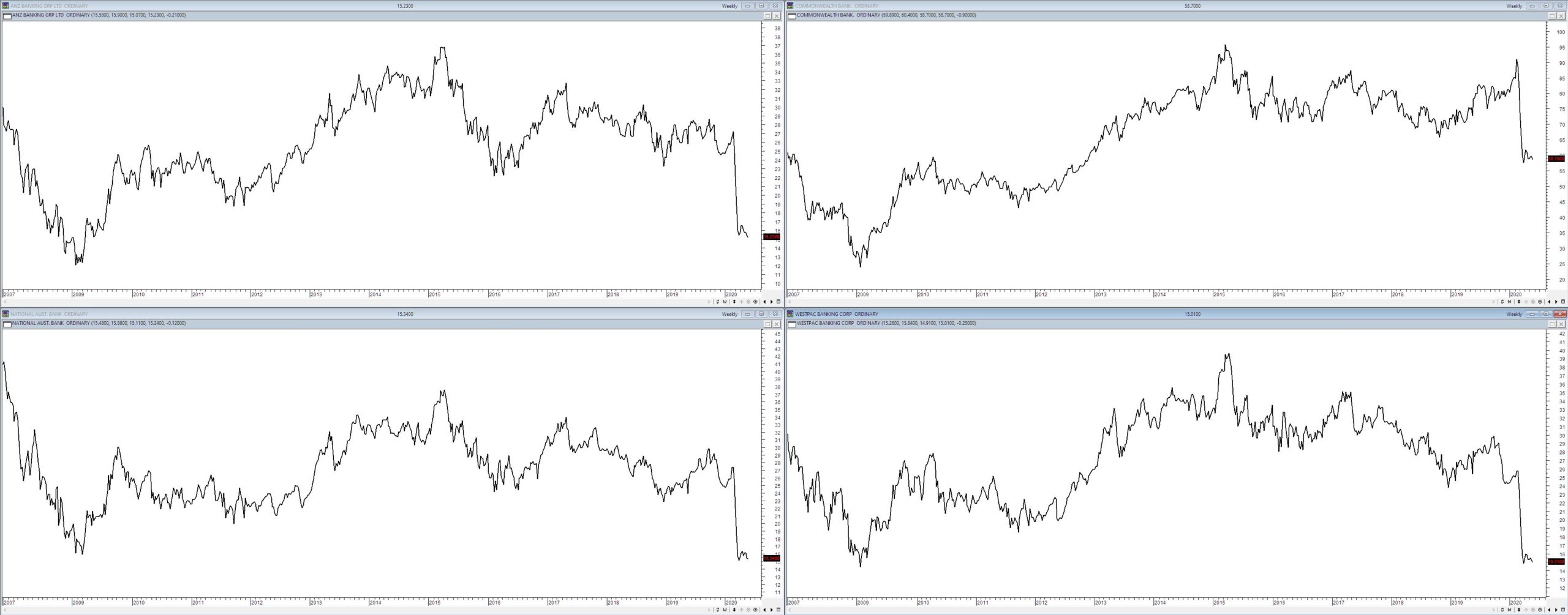
What is interesting about the banks post the GFC is their price trajectory – there was a recovery post the fall but the high point was 2014/2015 since then the banks have been with the exception of CBA drifting down. Whilst, I was vaguely aware of this drift I wasn’t fully aware of how ordinary the banks had been for the past five years.

The central message is that there are no guarantees and your perception of how well a business should do is often not the same as the market’s perception of how well its price does.


