I am an old school sort of guy and this is reflected in the way I approach markets. This approach came about in part because of personality but in part because of the limitations of technology. When I became interested in price action as means by which to generate trading signals the PC was in its infancy and was in no way capable of plastering a chart with dozens of lines. In fact it was hard pressed trying to draw a decent bar chart. These limitations enforced a discipline on you to be sparing and precise. But also to learn to look at price action without turning the chart into an Andy Warhol kaleidoscope. I have long held that the more you draw on a chart the more removed you are from price. I am also of the view that the more you apply to a chart the less secure you are in your opinion and that you are desperately searching either for some magic confluence of events or to so obscure price that you always have an out in case your opinion is wrong.
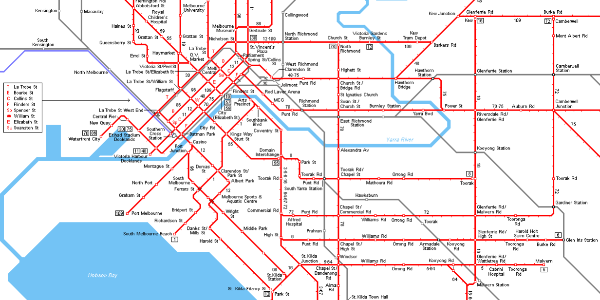
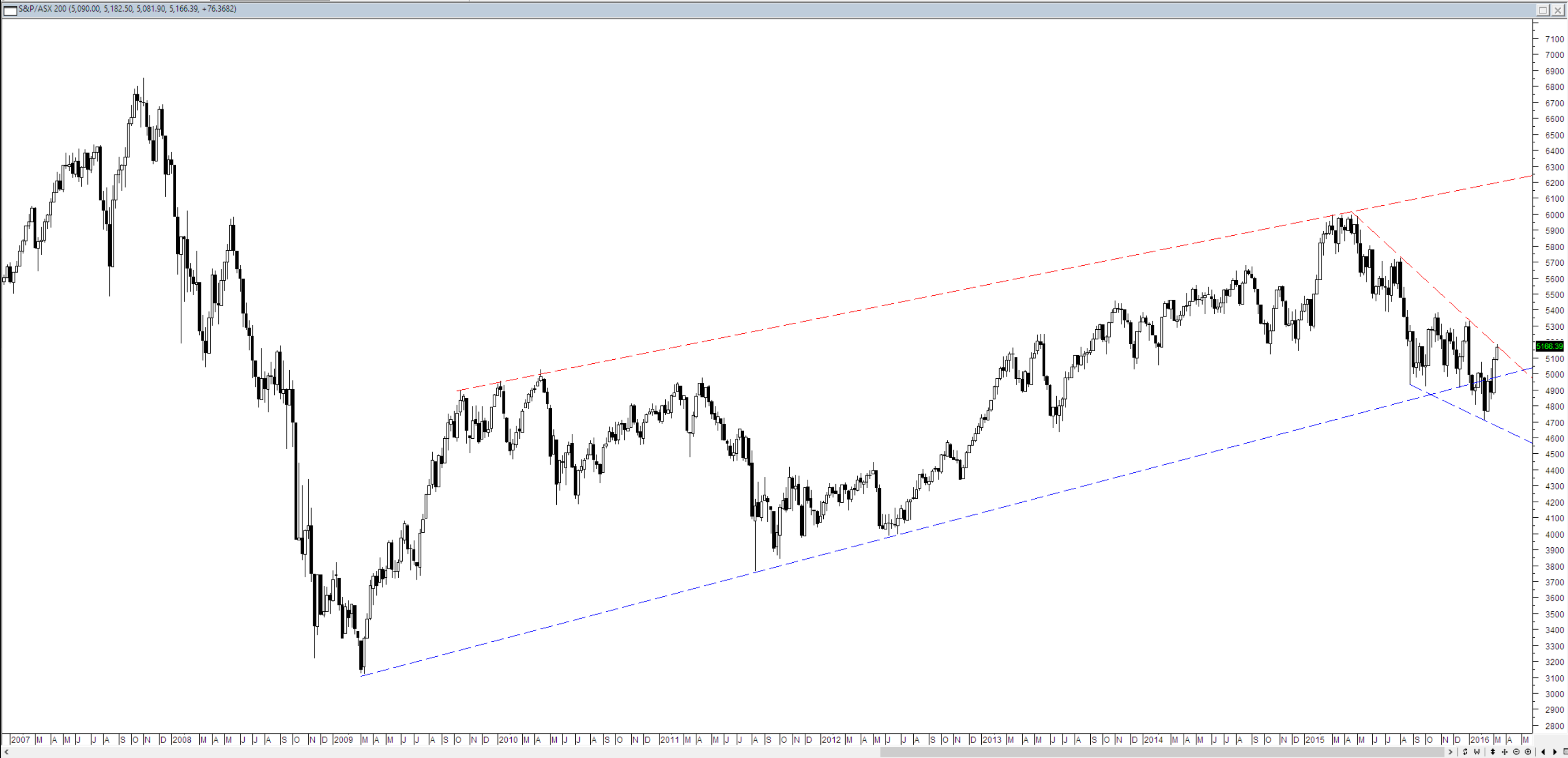
Of late I have been receiving charts of the All Ords that I have in the past referred to either as an aerial map of the Melbourne tram network or something akin to the drawing on the plains of Nazca. In my view it simply isn’t needed. Consider the chart below of the ASX 200.
This chart has four lines on it. Two tell me that the very broad meandering recovery from the GFC is still in place and two tell me that the market at present is stuck in a downward sloping channel. A narrative could be built up that says that if price breaks out of the downward sloping channel then it may progress back into the body of the broad recovery channel. An alternative point of view could be that if price fails this test it will drop back into the downward moving channel. I am not certain how you will get anything more by adding dozens of lines with magic retracement numbers on them to the chart.


On this chart at this time (if you stick to drawing just horizontal support / resistance lines) you really only need to have three tram tracks.
very true Chris..less is more. have uncluttered my charts some time ago & can now look at them with much more clarity.
Beautifully put.
It is a little like drawing lines on x-ray prior to joint replacement.
One line usually tells the accustomed observer all there is to know.
Agree with this. When I removed various indicators such as moving averages from my charts it was easier to see chart patterns.
I never thought about it but it’s true that the more you draw on a chart, the less you are confident about the stock. It’s kind of like you are trying to justify the buy.
I smiled at the line “magic retracement numbers” because I’m still a fan of Fibonacci retracements.