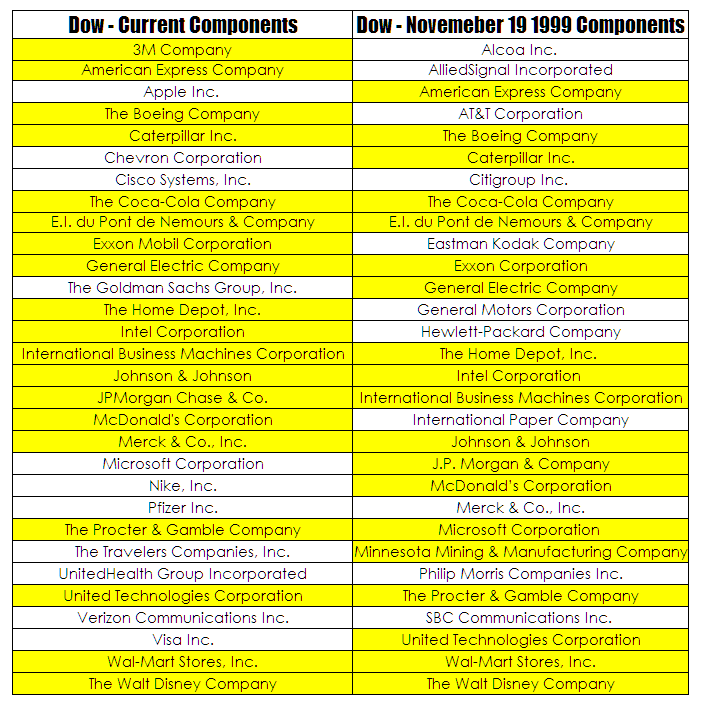
I am still beavering away looking at changes in the S&P/ASX200 over time – it is a time consuming exercise as with all things Australian quality data is hard to come by. Both Standard and Poors and the ASX are friggen hopeless when it comes to providing useful hard core data for traders. However, the difference between the original S&P/ASX 200 and the current version is staggering. In the meantime I decided to have a quick look at the Dow which has proved to be much easier courtesy of Wikipedia
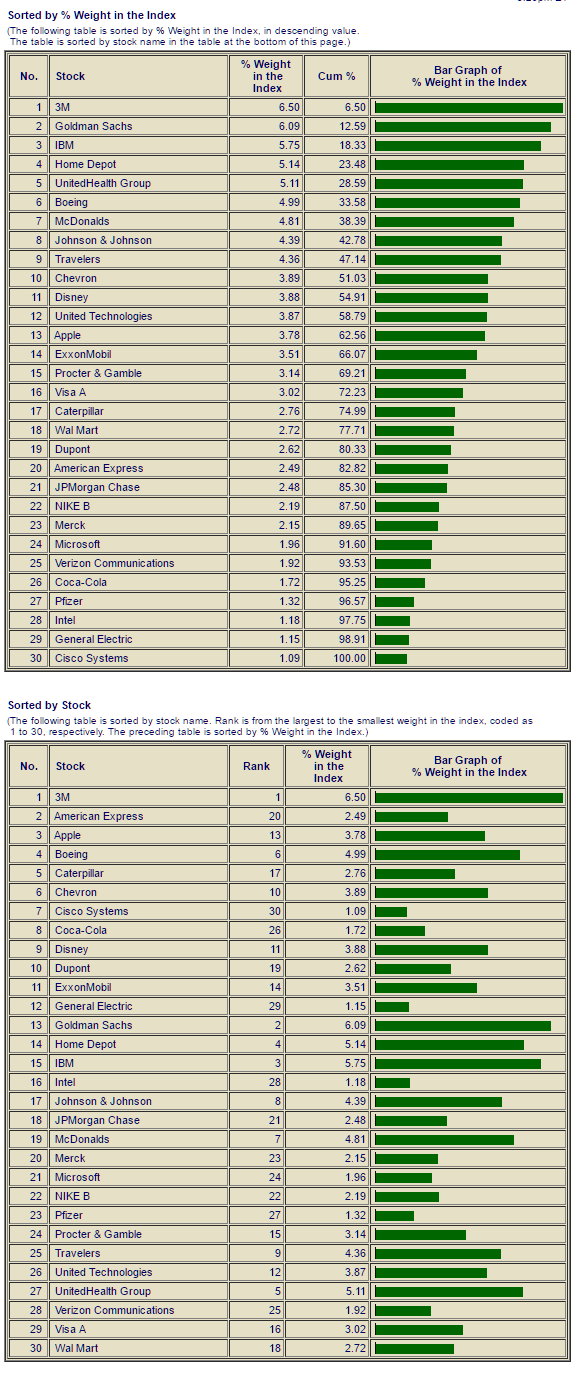
The cells highlighted in yellow represent companies that have held their spot over the past two decades. As you can see there has been significant turnover. And if you were curious about the weighting of each stock with the Dow these two neat little charts from IndexArb will help you.
Source – IndexArb


