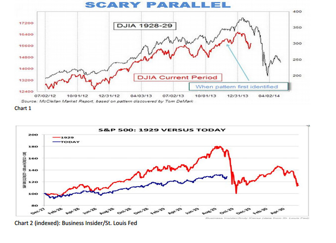
During my sabbatical I got bounced the video below – it only goes for about 90 seconds so its easy to get through. If you are under the age of 25 cannot concentrate for more than 90 seconds the general gist of the story is that the current market looks exactly like 1929 and the world is going to end next week or some such thing.
I am always intrigued when I look at images that overlay one segment of market history with another. To the untrained eye they look very compelling – it is the old argument, if they look the same then they have to be the same. however, such charts are really quite naive and display a lack of understanding of the importance of context. Interestingly I am not the only one this sort of comparison has annoyed. I found the following chart on the WSJ
It quite correctly looks at the two markets in terms of the returns the market had been generating up until today. The accompanying article is well worth reading.


