This snippet popped up on my Linkedin feed last week as a single headline – I didn’t know where it was from but eventually tracked it down to the AFR. As you can see it trumpeted the fact that the Australian market is one of the highest yielding in the world. I have to admit I am always intrigued by the fascination that people have with dividends I have always been of the viewpoint that traders get paid on price. Our job is to buy an instrument at X and sell it at X plus 10. Not sit there and wait for it to pay us a salary. In part it is this notion of salary that I think attracts people to dividends – it is difficult for people to get rid of the notion that they need to receive a regular income. It is why people are attracted to options writing – that and the fact that some idiot told them at a seminar that its free money.
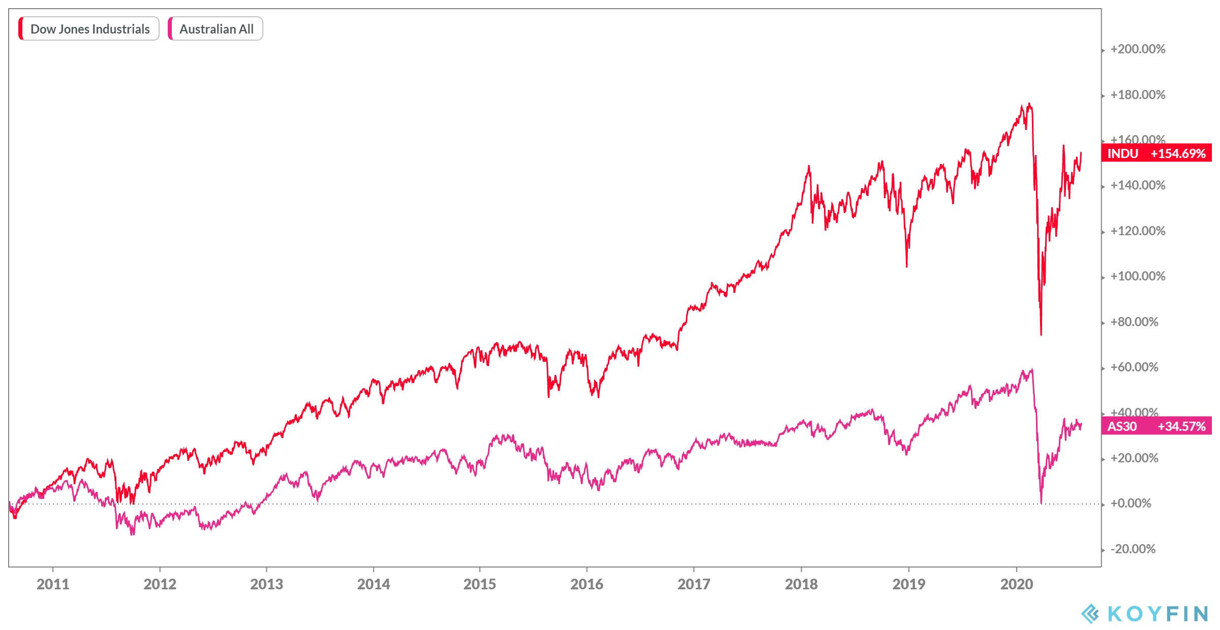
If we compare markets on only price action we get an obvious picture.

On a price-only basis, the local index is a poor performer – this differential narrows a little bit over a little bit over a 20 year time horizon (152% vs 89%) but expands over a five-year period (54% vs 7%) There has been no real compelling reason to be a traditional long-only equity investor in Australia since the GFC. However, I thought I would take a slightly different tack and look at the differences between the total return indices to see if dividends made a compelling difference between the two over the last ten years.

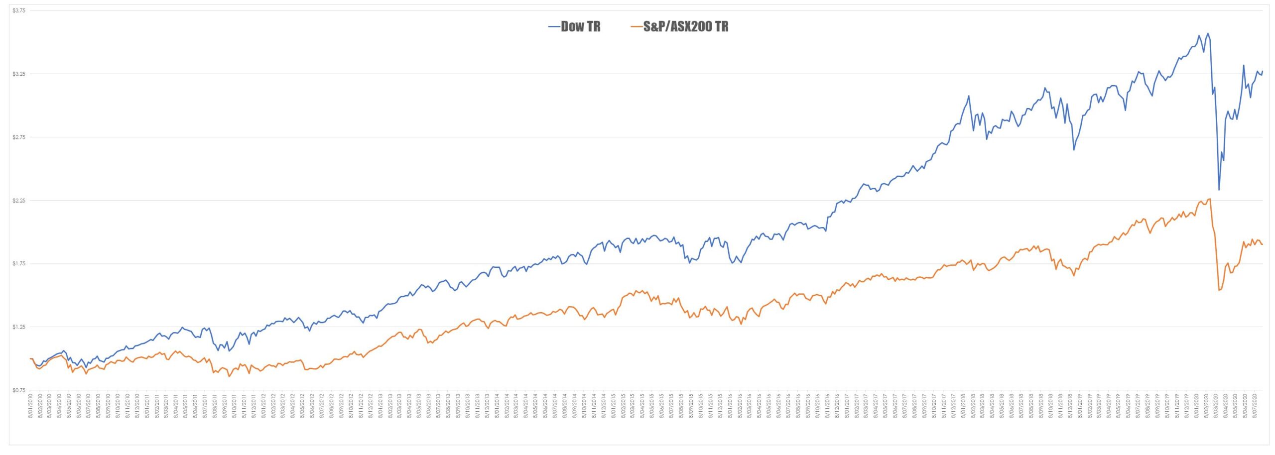
The gap does narrow ($3.00 vs $2.00). However, the Dow is a very narrow index so I decided to run the comparison over the S&P500.

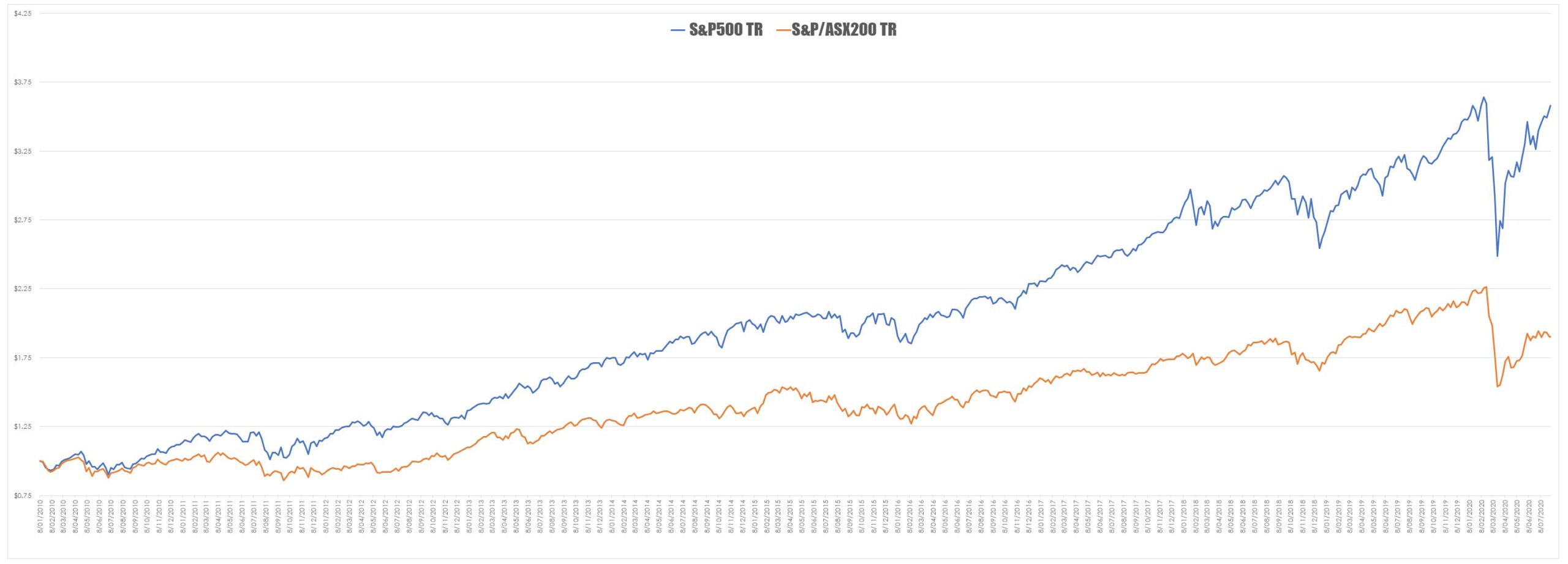
As expected the gap widens ($3.55 vs $2.00).
So does being ranked among the highest-yielding markets in the world actually count for anything….probably not. Price always wins because of the immutable fact that as a general rule when your yield is going through the roof your price is going through the floor.


Stock dividends are suitable for investors that desire modest annual income. At the other end of the wealth spectrum, NASDAQ momentum stocks are suitable for investors that desire to be wealthy. The disparity between the XJO is even wider when compared to the NASDAQ 100 index. As seen on the charts in this article, the Australian XJO index represents large opportunity cost. This underscores why traders need to use comparative analysis to determine which markets and sectors have out-performed historically. Daily new high scans are essential in order to track the strongest markets, stocks, and sectors.