It is always good to take a step back from media hype and bluster about the world ending and actually look at what is happening in the markets. I headed off to training this morning with some peanut on the radio jabbering on about how the Dow had collapsed some 350 points and I thought to myself so the f#4k what….
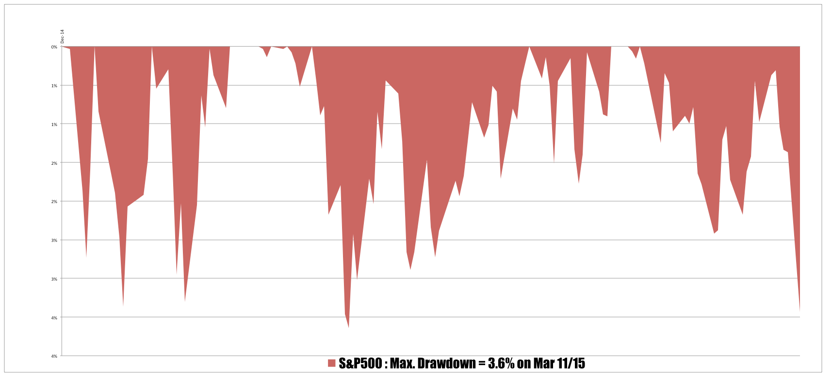
Context is everything when making decisions. Consider the chart below which is of the drawdowns in the S&P500 for this year.
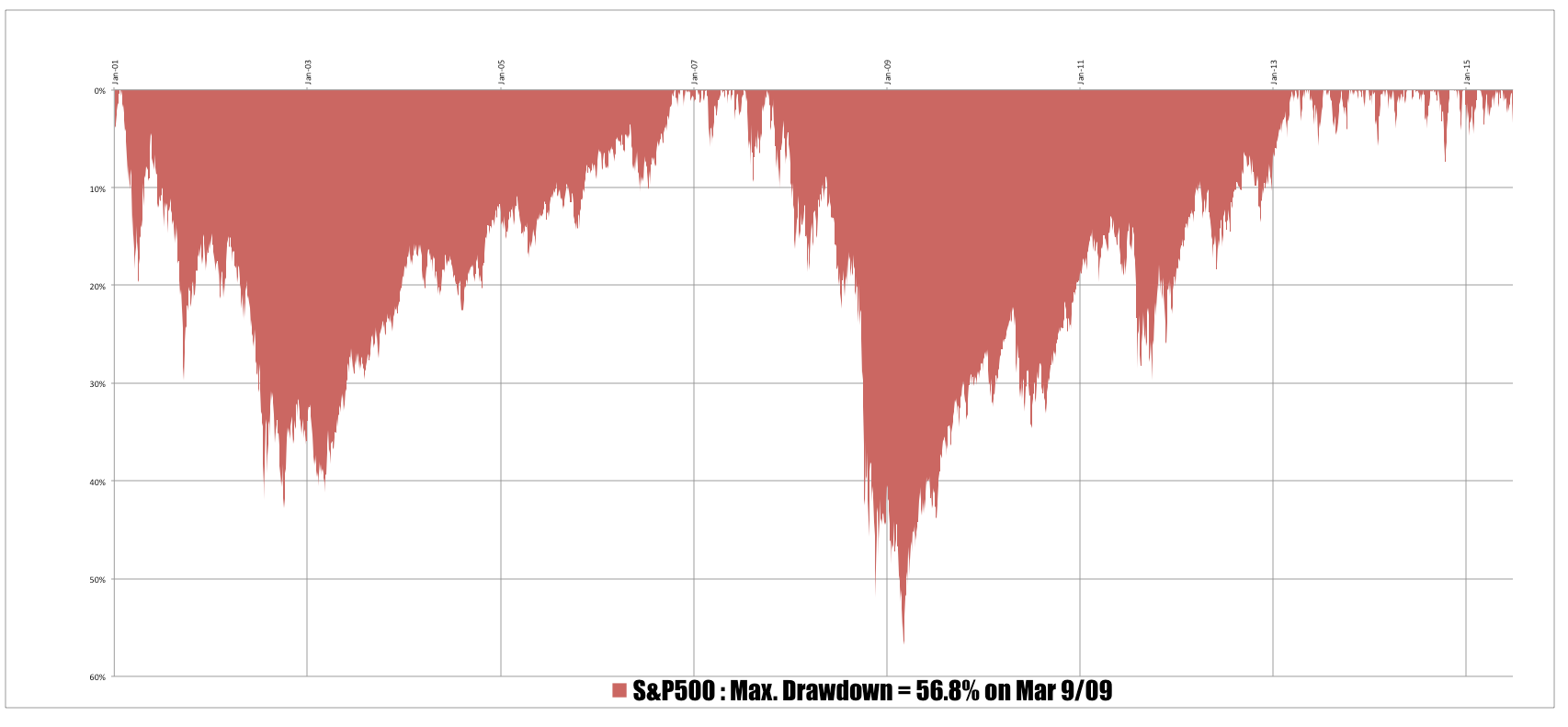
 As you can see the largest drawdown this year occurred on March 11th. This slippage may eclipse that, but to date it has not. Even if it does it only means that the broader US market is off a few percentage from its all time high. The chart below shows the wider landscape of events.
The largest drawdown in the S&P500 this century happened at the bottom of the GFC – the market lost over half of its value. You can see the current drawdown in the top right hand side of the chart – they barely register compared to some of the earlier drawdowns.


Guess it always pays to look at the big picture!
I love these big falls in the market – especially when I’m virtually out of it. I start to look for some of Louise’s bottom reversal candle patterns.
Did have 12 open positions. 9 of those hit there stops. Am now waiting for my filters to show a rising market again and am looking to replace the stopped out positions. Not that hard really. If market continues down I will have a longer break. Quite happy investing on weekly charts.