Its a shitty day in Melbourne, so with nothing better to do I decided to fire up excel, download a bit of data and see what I could learn. Anyone who has spent more than 10 minutes on this blog will realise that I am fascinated by mechanisms of generating excess return with minimal cost and why fund managers cannot seem to be able to do the simplest of things. The poor performance of fund managers and the excessive fees they charge for being bad at their jobs has lead to an explosion in passive mechanisms of investing. ETF’s particularly in the US has become the default standard for many investors. With this in mind I decided to look at the data for some of the local funds just to get a sense of how they perform over time and to see if this performance gives any clues as to how money flows around the market.
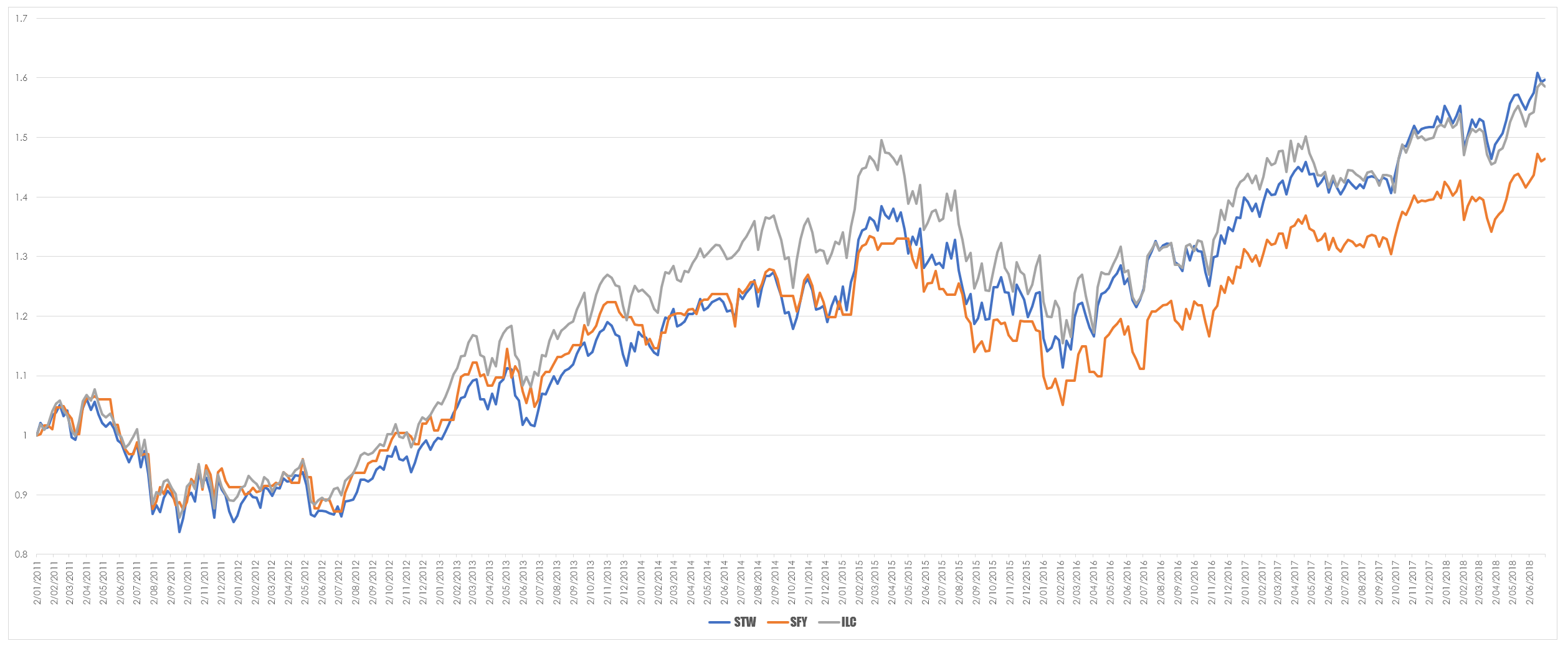
The chart below looks at the S&P/ASX 200 (STW) S&P/ASX 50 (SFY) and S&P/ASX 50 (ILC) ETF’s. I was simply curious to see if an ETF such as ILC which represented the top 20 domestic stocks and makes up approximately 47% of the total market capitalisation.
As you would expect this is a dislocation between the performance of each of the ETF’s. What is interesting to me is how poor the performance of the broader market is compared to the very narrowly focused ILC. However, I was hampered by the limited data I had because most local ETF’s are fairly new. To overcome this and see if this trend continued I decided to look at the underlying indices and for the sake of completeness I threw the S&P/ASX 50 into the mix as well.
Intriguingly with more data the picture changed a bit. The S&P/ASX 200/100 now took the honours for performance during the bull run of 2003 to 2007 and all were ordinary until the S&P/ASX 20 took the lead and was then usurped by the S&P/ASX 100. The difference between this graph and the ETF’s I think is a function of timing differences – a different starting date will always yield a different trajectory. What is more interesting to me is to observe how sentiment in markets change. During bull markets it has been my observation that money flows out of what you consider benchmark stocks and into the lesser end of the market. So during 2003 to the GFC the bulk of market action was in the broader market. The term traditionalists might use is the the heavyweights represented full value and so were simply lacking in demand. A more pragmatic explanation is that investors chase leverage and you dont get much out of stocks you would buy and then put away. Investors love a punt not an investment.
When markets are recovering from a slide the reverse tends to happen – there is a flight to what is consider to be quality therefore they are the first to recover. What we are seeing now may be a transition back to the broader market as players seek stocks that they consider to have more upside. It also doesn’t help that the majority of the S&P/ASX 20 in made of financials and we know how well they have been fairing.
For the sake of completeness with the indices I wanted ot have a look at the total return indices – that is price and dividends are combined.
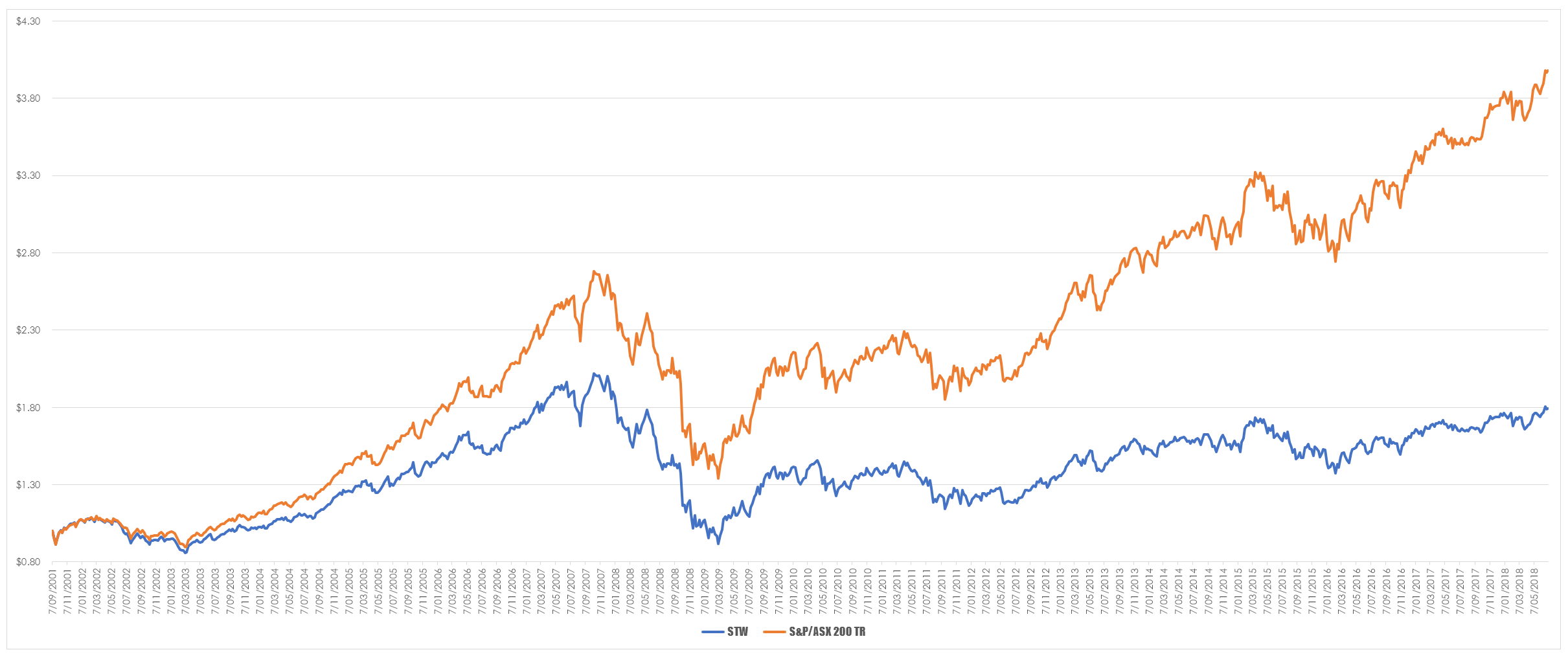
My expectation was that the total returns chart would look pretty similar to the price only return and it does. The broad pattern of money flow is the same. However, the central question for those involved in markets is how do you make money out of any of this. So I thought about comparing STW to the S&P/ASX 200 Total Return index and I got the result below.
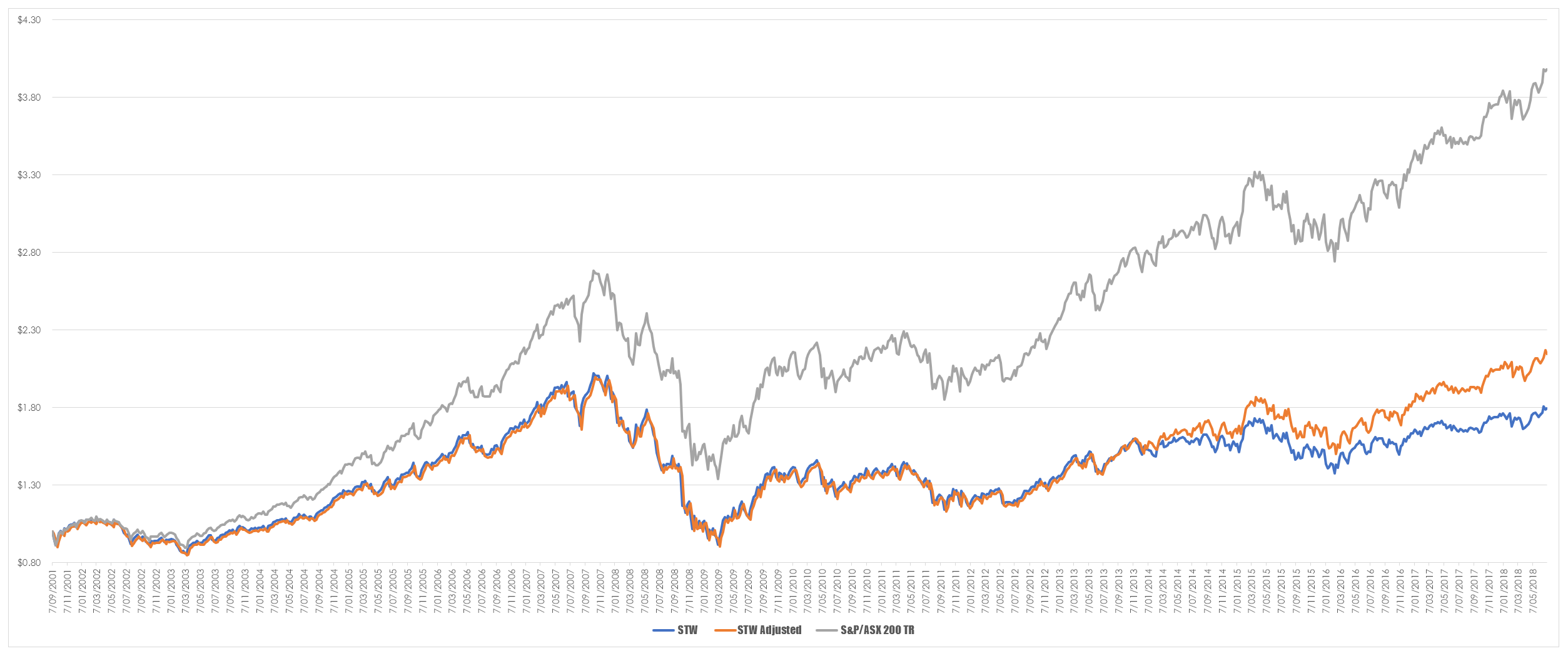
At first glance it looks as if STW is somewhat of a dog and does a poor job of replicating the index in terms of overall long term performance. However, this is a little bit of an unfair comparison since I am comparing a price only ETF with a total return index. A more appropriate comparison is between the price of STW adjusted for dividends and the total return index.
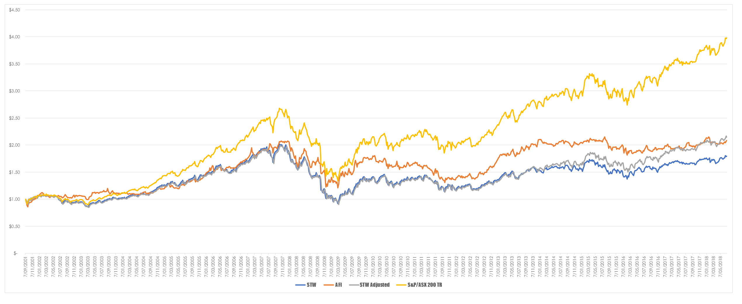
This chart surprised me as I knew the price only STW would be outpaced by the adjusted price. I wasn’t ready for the degree of out performance generated by the total return index. My first guess is that what you are seeing is the impact of fees and costs but this is something I will have to think more about. and since we are talking about making money I decided to throw into the AFI which is a listed fund manager that has fairly deep history and see what the comparison looked like with that included.
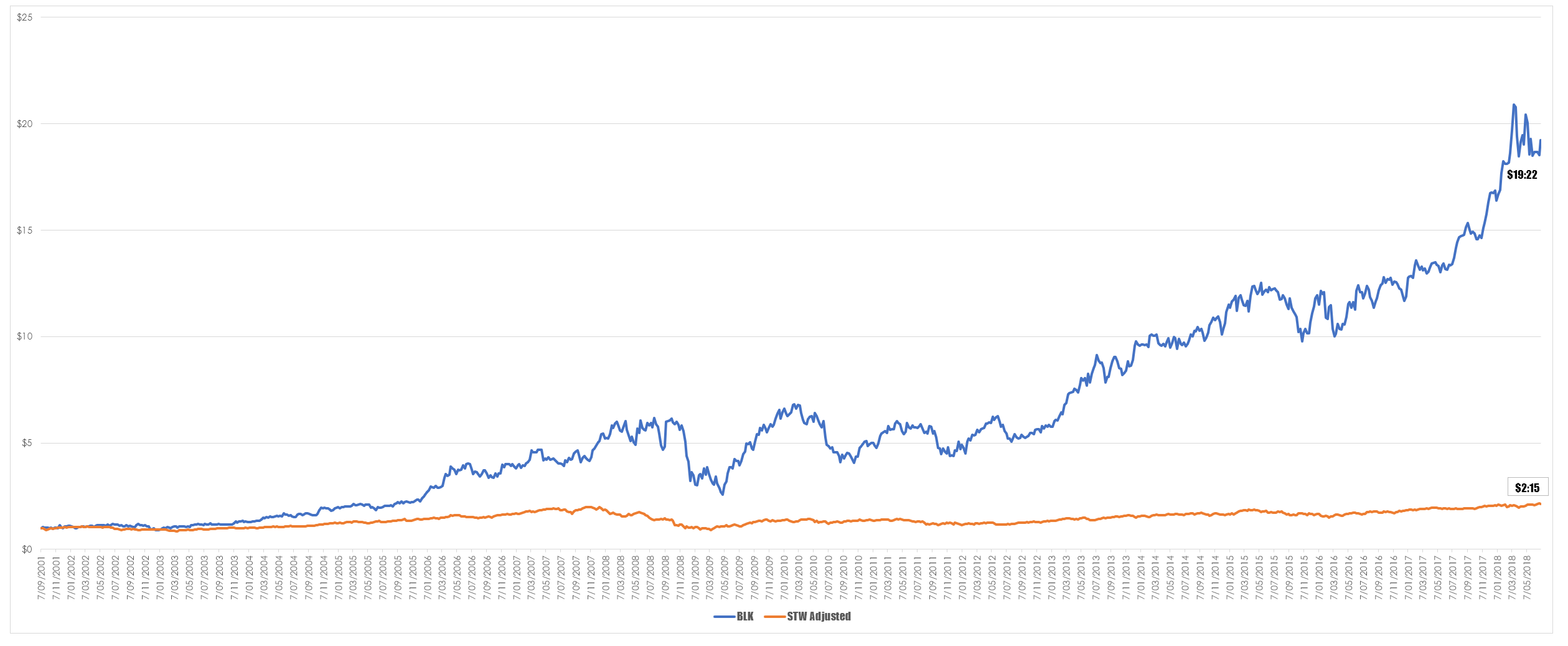
There is some difference between the adjusted STW and AFI post the GFC but that gap has narrowed of late. My guess is that STW is a blunt instrument with no flexibility at all whereas AFI can decide which stocks to include and which to discard. This capacity has given them a small degree of alpha over the index. Plotting this brought me back to one of my long held theories that you are better off owning the fund manager than the products they offer. To set up somewhat of an over excited example. The company BlackRock Inc are one of the worlds largest generators of financial products, particularly ETF’s so I decided to compare an investment in them to the adjusted STW.
It is no contest really. The reasons for this are probably many and varied but I like to think they can be boiled down to a simple maxim. Fund managers act to maximise the value of their own investment not yours. Granted STW has a fixed investment profile. But I dont think it would matter what product I compared to BlackRocks share price I would get the same result. The lesson for me has always been that self interest is a powerful motivator within the finance industry and as such you are well advised to work out where that is and then follow it.

