One of the things you learn quite quickly in trading if you have any degree of awareness and humility is that the market will not in any way respond to your exhortations to behave in a certain way. Recently I got a notification from LinkedIn that I was suitable for several jobs that were being advertised so for shits and giggles I thought I would have a look. My only comment is that if artificial intelligence is recommending jobs dealing with members of the general public to me then we are all screwed.
However. whilst I was there I spotted a chart that was almost identical to one below.
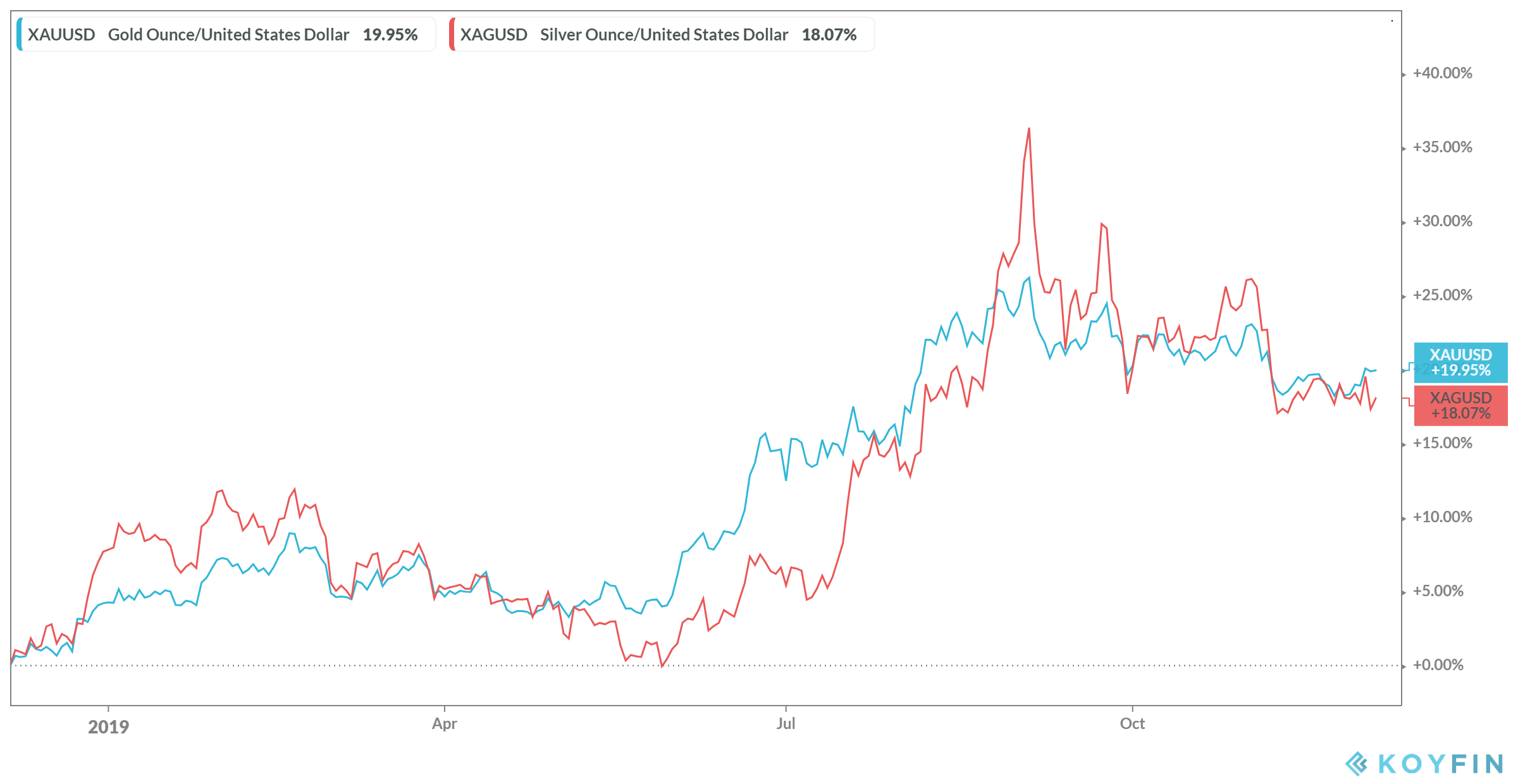
This chart shows the comparative performance of gold and silver and it was immediately followed by a chorus of silver must go up, I’m buying silver right now, I am not only buying silver I am shorting gold and selling the spread. Being long gold and short silver are functionally equivalent to selling the spread but the poster of the comment didn’t seem to realise that. There area few problems with this sort of analysis – if it can be called that. The most obvious is the use of the word must – this implies that the market is subject to a series of fundamental forces that it must obey. Much like if you throw a ball into the air it must come down under the influence of gravity. To my knowledge markets operate under no such doctrine that governs the direction they will take. In many ways, such an assumption is similar in tone to that made by LTCM before their collapse. They assumed that the market was made up of clockwork-like interrelationships that were inviolate. Again no such relationships exist in markets. To suggest otherwise is to misunderstand the nature of markets but it also displays a remarkable breadth of hubris.
Additionally, such an analysis displays a lack of fluidity – the chart above could equally be interpreted as gold has outperformed in this period and therefore should fall. Or alternatively, both instruments could fall and the relative differential is maintained. In suggesting that silver must go up an internal bias is being demonstrated that precludes any understanding that there may be alternative outcomes.
However, there is another problem with this interpretation and it is one of time scale. As I have mentioned many times before the starting date of performance comparisons matters and it greatly influences the picture that is generated. Consider the chart below.

This chart shows the relative performance over the past year and in this time frame the differential has disappeared. This raises the question as to which chart is correct – the longer or shorter term. I would posit that if you are making a timing decision and trading commodities is a timing decision then the short one is more relevant. However, neither give you enough information to make any form of trading decision since all you are seeing is relative performance over a random time frame.
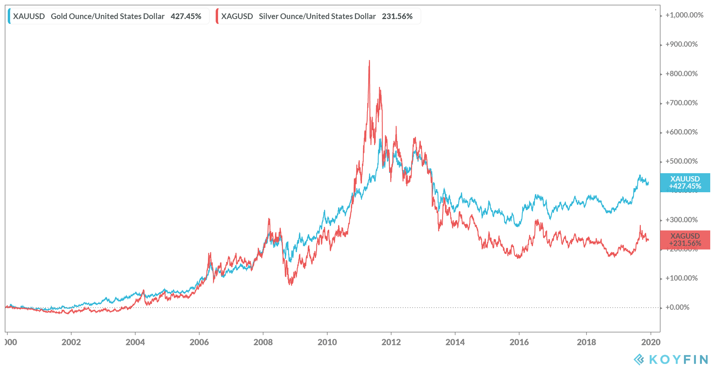
To further confuse matters consider the long term chart below and make of it what you will but remember the market doesn’t care what you think.


