Hindsight Is The Perfect Investment Tool
It is often the preserve of finance journalists to suffer from the almost terminal affliction of hindsight bias – this sort of creeping determinism that some things were obvious all along. Recently I came across an excellent example of this whilst trawling for an online chart on Yahoo Finance. The piece breathlessly claims How buy and hold investing turned $50,000 into $500,000 in ten years – the only problem is that it didn’t. What the author did do was look back in time at a series of stocks and say that if you had bought these 10 years ago then you would have done really well. As the old saying goes, if wishes were horses then beggars would ride. As part of the piece the author makes the inferred claim that some of the stocks he has picked may have the same potential, so armed with data, a spreadsheet and a knowledge of how trading actually works I thought I would take a look at one of them – MNF.
What I did initially was to convert the returns from MNF into the value of $1.00 invested 10 years ago. I do this because it removes the falsehood of claiming annual returns that don’t match reality. As an example imagine you invest in a fund that in the first year makes a 100% return, So you jump up and down and congratulate yourself on how brilliant you were. The next year the fund has a bit of a set back and generates a loss of 50%. This isn’t so bad you think, after all the annual return of the fund is 25% pa. This is calculated by taking the first years return 100% and subtracting the second years return 50% and dividing by two – this gives you 25%. So you are surprised when you look at your statement to see that you haven’t actually made any money because on the first year you doubled your investment and in the second year you halved it. Your actual return is at odds with the quoted percentage return. This unfortunately is a common problem in investing and is why managed funds seemed loath to provide historical unit prices so that investors can plot a true equity curve. As a general rule whenever you see an annual return figure quoted you should try and get hold of the underlying prices so you can see the trajectory of those returns plotted as an equity curve.
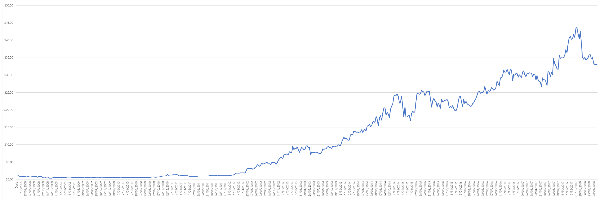
When I plot the value of $1 invested in MNF I get the following curve –
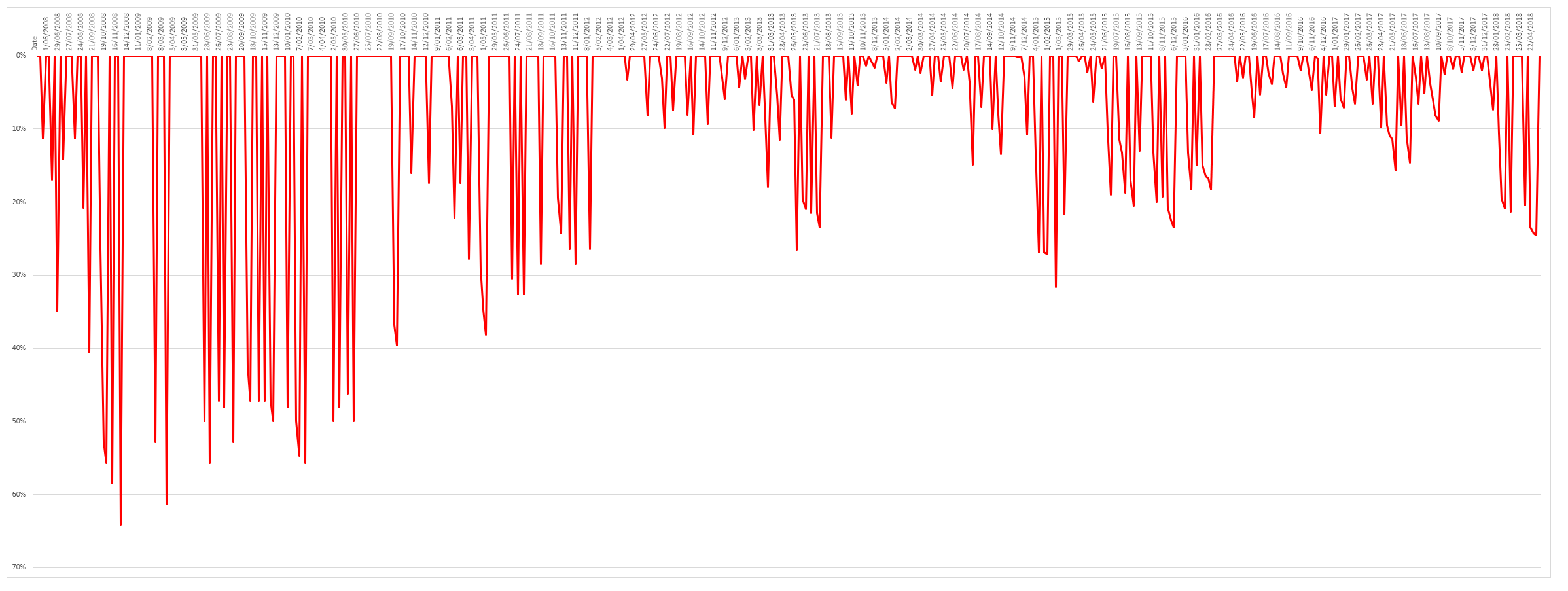
The curve is mighty impressive – if I had invested $1 in MNF ten years ago, at its peak it would have been worth over $43. However, there are a few problems with our investment the first and most obvious is that for several years your investment goes nowhere. There is buying and holding and there is buying, holding and praying. The second is the horrendous drawdown the stock price experiences as evidenced below. It should also be noted that if your investment mandate restricted you to stocks in the S&P/ASX 200 then you would not have seen this stock till quite late in its trend – the same is true for all the other stocks mentioned int he article. Hindsight is not all it is cracked up to be.
In the early years your investment regularly dropped 50% or more. I doubt anyone would have the stomach for this on a regular basis. These drawdowns are evidenced by the number of times you would have been thrown out using any form of stop. The chart below uses a 3ATR trailing stop.
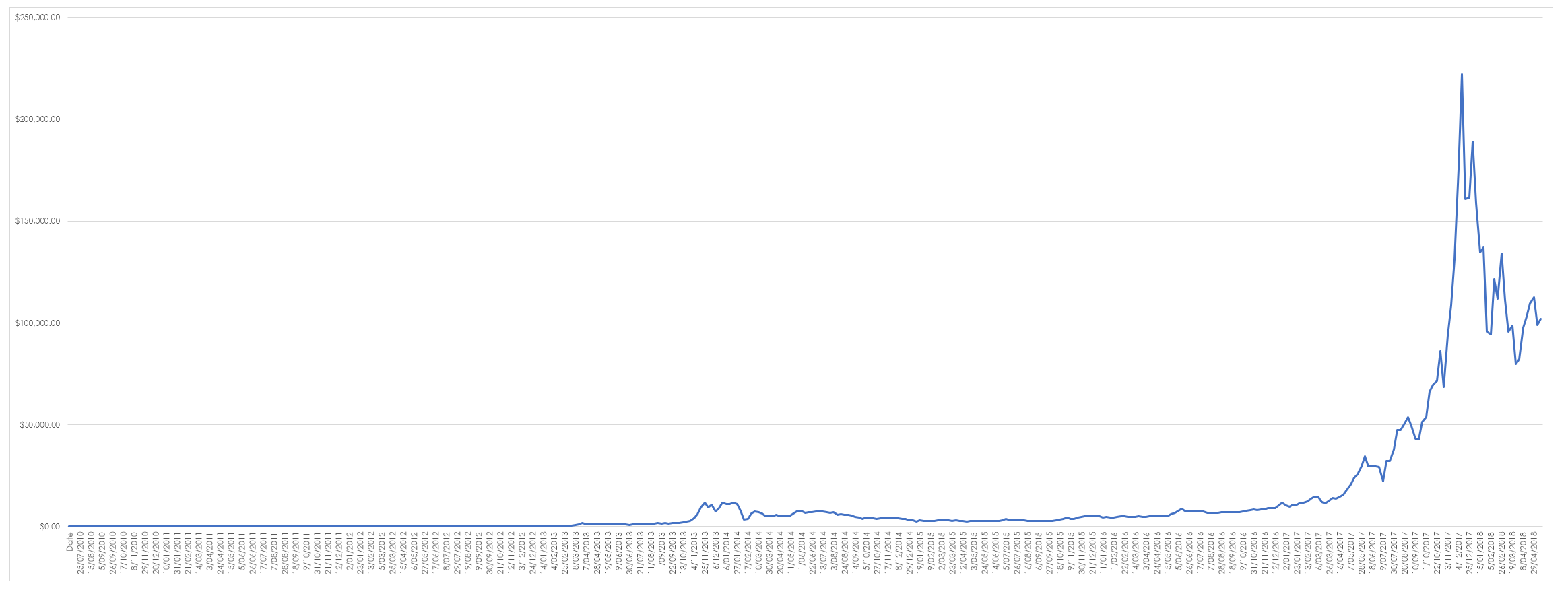
There is no doubt that long term trend following is a powerful investment tool but it needs to be tempered with realism – unfortunate we don’t posses a time machine so we cannot go back in time and make pronouncements about what we would have bought. As such this sort of article is fairly meaningless and doesn’t really contribute much to an investors library of trading knowledge. But since we were in the spirit of being completely unrealistic in deciding how to make investments I applied the same logic to Bitcoin to see how much $1 invested a decade ago would be worth now.
If I were being formal I should have converted the chart to log scale but that removes some of the drama of the move – at its peak $1 invested in Bitcoin would have been worth $222,107.54. That is something worth inventing a time machine for.


