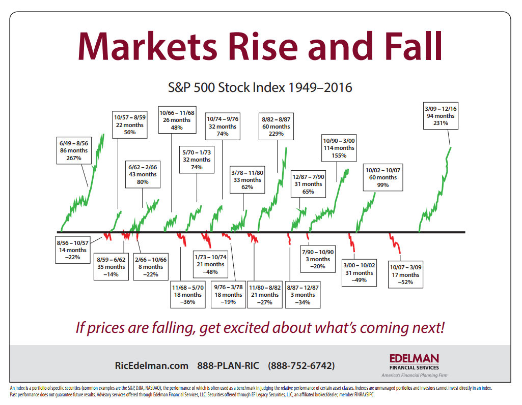
I got bounced the chart below this morning because as the person who sent it to me said its The Most Important Chart on Investing You’ll Ever See.

I only had the image so I traced it back to here. The chart itself simply shows the relative length of bull and bear markets in the S&P 500 since the late 1950’s and as such it is informative in a broad sense. However, there are a few caveats when looking at this sort of thing since they dont actually tel the story people think they do. All busts are followed by bull markets and all bull markets are followed by a bust – this is a given in equities markets. But and there is always a but with these sorts of things. The chart above talks about the market not individual stocks and traders automatically assume that refers to their stocks. Traders who bought Babcock and Brown at its peak will be waiting till the end of time to get their money back. This distinction between individual entities and an index is important and it catches people. The second thing missing from these sorts of charts is any notion of time. Domestically it has been 3708 days since our GFC peak and the index seems in no hurry to surpass this point. The time between peaks is important because if you were planning to do anything significant such as retire in the interim then that would be problematic for you.
It always pays to look a little bit deeper when confronted by things that seem to offer simple solutions.


