Infrastructure
I found these two neat little charts courtesy of the OECD Strategic Infrastructure Needs to 2030 which seems to have been assembled by a cast of thousands.
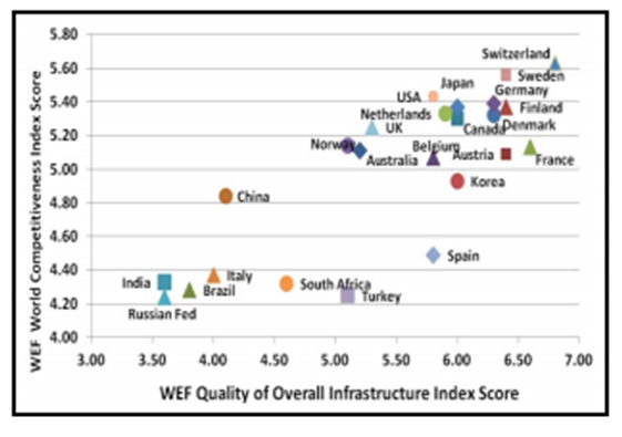
This first chart looks at competitiveness versus quality of infrastructure. As you can see in terms of the OECD we are only just hanging in there and we rank above economic powers such as Brazil, Russia, India, Italy and China. Which is not really much to boast about.
There is nothing revolutionary in this chart since anyone who has ever could a train in Australia can tell you how rooted the infrastructure is. But we do have big roads – there is probably something Freudian in that for politicians.
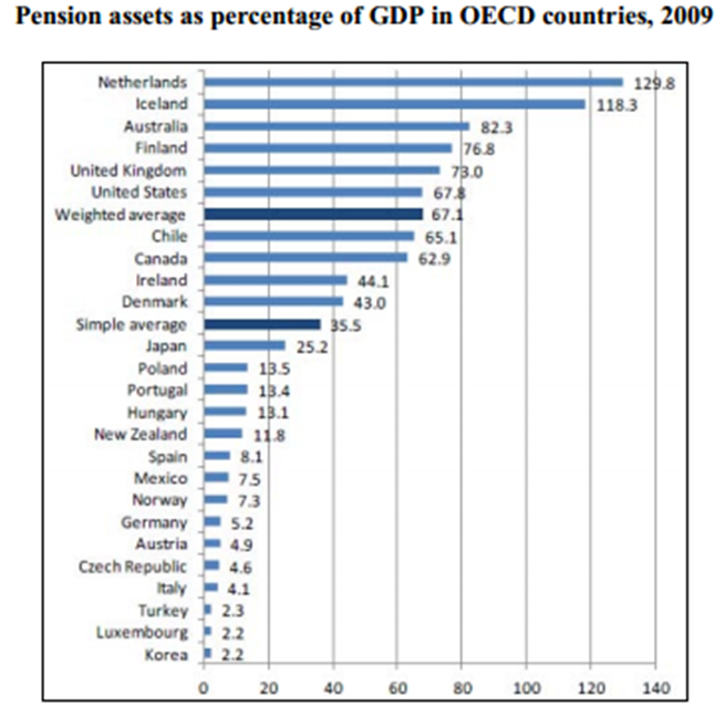
The next chart is interesting in that it looks at the size of pension reserve – in the case of Australia I guess they are including super in the mix to achieve such a whopping big number.
 The suggestion is that part of this coin can be used to fund infrastructure projects. My view on this is one of profound indifference since I don’t think it would be any worse than allow a fund manager to look after it. Who knows a new port or something might actually return more than 3.9% pa.


