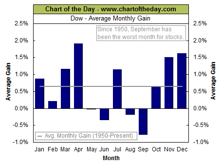
The chart below from the website Chart of the Day has been doing the rounds of late.
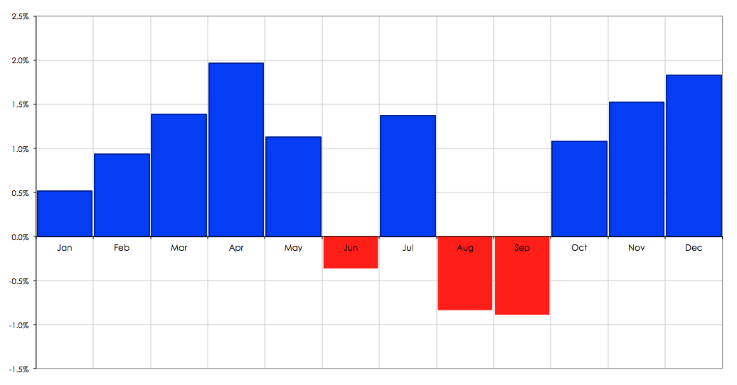
A variation on this chart has also appeared in Bloomberg and has been passed around a variety of news outlets. I am always interested in these sorts of charts and the narrative they are trying to convey. My feeling is that this is the old boogie man narrative, September is bad so you had better watch out. Catchy but not very informative. It is not very informative because like a lot of charts based upon averages it lacks nuance and therefore doesn’t convey a lot of information. The first thing I had to do was to see if I could match their results and get the same broad sweep. Intriguingly, as you can see below I didn’t manage to reproduce their chart completely but the overall picture looks the same.
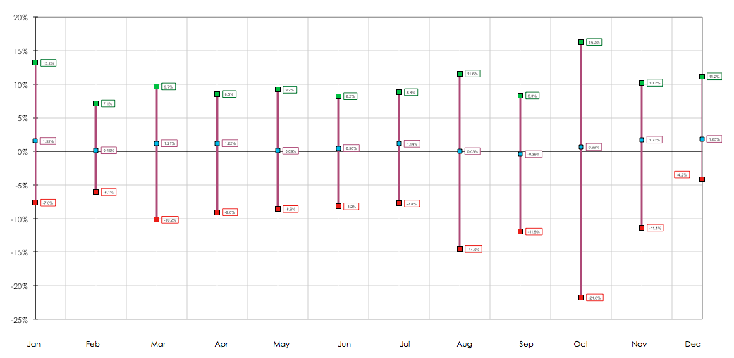
As you can see the end result is the same – September ends up being the worst month. However, remember we are dealing with averages and averages tell us nothing about the range of expected returns that we might encounter each month. Contrary to popular opinion excessive volatility is not a traders friend. I was able to look at the range of returns for each month in the chart below.
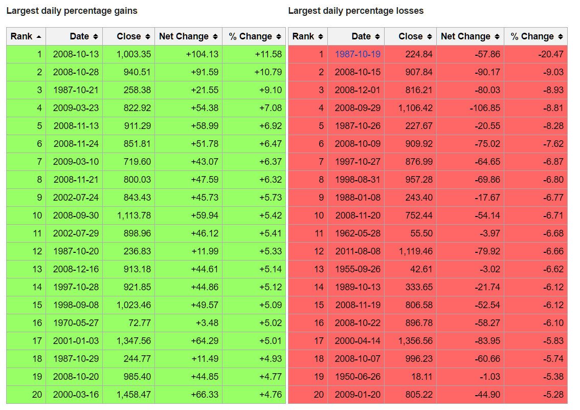
Looking at the volatility in returns tells us a slightly different story, September is quite tame compared to August and October, in fact its range is very similar to every other month. So whilst September might be the worst month in terms of average return it is not the worst month for volatility of returns. To get a sense of why October is afflicted by such a range I was able to find the following table on Wikipedia (it saved me from having to work it out)
October has the distinction of of having the top three percentage gains and the top two percentage losses. If you look closely at the dates you can see that on October 2008 was a particularly interesting time. From my perspective the issue here is that averages give us a somewhat limited view and I have highlighted this problem before. So what to do? That’s quite simple, accept that averages are if you will pardon the pun a somewhat limited way to convey information.


Weinstein, Page 71.
I wonder how those averages differ over the presidential cycle years? Year by year.(Page 69)