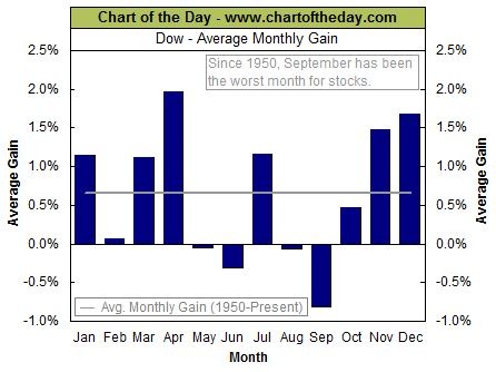
A chart similar to the one below has been doing the rounds lately.
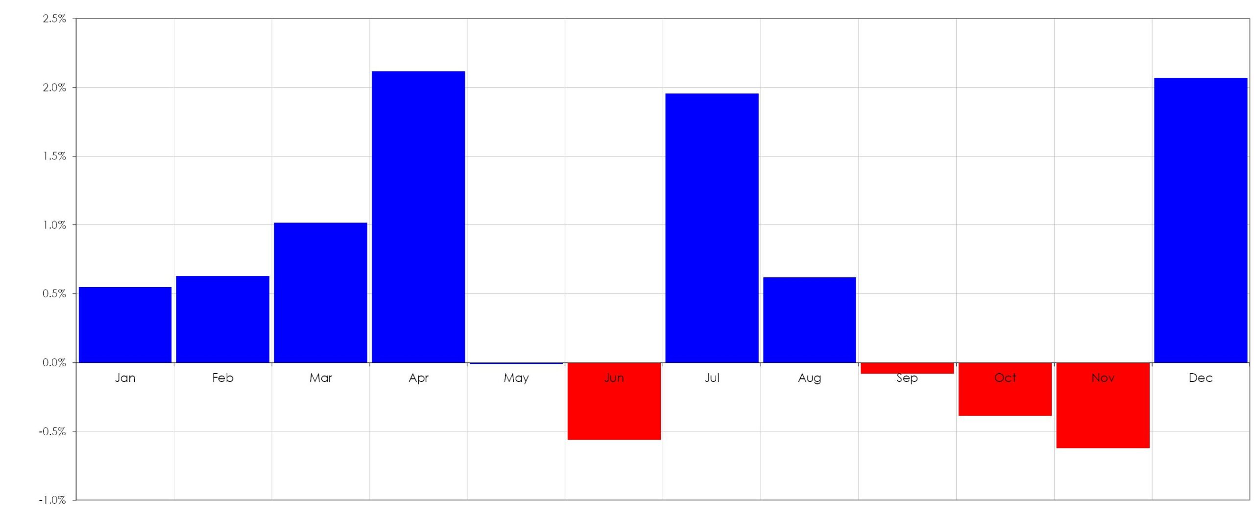
It generally accompanies a chart similar to the one I spoke about here – both are used to bolster the narrative that the world is going to end very shortly. Unfortunately, such arguments are a reflection of trying to find data to fit your narrative rather than observing the data and then generating a narrative around it. Out of curiosity, I thought I would generate an equivalent chart for the All Ordinaries and found the following.
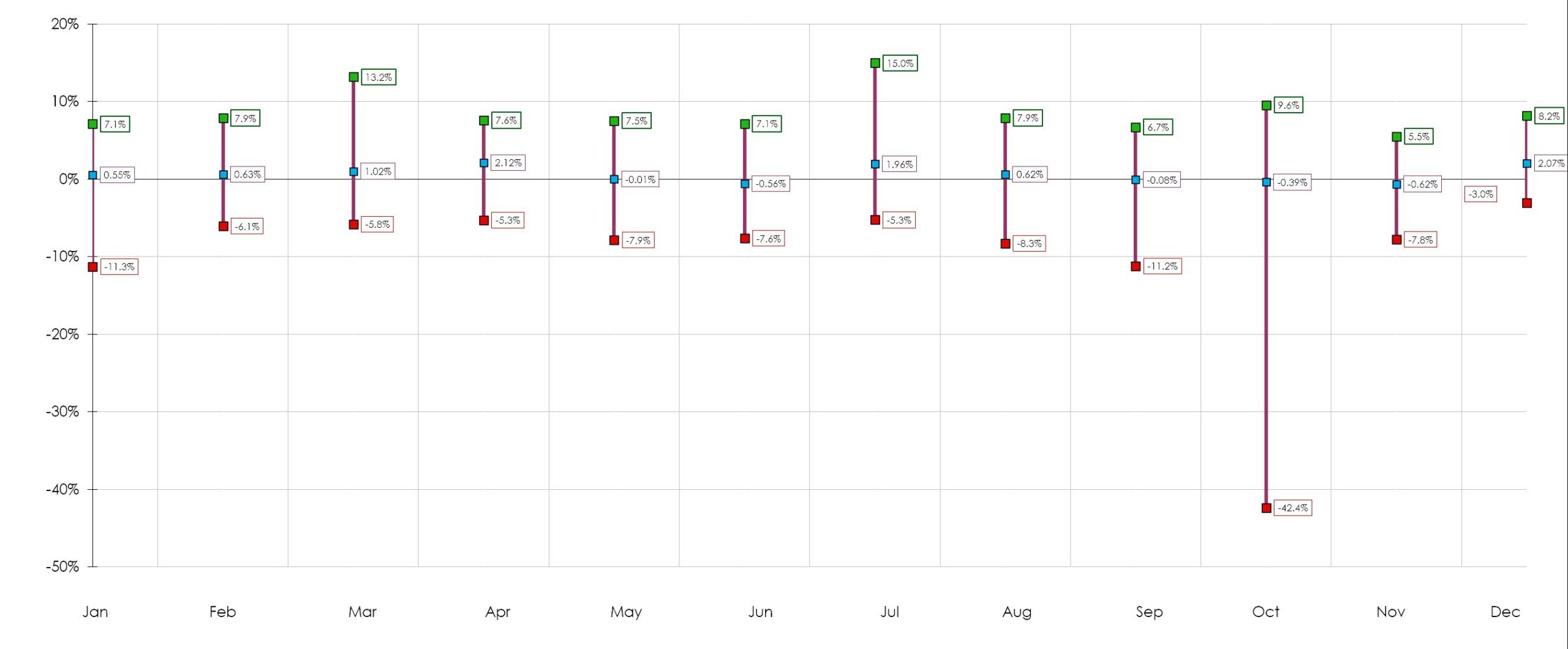
As you can see it has a slightly different rhythm from the chart of the Dow. However, this chart also has an error in that it neglects the range of movements that are possible at any given time. Just as I spoke about how scale matters so do the range of possible outcomes. The range of possible outcomes for each month is shown below.

Examining the range of possible outcomes shows that whilst June and November are our worst months October has the potential to generate wild swings in the value of the index. In trading it is not the unexpected event that wreaks havoc on your account but rather your inability to both envisage and then plan for it.

 I
I


