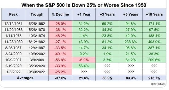
One of the things that has always amazed me about financial markets is the apparent lack of numeracy I see in many of its participants. As an example consider the table below which looks at gains made in the subsequent years by the S&P500 when it has been down 25% or worse in a given period.
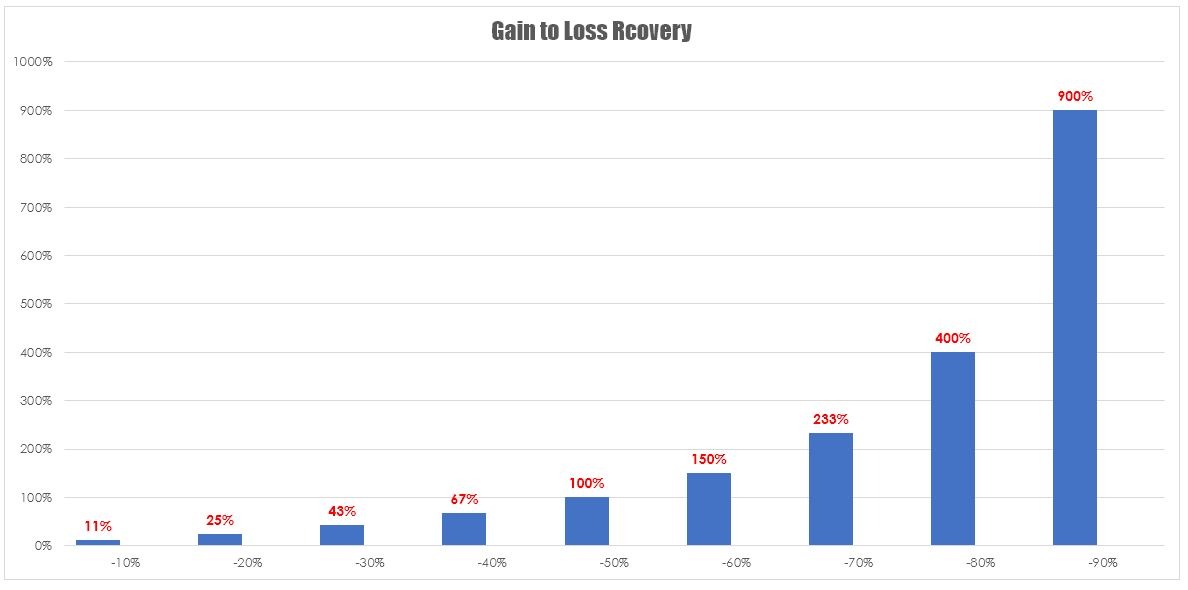
 The implication in such tables is that the market always recovers. That to a degree is true an index will recover over time. This is just a function of their inherent survivor bias. However, the problem with this table is it ignores a very simple fact if you lose 10% in the market you require an 11.1% gain on the remaining balance to get back to where you were. This chart implies that in the majority of cases the market recovered and by implication, your investments had recovered. This table applies only to the index it does not apply to the individual stocks that you may have within a portfolio. Investors unfortunately extrapolate this rather poorly constructed data to mean that their stocks will make these sorts of gains in the following years.
To give you an indication of the gain required to recover from any given loss consider the chart below. I actually consider this to be among one of the most powerful charts that you will ever come across in any form of investing because it brings home the message that you cannot afford to have large losses within your portfolio. Once the losses have gotten away from you your chances of recovering from that loss are very slim.


