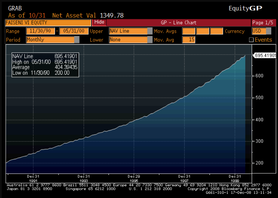
In particular lets talk fake equity curves and by fake I mean either made up (fictitious) or curve fitted ( made up by a machine to look really good) Unfortunately trading abounds with these curves and the internet and particular Facebook is littered with curves that purport to show how someone has managed to turn $10,000 into $5M without drawdown – in fact many claim to have never had a losing trade. An example of this sort of curve can be seen below.
This is the equity curve for Bernie Madoff noted fraudster who carried out one of the most successful and long running scams on Wall Street. You will note that the curve appears to be almost perfectly linear, most of the fake curves I have seen recently are not quite so blatant but they are close. Intriguingly, Madoffs curve set off no alarm bells with anyone. A real equity curve looks like the one below.
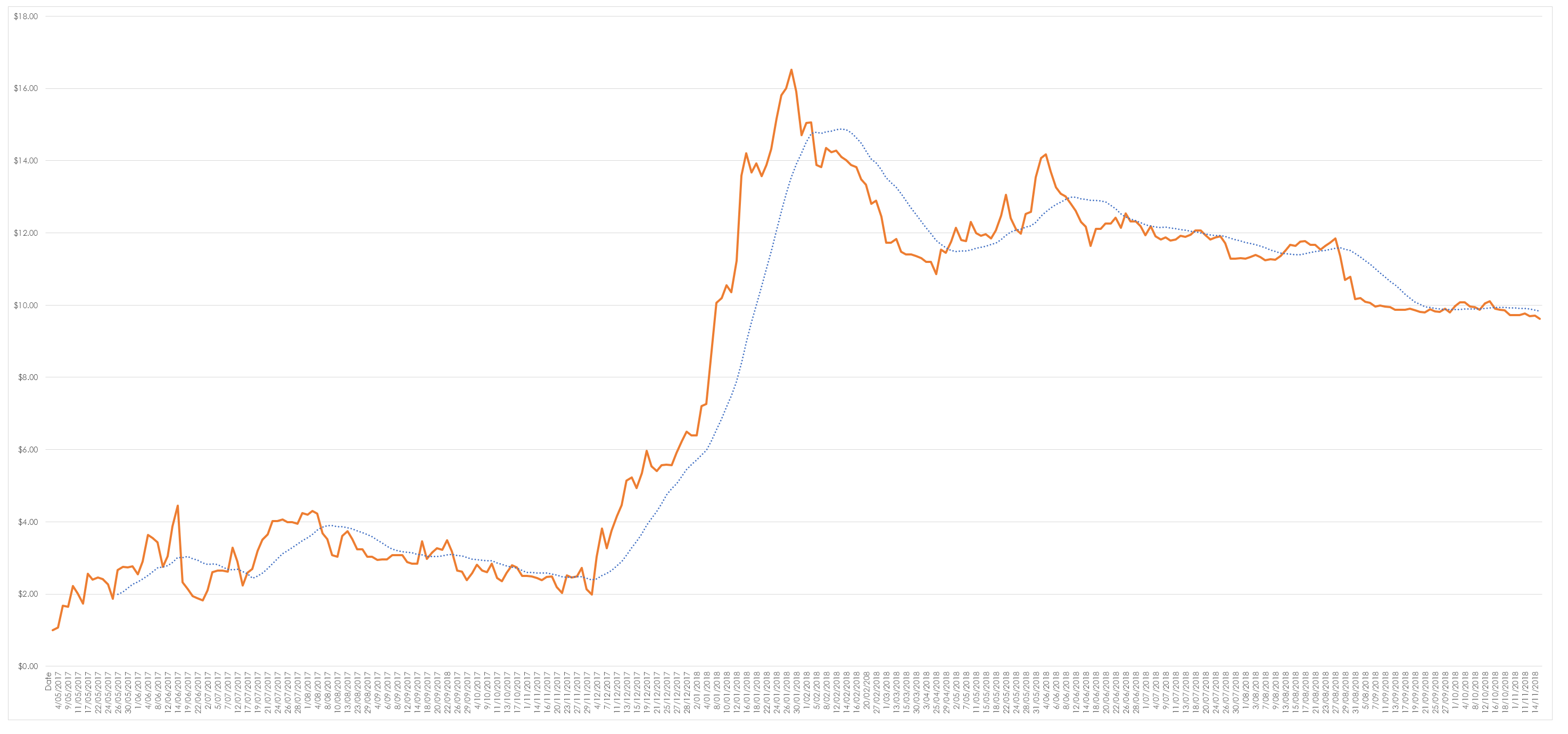
This is the equity curve for my highly geared short term system I have posted this because of its inherent volatility – you will note a few things.
- The start of the curve is a fluke – every other system I have ever encountered starts with a drawdown. This occurs because of the natural phenomena of taking your losses first and letting your profits run. I got lucky pure and simple and because it is luck I have to acknowledge and base no forward decision making on this at all. If you see an equity curve that instantly profitable and the owner of the curve doesn’t acknowledge that they got lucky then the curve is more than likely a fake.
- It is bumpy- it hits an equity peak early on and then moves into drawdown and proceeds to go sideways. I have always found trading at least the way I do it to be best described as punctuated equilibrium. Periods of movement followed by equilibrium. Trading is a business where you spend most of your life trying not to go broke whilst waiting for the next winning trade.
- All the gains come in a short period of time courtesy of a few trades. If a trader doesn’t acknowledge this then they probably have never traded.
- New equity highs are invariably followed by drawdown – this is a simple natural law. Returns display mean regression.
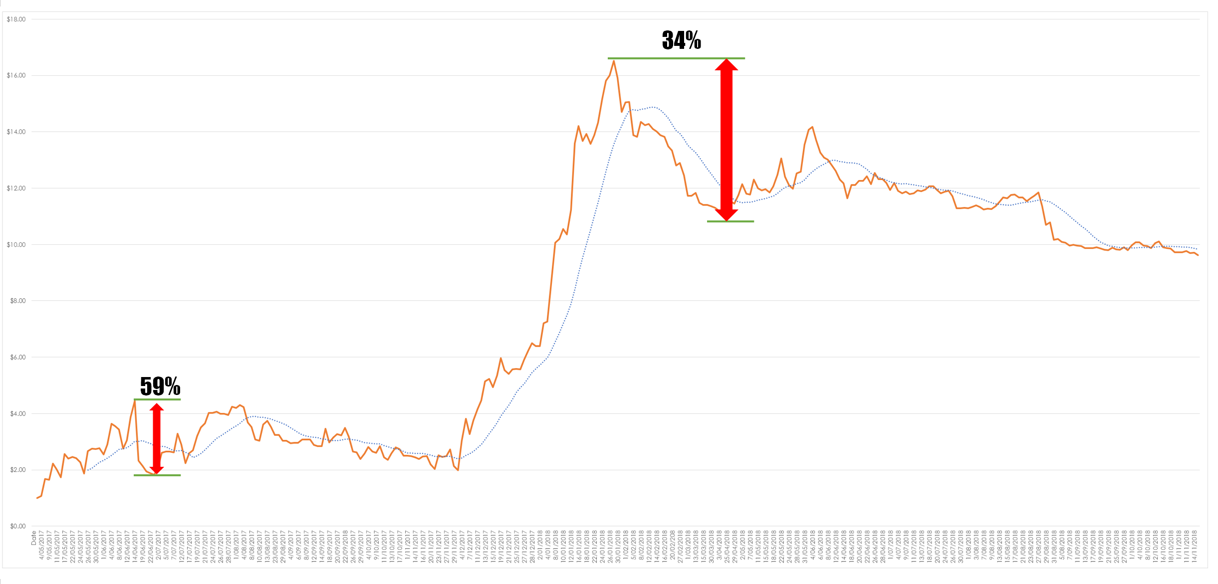
Equity curves should be a refection of the dirty nature of trading – you make money then lose some money and then make some more money. This pattern repeats ad infinitum. Fake equity curves only ever seem to show periods of making money not long periods of going down and sideways. But trading is best described as a profession where you try not to go broke whilst waiting for the next trade. However, equity curves can be a little deceptive. When I show a curve like this to people and ask them to identify the period maximum drawdown they are immediately draw to the fall from the equity high in January. This is natural and incorrect. It is natural because humans are poor at comparing relative and absolute values. Below I have compare this period with the true maximum drawdown.
My maximum drawdown occurs early on in this system – without looking at the data we can be deceived as to what has really occurred. This does raise the question of what is an acceptable drawdown for a system and the unfortunate somewhat weaselly response is that it depends upon what you can tolerate and what you want out of the system. For example the non geared version of this system shows a drawdown of 17% which for many is much more tolerable. However, this system was not designed with drawdown as a limiting factor its design was based upon maximising the dollar return of the system. As such it accepts the relationship between returns, drawdown and volatility as being an unbreakable trinity but it is willing to sacrifice drawdown and volatility on the alter of raw return. This obviously doesn’t suit everyone but if you remove the gearing the drawdown becomes tolerable but the return drops. And this is in part the central issue with the curves I have seen lately, they do not understand this relationship and try to convince people that you can have extraordinary returns without either drawdown or volatility. Sadly many people fall for this either out of ignorance or naivety.
If you see an equity curve that does not have lumps and bumps and which is not a reflection of the basic and often humbling nature of trading then I suggest you run. If you do not run then any consequences that befall you are of your own doing.


Thanks for sharing!
A related question: when do you decide to stop trading a system based on the equity curve?
A 50+ drop is huge and it takes guts and belief in the system to continue. I’d say you need to know your system in detail and if it doesn’t behave as expected something might be wrong and you either trade smaller or stop completely. Agree?
This depends upon what the system was designed to do. If you have designed a low volatility long term trend following system that displays a low volatility in returns yet it is drawing down 35% on a regular basis then there is something wrong with the system.
If it is not behaving as expected then trading smaller will just prolong your agony – smaller position sizes wont make the system behave the only thing that will make the system behave is shutting it down and analysing the results.