With the NASDAQ 100 seemingly off the boil at just over 14,000, it seems as if every market pundit on social media has delved into their bag of magical technical analysis tools to see if they can see the bottom.
I have to admit I find such tools to be a somewhat mixed bag of usefulness and as with the much broader notion of technical analysis the shorter the time frame you are looking out the “less” useful, they seem to be. And all are subservient to trend.
However, it is sometimes useful to look at what extremes in psychology can tell us since effective trading is merely working out who is in charge ad following them. But this does raise the question as to whether the tools you are using are actually symmetrical in that they convey the same fidelity of information on both bullish and bearish sides of the market.
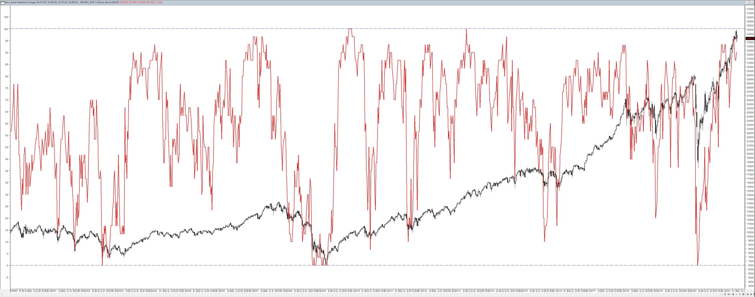
Below is a chart of the Dow and I have overlayed the number of stocks that are above their 200 week moving average.

The percentage of stocks above their 200 week moving average is given by the scale on the left and as you would expect it is bounded by 0% and 100%. Overlaying tools such as these enables you to see instantly whether they are actually telling a useful story about the past – note I didn’t say the future. Despite what vast numbers of technical analysts think the data we see on the screen irrespective of the tool is telling us about the past. And from this, we may divine inferences about possible futures – not likely futures. It is only a possible future because this tool only tells us the number of stocks below a given moving average – it doesn’t tell us how far below they are or whether they will stay below their moving average.
In terms of observations, one point does seem to stand out. Periods of extreme bearishness seem to correlate with the possibility of market lifts such as just after the GFC or after the initial COVID panic. This means we have to somehow reconcile this observation with the knowledge that such tools don’t tell us the depth of despair of traders in terms of how far stocks have fallen rather it just tells us that all stocks within a narrow index are below their 200 week moving average. For this conundrum, I don’t have a perfect answer merely a few possible suggestions.
- A 200 period tool displays long-term trends and as such a reading at or approaching 0% might indicate that the market has been bearish for some time but the index is now only just catching up because of the influence of a precipitant event such as the GFC.
- The Dow is a narrow index as such it is not really a representative sample. But because it is a narrow sample and it is subject to hypervigilance among investors and traders it might be easier to for it to move away from being extremely bearish.
- Eventually, the bottom fishing by institutions at times of crisis will begin to have an impact so any correlation with a tool such as this might simply be a coincidence.
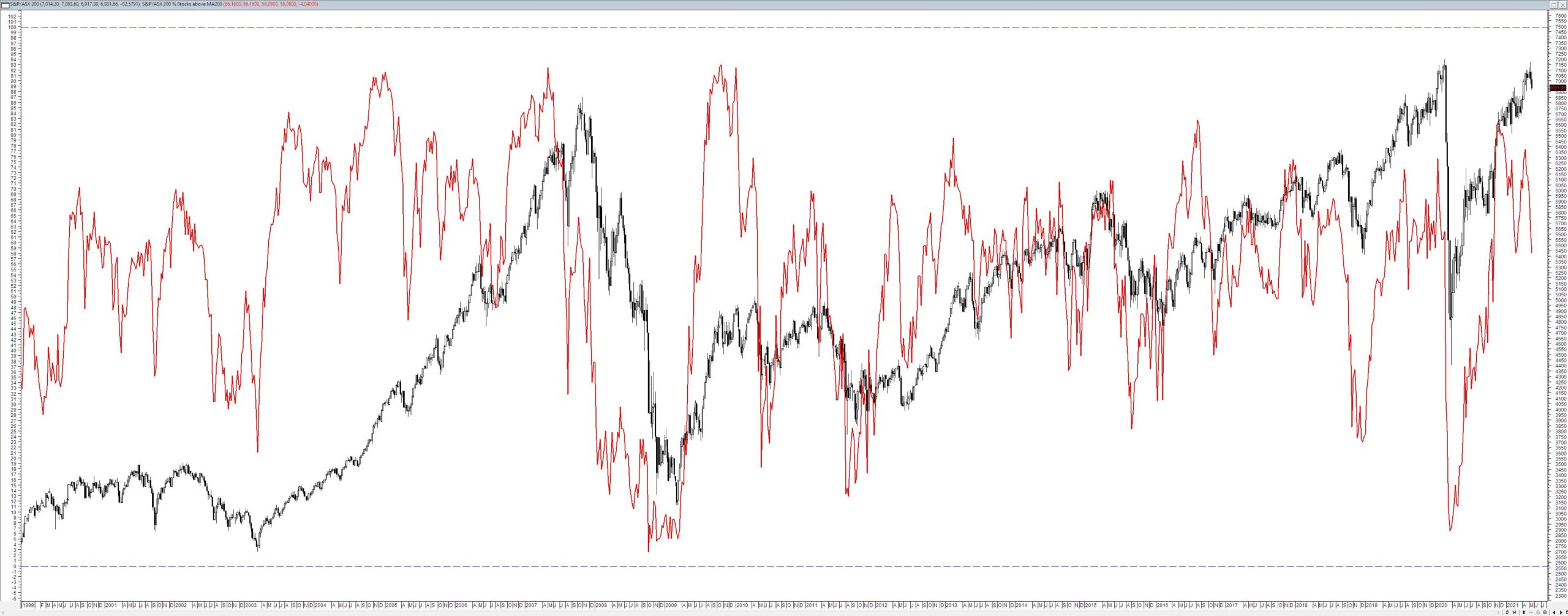
This does raise the question of what the local equivalent looks like. Below is the S&P/ASX200 plotted with the same tool.

One thing is immediately apparent in looking at the local index – the extreme range in values is simply not there when compared to the Dow. The reason for this is that the S&P/ASX200 is a bigger index in terms of the number of stocks it has much more depth and is much more heterogenous in terms of the types of stocks that make up the index. For example, at present, the index has in it CBA which has a market cap of $173,160,680,098 and at the other end of the spectrum is EML with a market cap of $1,107,194,809. These are vastly different companies in not only size but also investor focus. So it is unlikely that within the mix of stocks in the index that they would all be equally affected by any given event.
This raises the question as to whether a tool such as this has any utility in a broader market and I think the answer is that it probably does as a very broad market surveillance tool. It will tell you when the market is approaching an extreme of panic. As to what you do with this information is an individual decision.


