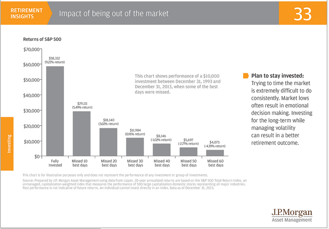
The chart below is currently doing the rounds.
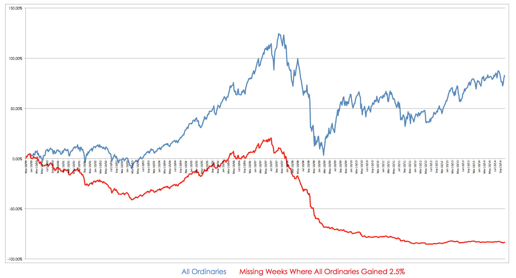
It is from JP Morgans Guide to Retirement and it is being repeated without critical comment over various sites. It offers the standard line of the need to be fully invested in markets all the time because if you are not fully invested then you miss the best days. If you miss the best days your performance is shot. The JP Morgan chart refers to being invested in the S&P 500 so I decided to repeat the exercise using the All Ordinaries and I generated the chart below which looks at missing those weeks where the All Ordinaries went up by 2.5% or more.
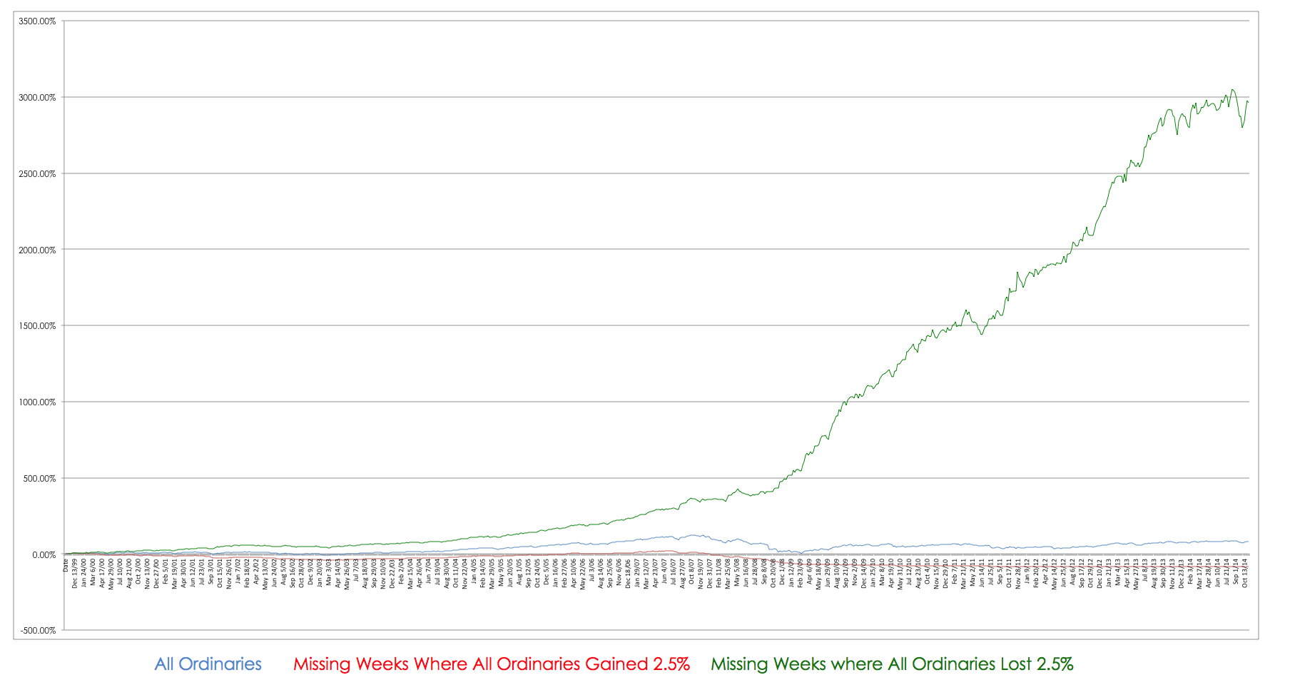
As you can see if I do miss the best times then my performance is rubbish when compared to simply buying and holding the index – so it would seem that JP Morgan are correct. However, there is something missing and that is the troublesome notion of bad times. Markets are symmetrical in that they go up and they go down and it is the going down aspect that is most troublesome for investors both emotionally and financially. If I add in missing the worst periods – that is using some form of filter and risk control then something dramatic happens to this chart.
The chart becomes severely distorted because of the impact of missing the worst times. This distortions occurs for a simple reason, losses have a greater impact upon your portfolio than do gains and this occurs because of a quirk in financial mathematics. A loss of 10% cannot be recouped by a 10% gain, it takes 11.1% to return your point of origin, a 20% loss requires a 25% gain, a 25% loss a 33% gain and so on. The percentage required to recoup a loss accelerates with the size of the loss as can be derived using the following simple formula –
G=L/(1-L)
G= Gain required to recoup loss
L = Loss
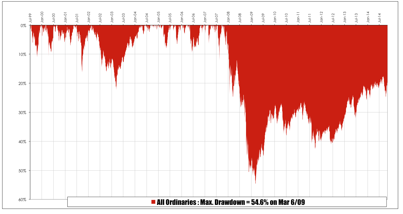
What the chart above demonstrates is that the person who starts with the most money wins and wins easily. However, I said there was also an emotional aspect to markets going down. The chart below is an underwater equity curve of the All Ordinaries – if you had a portfolio that mimicked the index you would have had to tolerate a drawdown of of 54.6%.
A drawdown of this magnitude is troubling in any investors world. In fact depending upon the timing of your entry you may still be in drawdown with little prospect in the short term of your losses being recouped. the unfortunate thing about the JP Morgan chart is that it will be reproduced by every financial planner in the known universe as an excuse to buy whatever under performing piece of shit they are getting paid to flog this week. It is impossible to miss all the bad periods in markets but very simple tools that are quite easy to learn can save investors an enormous amount of heartache and they make a tremendous difference to performance.


Perhaps you could calculate for me the outcome if we gain only 90% of the best of times and lose say 50% of the bad times – to allow for being slow to react in each direction. The result might be a good overall target for the trader.
How would you define best and worst times?