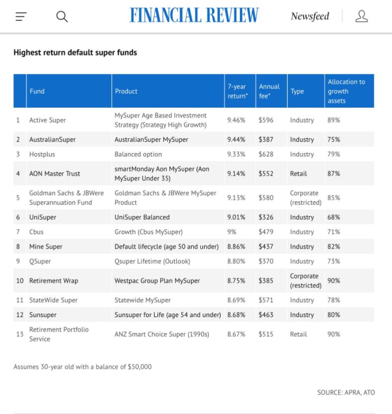
It has been a while since I updated my superannuation fees chart but was prompted yesterday by the following graphic that hit my LinkedIn feed.
 This was followed by the usual round of self-congratulations and back slapping as to how amazing the superannuation industry was. However, the table is lacking context in that it does not indicate what the total return of the market was doing that period, and in investing context is everything. The job of a professional money manager is to generate value over and above what the market can generate. If you cannot do that then you are being paid for effectively doing nothing. And as you would expect during the period under investigation the All Ordinaires Total Return Index generated an average annual return of 10.6%, the narrow ASX/S&P200 Total Return Index returned 9.36%. All funds in the list failed to beat the broad market and only one narrowly beat the ASX/S&P200 by 0.10%.
If we look at longer term the differential widens the Selecting Super site states the following –
Despite the shock of COVID-19, super funds are still averaging almost 7% pa over the past 30 years, which is nearly 5% pa above the long-term inflation rate.
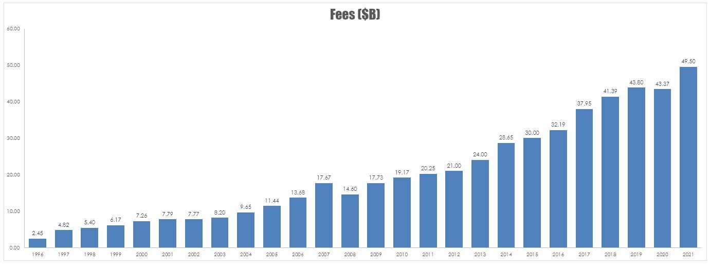
This also lacks context, over the same period the All Ordinaries Total Return Index generated a return of 13%. So the best and the brightest in the superannuation industry is on average only able to deliver to members 53% of the return of the total market. This little walk through the poor performance of funds prompted me to update my super fees chart which looks at a guesstimate of how much the superannuation industry is taking from investors each year for adding zero value.
In the chart below I have assumed that the average fee for investors is 1%pa.

As I have said before – I could be twice as usless for half the money.


