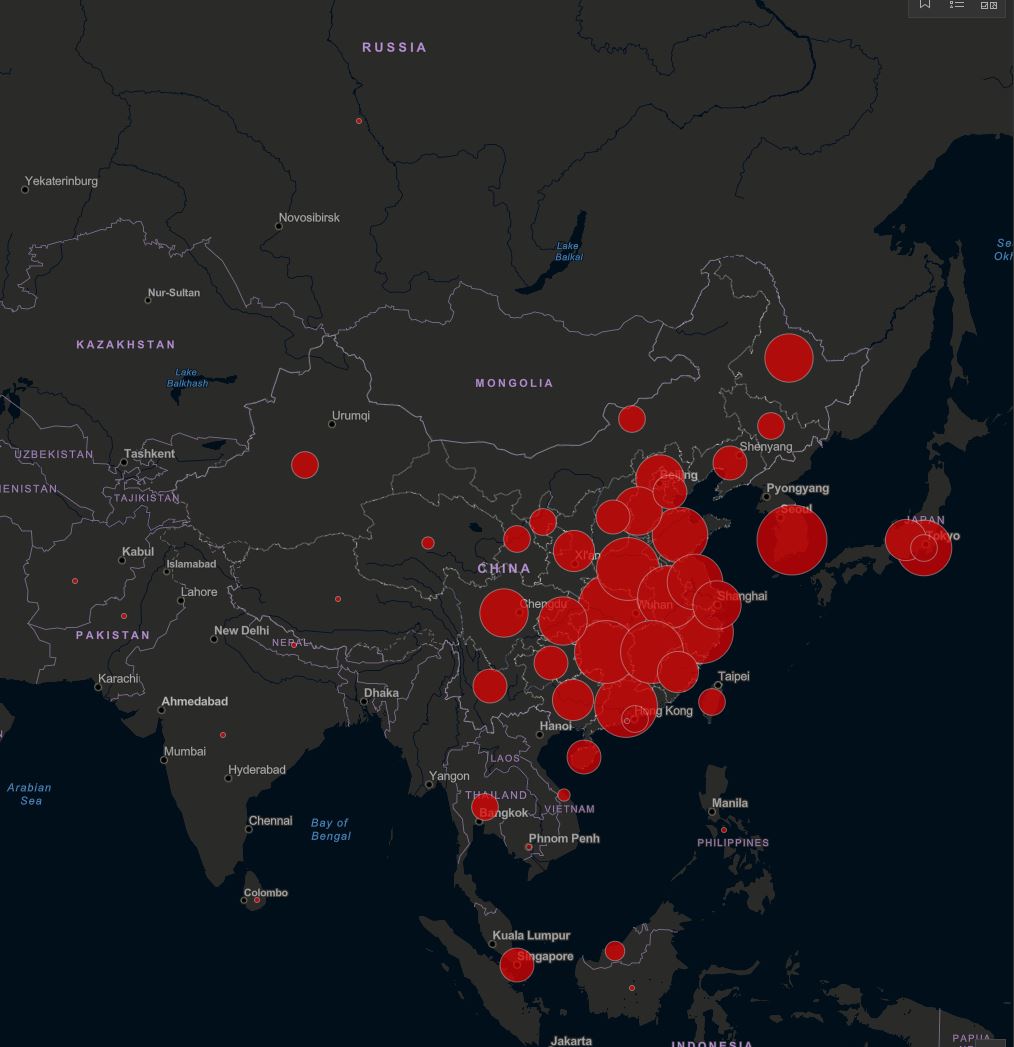
Whenever I see a report on the spread of coronavirus it is generally accompanied by a variation of the graphic below. Giant red circles encompassing massive areas of the globe.
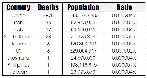
People see this and quite naturally freak out because it appears as if the world is engulfed in a runaway contagion. What is being shown only represents a narrow aspect of reality. I wondered what it would look like if the data were corrected for the number of deaths on a population basis. Unfortunately, the numbers are so small that it doesn’t translate well to a visual because the big red scary dots disappear into oblivion. but it can be shown in a table.
All of a sudden the numbers don’t look so bad. Now someone just has to tell all those stupid bastards who are stocking up on toilet paper that more people won first division Tattslotto in Australia last week than died of coronavirus.


On the money once more LOL
We are very much in wait and see territory. There is likely to be a long game here. Let’s not get too dismissive just yet. The virus hasn’t even hit the huge population in the African countries yet.
Adrian.
I am not so sure that the naysayers will get there way.
A chart of the XAO on a monthly view. This fall is a drop in the bucket compared to 2008/2009. If my stop gets hit then sure the draw down will be larger than my other systems. But honestly I want to miss another 2008/2009. And my stops will see to that. As long as the financial system doesn’t completely disappear.
For me. Same system, 3 accounts. Three time frames. So I still have funds on the table.