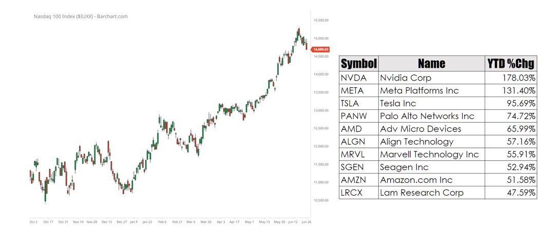
Every now and again graphics like the one below will pop up. They show either the NDX chart year to date, the top 10 stocks in the NDX year to date, or a combination of the day.
Apparently, this is meant to represent some great form of moral hazard that we are being informed about because it has dawned on a few financial journalists that it is quite possible for an index to be driven up by a small cadre of shares. However, despite the gnashing of teeth regarding the performance of a handful of NDX stocks, this is not really the whole story.
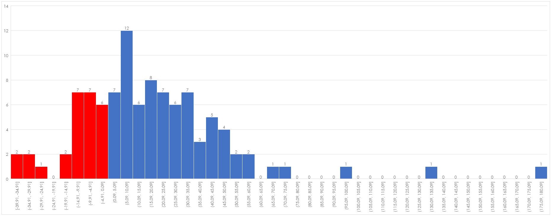
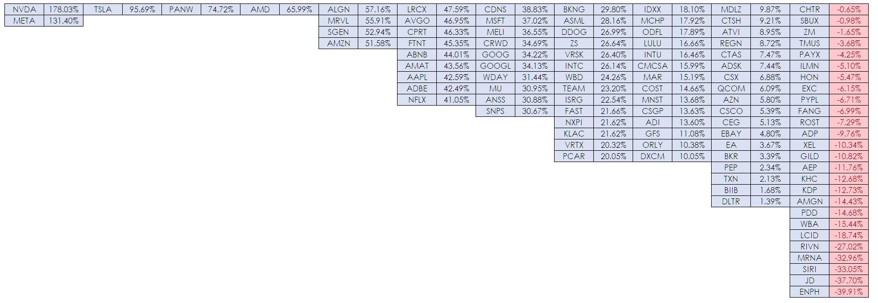
If you map the returns year to date for the entire NDX you find something interesting – 74% of all stocks in the index have a positive performance. If we break that down into a rough and ready distribution you get the following –

Only 26 stocks have had a negative year. And if we break the return down into blocks we get a better sense of how well the majority of shares have done.

Chances are if you had thrown darts at a list of all stocks in the NDX you would have done quite well. In fact, as a final exercise, I did a bit of dart throwing using the random function in Excel and generated the following three random portfolios each with five stocks.

This raises the question as to what is the lesson in this.
I think there are two points. What passes for a financial journalist’s idea of moral panic is simply a complete failure to understand how markets work and most importantly markets matter more than shares.


