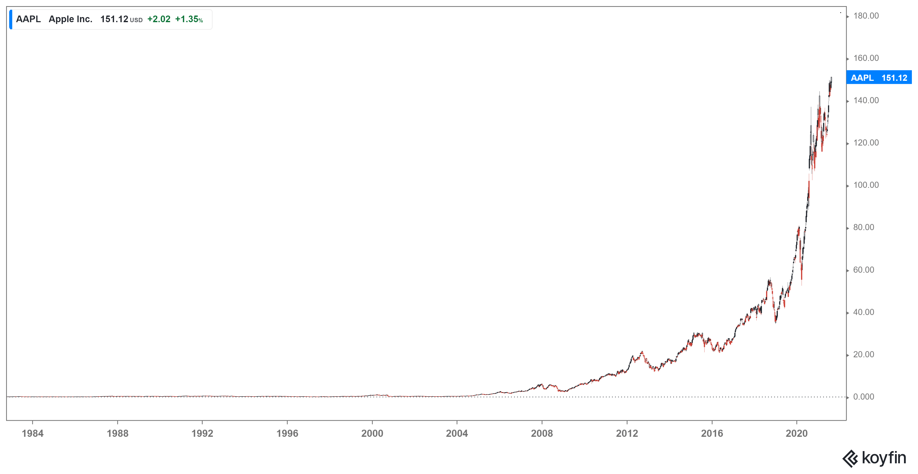
Traders are often caught in a bind – if the stock they own is going down they feel like they have too many. If the stock they own is going up naturally they feel as if they should have bought more. In the latter case, this generally occurs with a liberal dose of hindsight bias – if only I had bought something like APPL in the early days and just kept it. Often in ruminating upon this failure to be able to go back in time and correct a perceived error they point to a chart such as the one below.

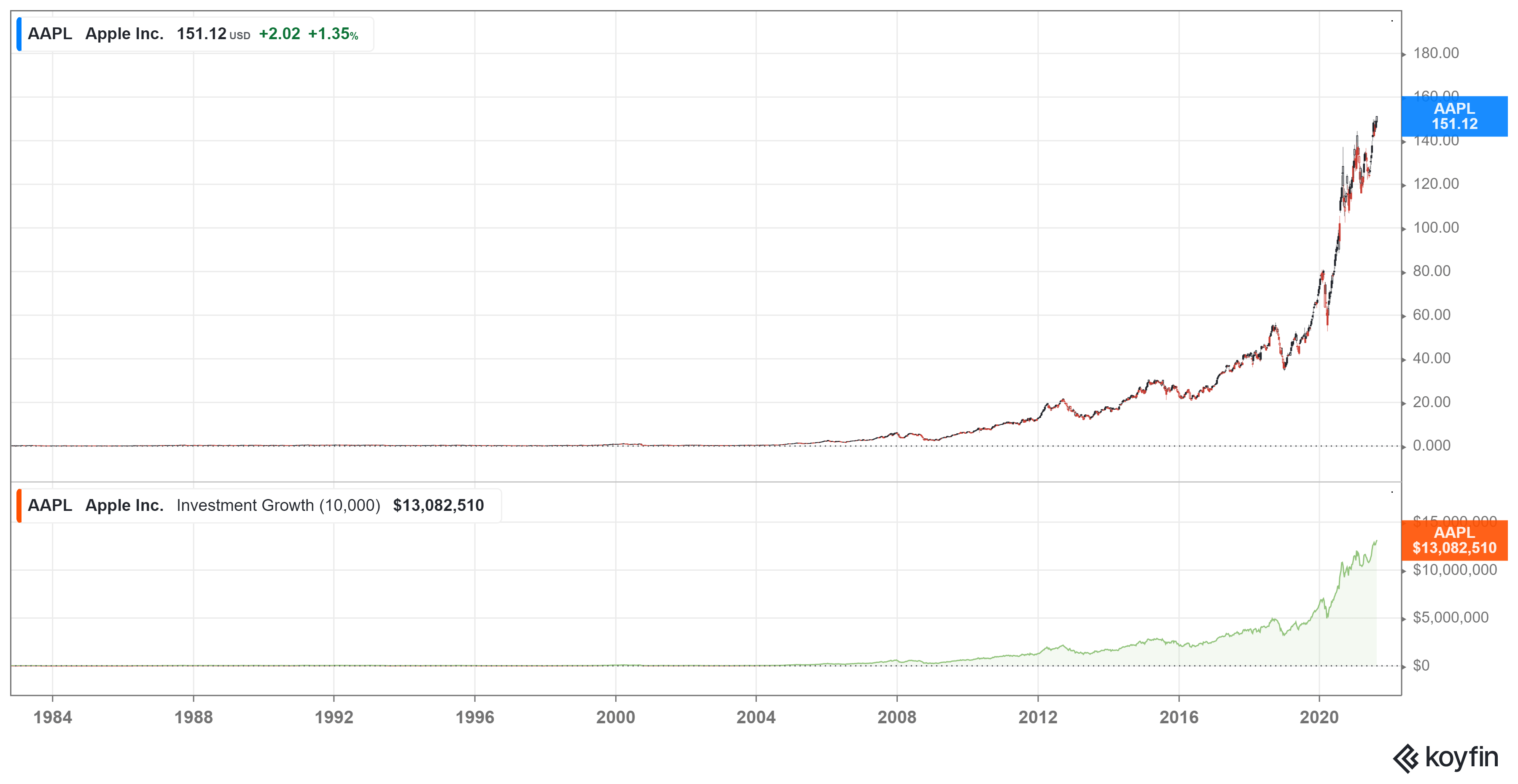
They then further torture themselves by dropping in some hypothetical numbers to get a chart like the one below which shows the value of $10,000 invested in AAPL way back when.
 Obviously turning $10,000 into just over $13M is not to be sneezed at. However, there is a trick in the data that might have shaken the most ardent investors’ confidence.
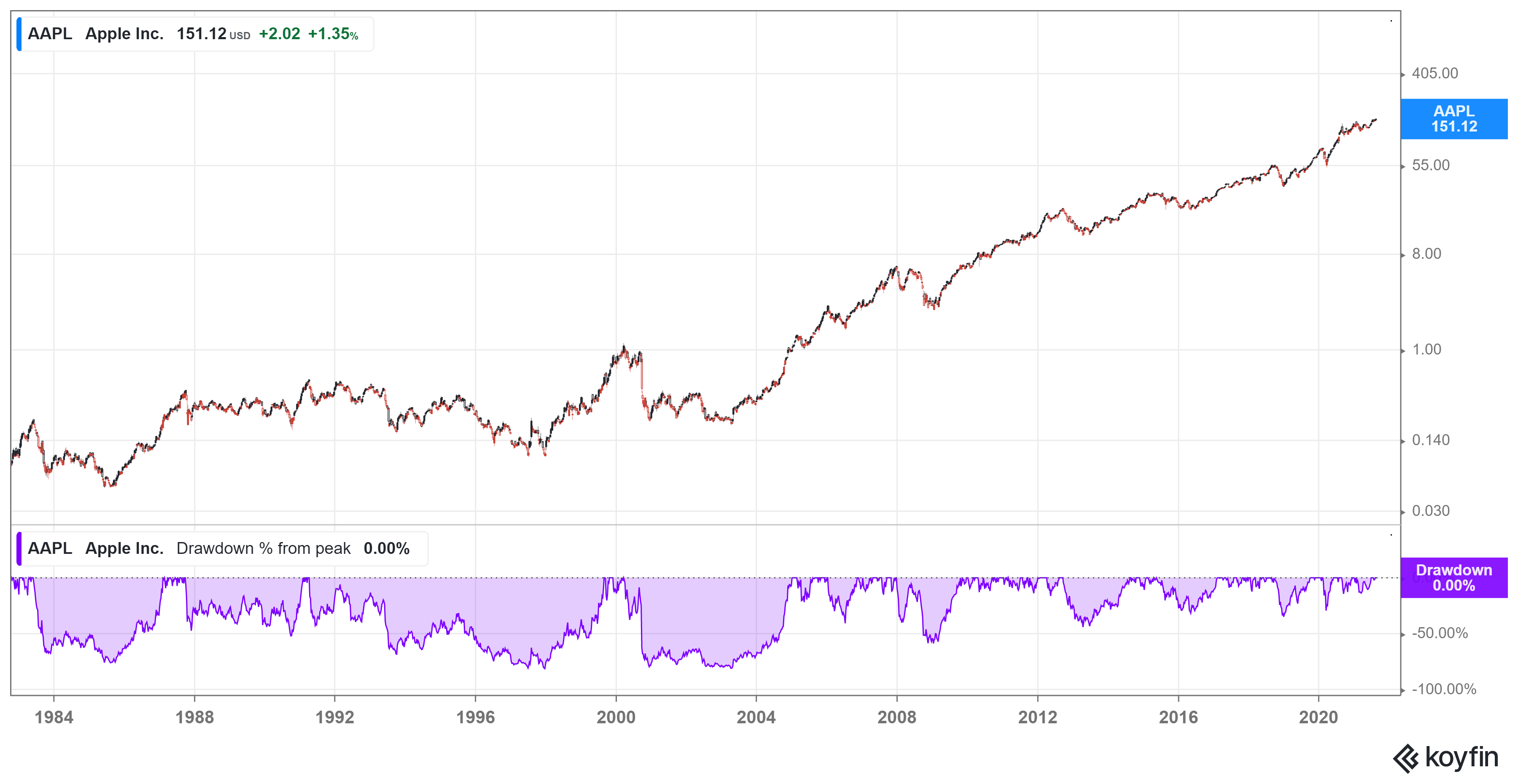
 By changing the scale from linear to log and adding in the drawdowns changes the picture a little bit. To have made it to your $13M payoff you would have had to endure multiple drawdowns in excess of 50% and some hellish periods where the stock collapsed almost 80%. Even the most ardent AAPL sycophant would have found that hard to stomach.


most of the time veneer thin research can make everything look profitable.