I posted this in the Alumni section of our Mentor program forum yesterday and thought I would drop it into the blog for others to see.
———————————————————————————————————————————————————
I have just done the Market wrap segment for Talking Trading and as you would expect part of the focus was on the US and the difficulty tech stocks seems to be experiencing. In preparing for the segment i jotted down a few notes on the NDX and noted something interesting – the world has not ended. In fact the NDX at present is pretty much intact, what we have is a situation where hysteria has trumped reasoned and rationale analysis.
I have generated a few charts to highlight the point.
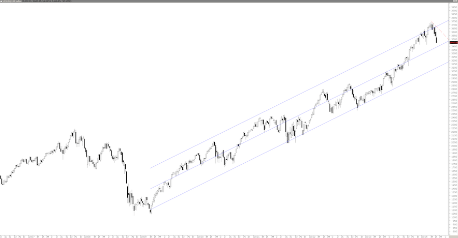
You can see that the long term trend of the NDX is still within a fairly well defined channel.
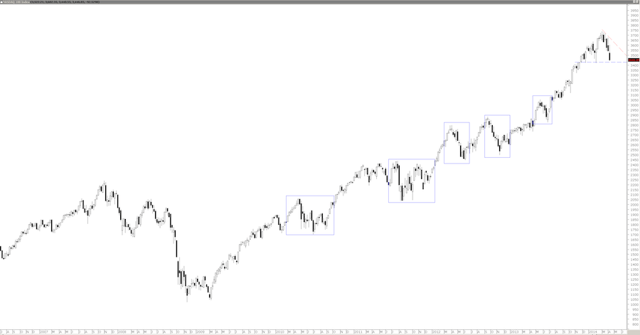
Contrary to popular belief the NDX has had a series of pullbacks since the GFC – the remarkable thing is the three fold rise.
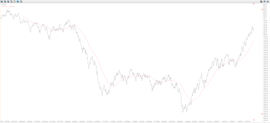
The NDX AD line is also above its 90 week moving average.
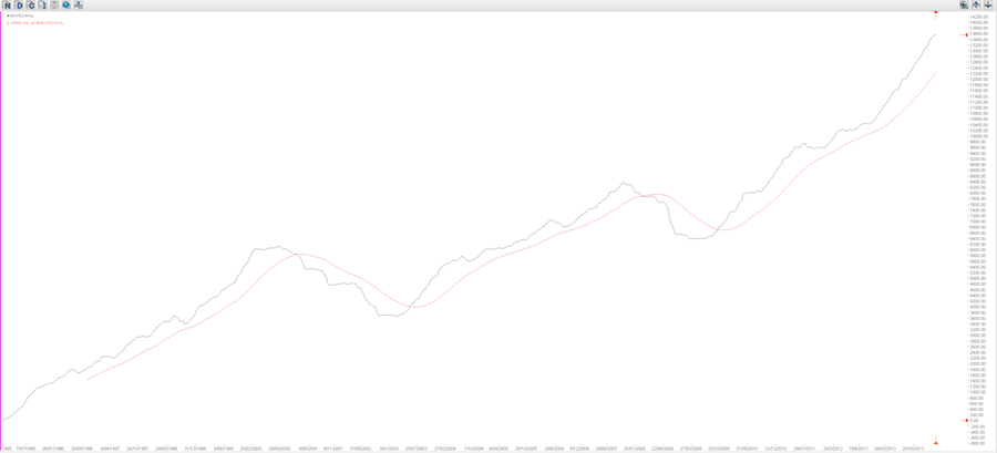
The 52 week Cumulative High-Low is also above its moving average.
The issue here is that we exist in the present – trading is a Zen activity as such there is little place for panicked prognostication. I can understand why the media become jumpy at what seem to be large falls. They see these falls outside of the context that is available to us. The 24 hour news cycle not only means news 24 hours a day but it also means a collective memory of only 24 hours.
None of these charts say that the NDX might not continue its fall over the coming days, weeks or months. That is not their purpose, their own purpose is to provide a little context to what is happening. They also provide a view of the markets true internals – this is what the market is doing. Not the narrative interpretation of what people expect the market to do.


