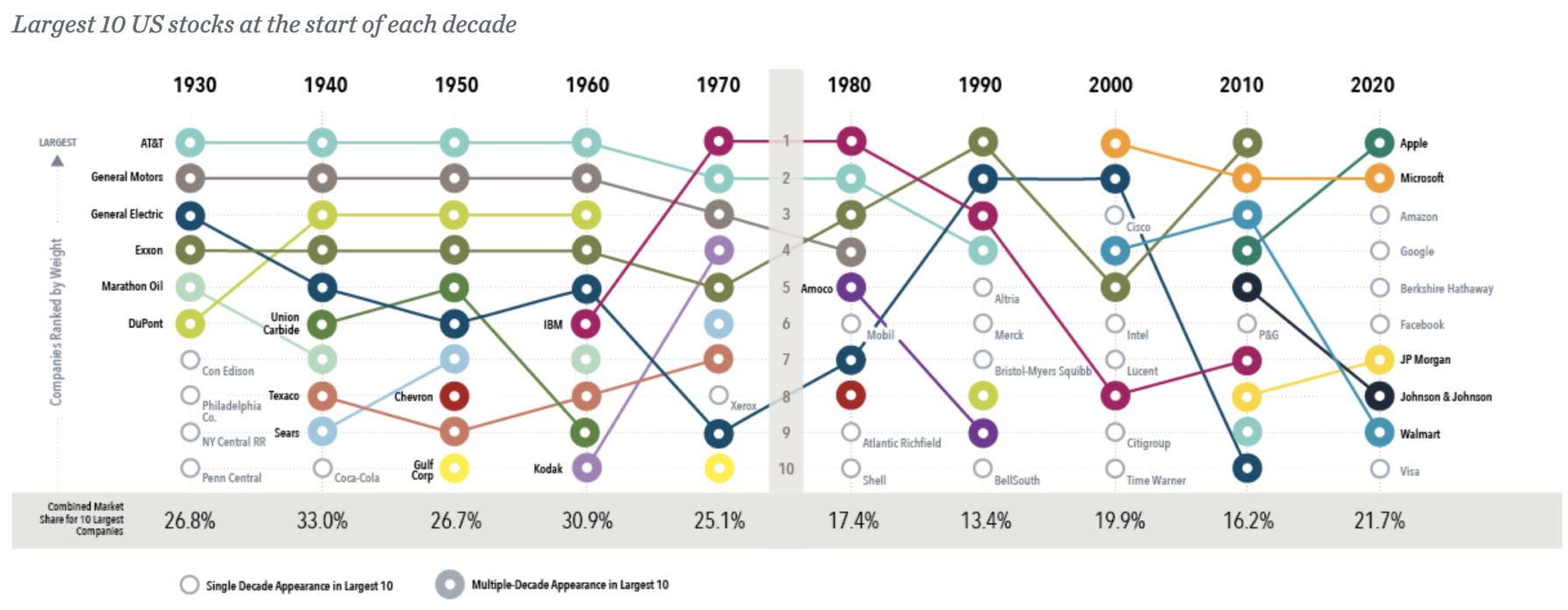
I came across the chart below this morning which looks at the performance of what you would term large or dominant stocks within an index.
What these sorts of charts do is educate you about the history of markets but they also reaffirm that there is nothing new under the sun. As the article that accompanies the chart says large and in charge is nothing new so the concern over the impact of a handful of stocks within a given index is really a problem of a lack of market literacy. Traders are simply too lazy to look back at history to see if it offers any clues as to what is happening at present.
These charts also prompt me to look at current markets in an attempt to compare the relative performance of various related indices. If we are looking at this conversation today then attention is naturally drawn to the technology based stocks and their impact upon markets. The natural candidate for this investigation is the NASDAQ 100.
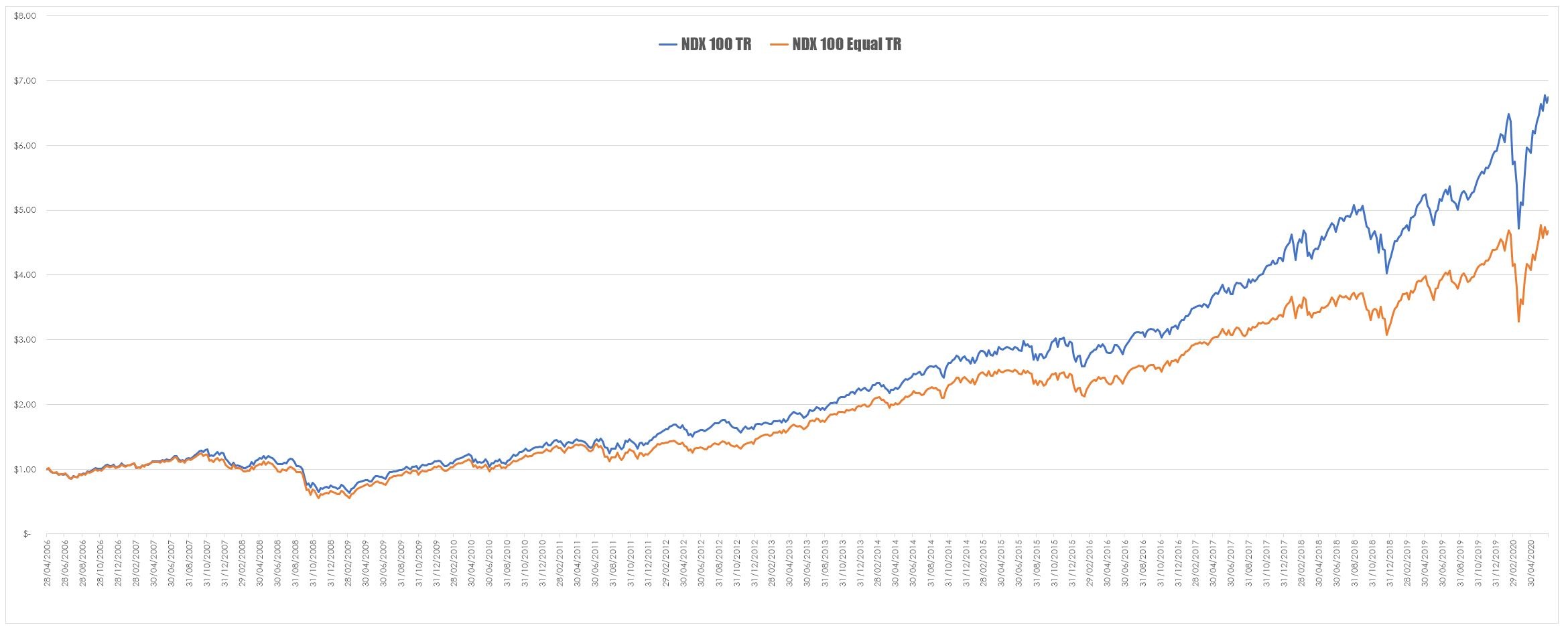
I started out by mapping the relative returns from the NDX 100 TR and the NDX 100 Equally Weighted TR.
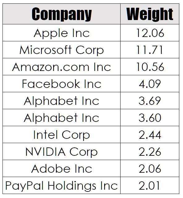
As you can see the standard NDX outperforms its equally weighted cousin by a fair margin. The reason for this is simple – the equally weighted index gives all components a weighting of 1%. The current weightings of the top 10 NDX stocks are as follows.
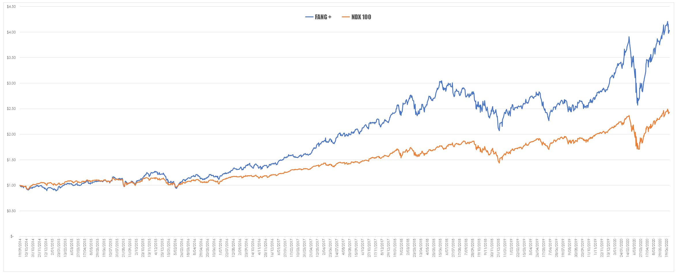
It is easy to account for the underperformance of these stocks when you consider the performance in recent years of stocks such as AAPL – suddenly dropping this weighting within the index down to 1% will have a dramatic impact upon performance. However, I wanted to see if I could get a sense of the outperformance of technology stocks when compared to the standard NDX. I did briefly to with the idea of rebuilding the NDX without these stocks but dismissed that as an annoying difficult task. However, there is a proxy for technology stocks in the FANG + Index. This approach is a bit dirty because it doesn’t do a perfect job since it is known as the FANG+ Index for a reason. The components of the index are shown below.
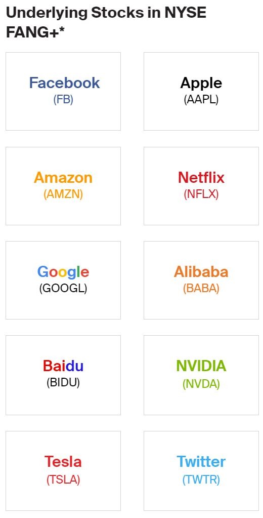
I had to generate the comparison using daily data as the FANG+ Index is a recent creation – I did manage to get some data dating back to 2014 that was the result of modelling but this didn’t really seem to affect the outcome. But it is a caveat to be aware of.
This confirms that of late the heavy lifting in the NDX is a result of a handful of stocks but this has always been the way. Broad indices are by their very nature deceptive because of their construction. Bigger stocks occupy more of an index – bigger stocks tend to get noticed and bought into by investors – thereby making them bigger still and the cycle repeats. This self-perpetuating cycle drives the index higher and the popular perception is that the entire technology sector is rising dramatically when in fact it is being driven by a handful of stocks. The stocks that make up the rest of the index may not be participating in the rally at all.



So would you prefer to buy the index or a dominant stock? – assuming their charts looked similar or if there appeared to be a lot of correlation
It would depend upon the returns correlation between them. Indices have long been driven by dominant stocks – in this case the NDX is really driven by five.