Perspective
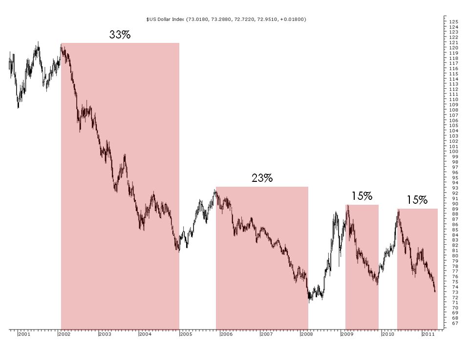
With all the gnashing of teeth regarding the collapse of the USD and the subsequent end of civilisation as we know it should this fall continue I thought I would post a chart of the USD Index. The USD Index measure the performance of the USD versus a basket of currencies.
 On this chart I have noted the major falls in price – as you can see the current slip of 15% is less than half the 2002-2005 decline and price is yet to touch the lows generated by the 2006-2008 decline.
If I taken the chart back to 1985 with the Plaza Accord high then you would have seen a drop of around 52%. So it seems that the people who are getting theirs nuts in a crush over the dollars decline seemed to have missed the past drops in the market.
Just goes to show that market commentators have very short term memories and a lack of perspective about the things they talk about.


Nice analysis Chris. although I’m not sure it’s short memories that market commentators suffer from, but a shortage in intelligence. Night after night they cheer the dollar on like it’s a horse in a race. What they never talk about is the damage our ‘runaway dollar’ is doing to someparts of the economy, or what the hangover will be like when it corrects, which your analysis could be interpreted as being not far away.
I thought the shortage of intelligence was a prerequisite