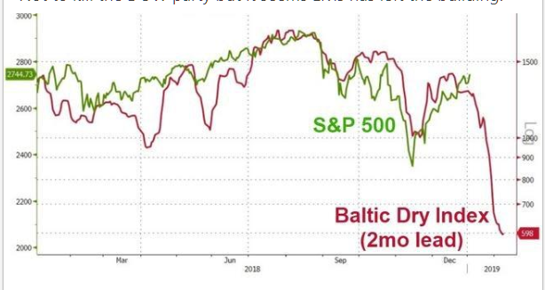
I came across this chart on LinkedIn –
It is a comparison between the Baltic Dry Index and the S&P500. For those who dont know the Baltic Dry Index is a proxy for all dry shipping around the world. Fundamental analysts then somehow contort this is to meaning something about world trade and occasionally you will get someone who overlays it over something else and offers some form of pronouncement. But I have long questioned the relevancy of simply laying prices over one another and drawing some form of conclusion from them. The most egregious example of these tends to be people who overlay say a chart of the Dow in 1929 over the current market and then pronounce that the world is going to end.
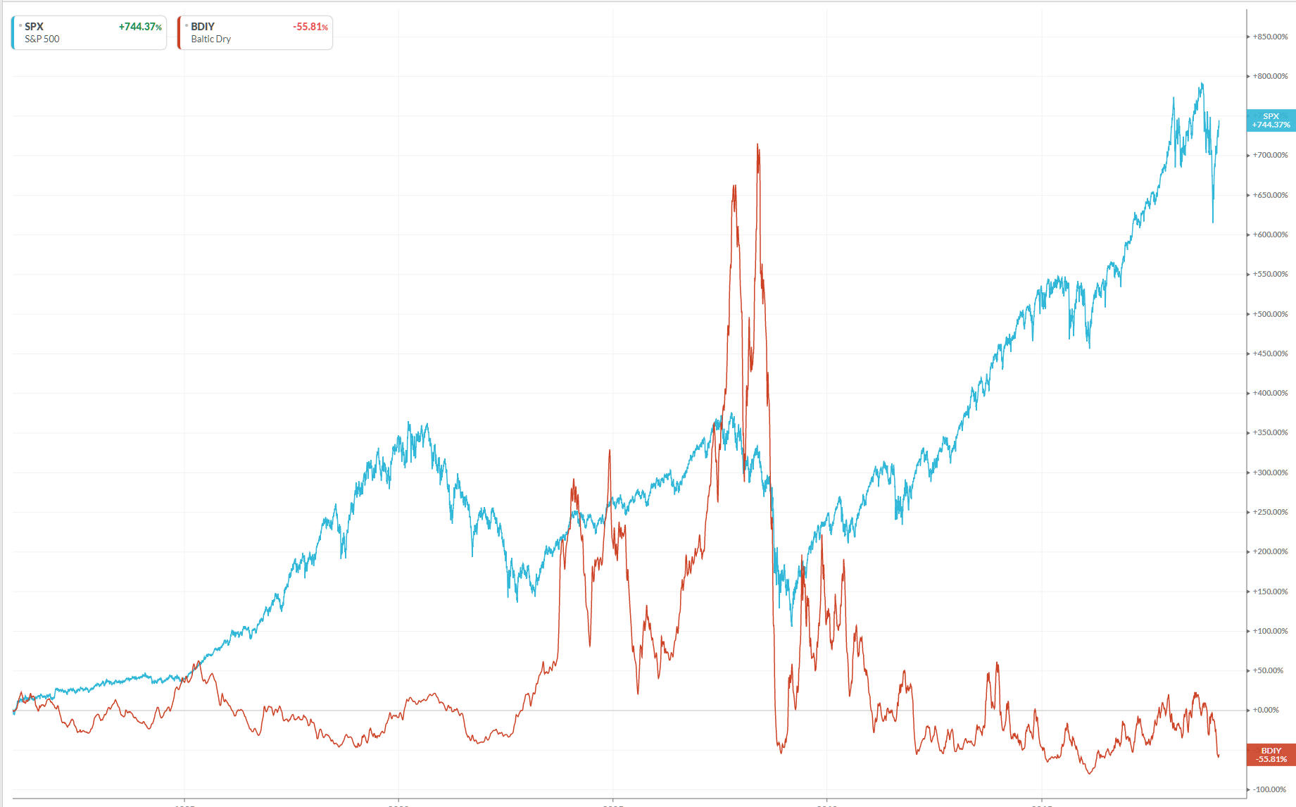
With this in mind I decided to convert the above chart into a performance chart and see if any relationship held.
You can draw your own conclusions as to the relevancy of overlaying simple price measures.


