I was mucking around on the Valuer Generals site the other day searching for historical bits and pieces relating to my property when I noticed that the VG kept historical records on their estimation of the median house price in Melbourne. One of the things I have always found difficult in real estate is not the paperwork, the land rats, tenants, maintenance or the incredibly primitive way that houses are actually sold but rather the paucity of data that surrounds their instrument. Reliable and consistent data seems to be very hard to find and this was an issue I found when I was looking the the VG estimations – I couldn’t get them to tie in with other bits and pieces I found. However, only the VG site had any depth of historical information. Imagine trying to deal in a stock that had half a dozen conflicting prices from different sources, none of which you could actually deal in because prices are largely made up and then trying to find out what the price was five years ago only to get another half a dozen differing prices. It seems as if the real estate market is deliberately set up to be obscure and in some ways reminds me of an embryonic options market where those involved either didn’t understand their market very well or were being deliberately opaque.
Out of curiosity I downloaded the VG’s median house price data just to have a look at the trajectory. Because I am frequently bored I like to look at the history and structure of various markets – too few people are actually students of the markets they operate in. As such they miss out on a large number of free lessons that can short cut their process. No one makes original mistakes in their investing, everyone has made the same mistakes before you and the lessons from these mistakes can often be found in the data. Whilst mucking around with the data I remembered that the ASX often produces a comparison between the returns that are generated by various investment categories. I have always thought that these comparisons had a flaw in that they relied upon simple average returns, looking at averages is fraught with danger because they can be extremely misleading. Which is why managed funds constantly quote them.
As an extreme example consider the following investment scenario. I discover a magic fund with brilliant marketing material and on day one of year one I invest $100,000. In the first year the fund makes a return of 100% and I think I am a genius. In the second year the fund loses 50% and naturally I think the fund manager is an idiot but I am consoled by the fact that the year before I made 100%. When I present this scenario to people I ask them what the average rate of return is for those two years and most people answer correctly – it is 25% (100%-50%/2). I then ask how much have I made on my original $100,000 and I generally get an answer in the ball park of $100,000 x 25%pa. These guesses range from $125,000 to $150,000 as people try and do a compound interest calculation in their head. The truth is I have made zero – in the first year I doubled my money and in the second year I halved my money thereby returning me to my starting point. Yet my average return is 25%. This is why when looking at returns we have to be careful about using a long term average to generate an idea of how much we would have made. It is better to look at each individual piece of return data and assign a dollar value to it. This way you can build some form of equity curves which gives you a lot more information as to the trajectory of the value of your investment.
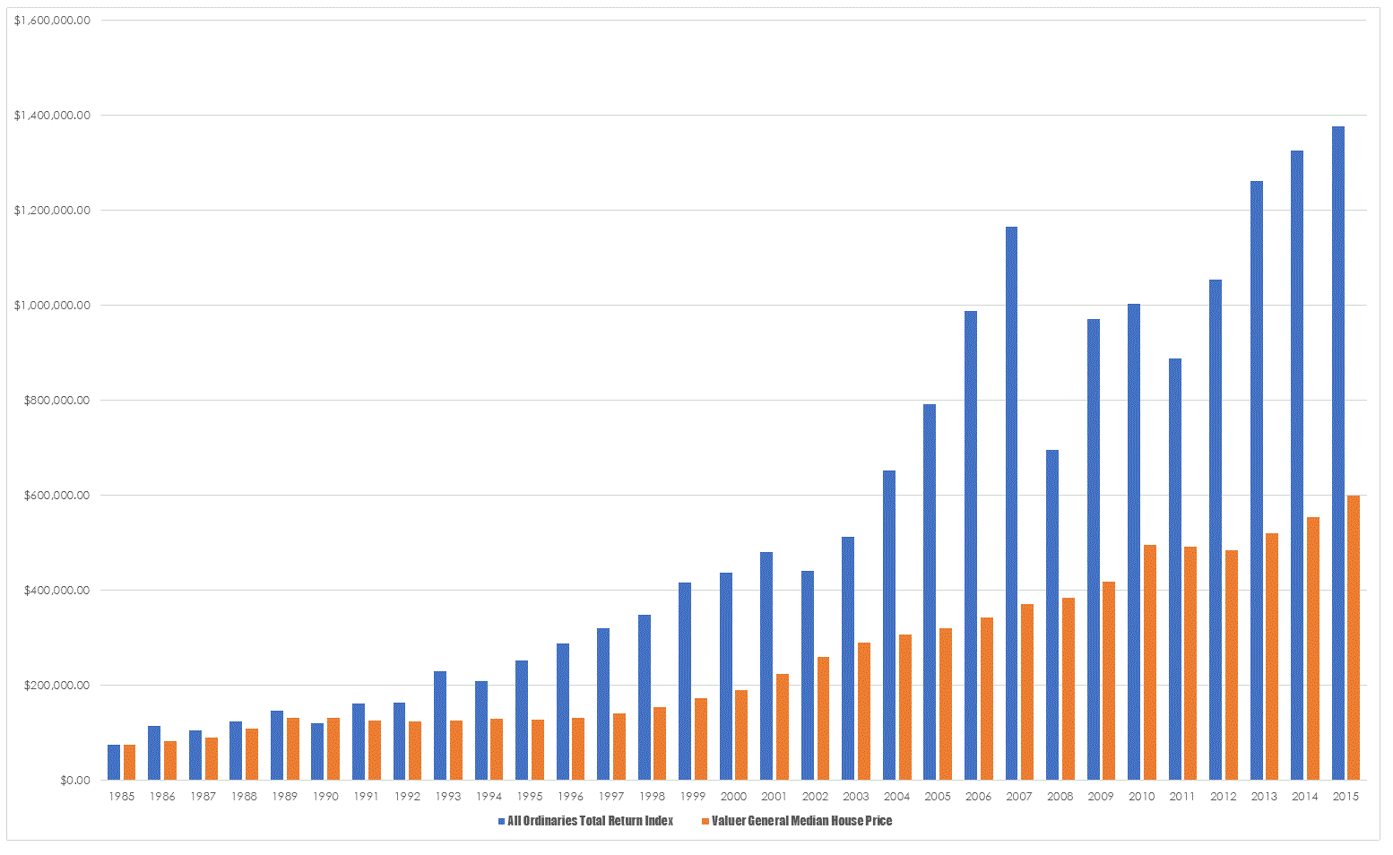
For a bit of fun I decided to take the data from the VG’s site and apply the returns from the All Ordinaries Total Return Index to their initial starting capital of $75,500 and see what the comparison between the two was. In effect I built an equity curve for the median house price and an identical investment into a surrogate ETF.
I have to admit I was a little surprised at the size of the differential because when you hear talk of comparisons between the two investment vehicles the impression you get is that the returns are quite close and that with the runaway bull market in housing that property has been the place to be for long term passive investing. Plotting data like this enables you to get a sense of the trajectory of price and to me two things are immediately apparent. Equities are more volatile in terms of a passive investment and this volatility is apparent in the impact of the GFC. Property moves a little like a truck, slow and steady whereas equities tend to throw themselves around a little. However, the shocks are not as severe as I thought they would be, 1987 is a blip that doesn’t appear and the tech wreck was a mild impediment. What did do the damage was the GFC and this is the problem with a simple buy and hold methodology.
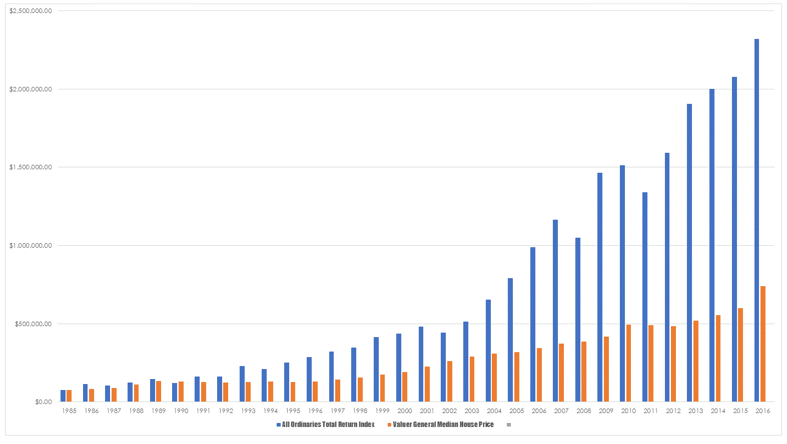
To compensate for this volatility and to give a more real world flavour to our surrogate ETF I dropped the loss from the GFC to 10% from the historical 40.38% which is reflective of what actually happened when our macro filters kicked in and dropped us out of the market. The result of this simple fix is interesting.
The dramatically different result is simply a function of controlling runaway losses and not allowing them to have a detrimental impact upon your equity. Such a technique is not rocket science but it does seem sufficiently difficult that it eludes all professional money managers.
Despite what the data says I am doubtful that it will convince die hard property advocates of anything – people with firm opinions are immune to data and it is hard to break the emotional bond that people have with actually owning something. And that is not really the purpose of the exercise as the advantages of equity investing over property investing are many , manifest and quite easy to elucidate. But is does serve as a salutatory lesson in what the differing mechanisms of presenting returns can tell us. It also tells us in no uncertain terms as to why the worlds second richest individual is a share investor and not a property investor.


This is an interesting post on several levels.I figure that the 30 year CAGR of median house prices in your chart to be a little over 7%.
To me, that puts the current debate about the ‘housing bubble’ in perspective.
The CAGR of stocks in your chart is about 10% over the same period. (first chart). No bubble talk here !!!.
Quite the opposite in fact.
A interesting article – can you please take it one step further to better reflect the investment potential between the two by considering most folk have self financed shares, but use leveraged finance for housing (the mortgage costs should also be allowed for).
Thanks for your work on this info. It reinforces the notion that success in equities is absolutely dependent on controlling losses. Very simple to understand but it engenders a lot of strange investor psychological reactions. I believe you have written about a few of these.
By the way I wonder how real estate prices would fare if negative gearing disappeared.
Hello Chris,
Good to be reading your stuff again.
The All Ordinaries Total Return Index includes all cash dividends reinvested.
Should the comparison be then with median house prices with rentals reinvested?
Alternatively, compare the All Ordinaries index with median house prices, where neither has dividends/rentals reinvested.
In this scenario, using the raw All Ordinaries, the 75K would have appreciated to only 620K, similar to the housing appreciation.
You can only invest in the vehicles that are available to us and the comparison looks at available vehicles. You cant invest in a price only instrument.
My guess is that even comparing investment property with leveraged index investment would still show the index winning simply by virtue of the much lower start up costs. An investment property will set you back anywhere between 10% and 15% of the total value as a start up cost. A leveraged index fund would cost less than 1%. And once you add in things such as maintenance, insurance and the like you are left a fair way behind.