Realism in returns
Recently there has been a discussion on our mentor forum regarding trading for income versus trading for capital growth. I have been party to many such discussions over the years and one thing that tends to be common in all of them is the notion that returns are linear. For example if a CAGR of 20% is quoted the assumption is that every year you make 20% without fail – not that some years you might make more and some years you might make less and that over time the average return is 20%. The assumption is that every year you make 20%.
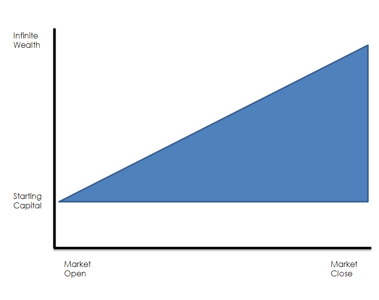
This notion of linearity is best exemplified by the following hypothetical equity curve. I have exaggerated somewhat in suggesting that new traders want to be infinitely wealthy at the end of their first trading day but I have had letters from people complaining that they had placed a few trades and still were not as rich as Bill Gates.
However, in many ways it is not the fault of new investors since most shonks in the industry only quote an average return – you won’t see an equity curve or returns broken down by period and there is simply no way they will show you an underwater equity curve. To consider how this intellectual dishonesty works imagine the wild statement that system X returns a guaranteed 25% per annum. When people see this sort of figure they instantly go moist in their unmentionables because they do a quick mental calculation of how much they will make after a few years. Consider how this return might be achieved.
Imagine I am your archetypal FX/Options/Internet Marketing shonk/guru/bullshit artist and I see that my hypothetical trading returned 100% in the first year but then only had a loss of 50% in the second year. I trumpet the fact that I made 100% in the first year, then mumble something about having a losing year the second year because of market conditions but my average return is still 25% per annum.
The true question is how much money has actually been made and by applying a simple sum to each return we can see. Say in year one I invest $10,000 a 100% return makes this into $20,000 and in the second year I lose 50% which means my $20,000 becomes $10,000. Despite being promised an average annual return of 25%, I have made no money. The interesting thing is that this tactic is also used by large superannuation and mutual funds to hide their appalling real returns.
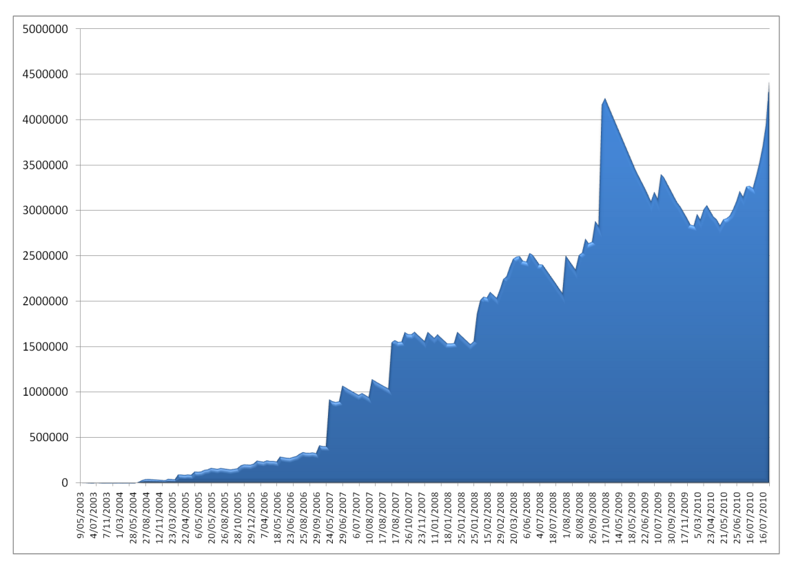
The issue here is two-fold. Firstly, realism – people need to be realistic in the returns they are initially seeking or that they think they might achieve. The good thing about markets is that they do not put an upper limit on how much you can earn. There is no ceiling. Secondly, when being told about returns you need to be able to see an equity curve so that you can look at how the returns using real money are accumulated. The chart below is of a real equity – you will notice it is not linear like my over exaggerated example – it is lumpy. In some years you make no money and in some years you go backwards. Welcome to the reality of running a business.
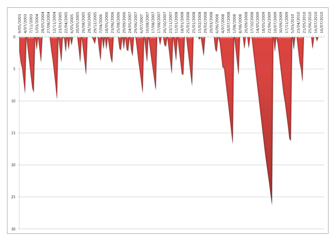
This chart is more telling it is the underwater equity for this system – it shows you in graphic detail the losing periods the system runs into and how long they last for. Underwater equity curves are a must for all system examination.
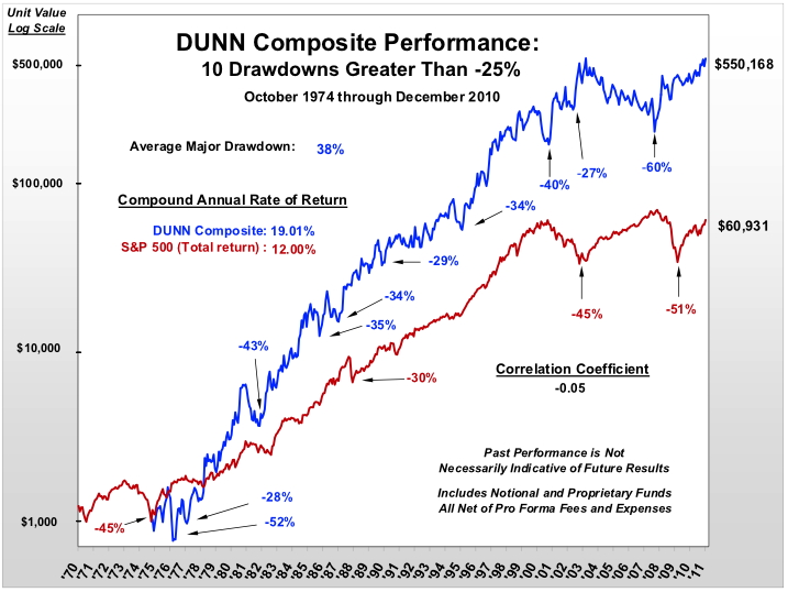
 Finally a dose of extreme realism. This is the equity curve for Bill Dunn a somewhat legendary commodity trader. I have chosen this curve simply because of its longevity and the highlighting of his drawdowns over his trading career.


