I offer the following three charts without comment other than to label them. You can assemble your own narrative as to what they might mean for trading in general and for your apprach specifically.
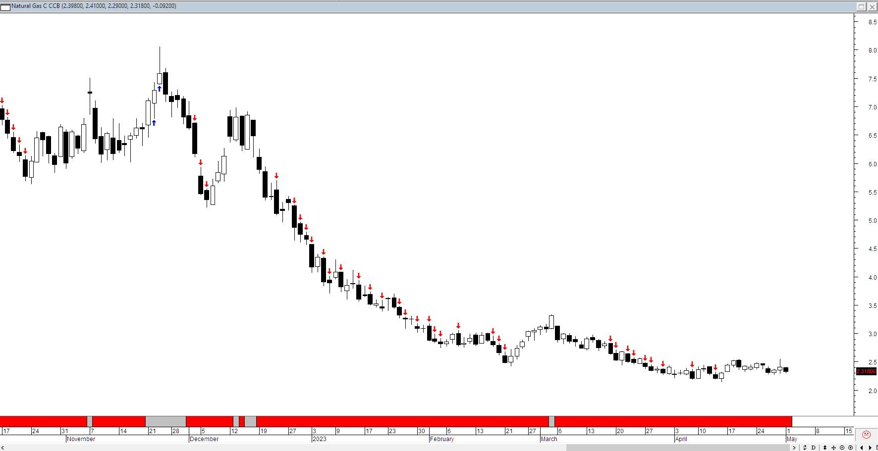
Natural Gas with a simple breakout – guess the trend.

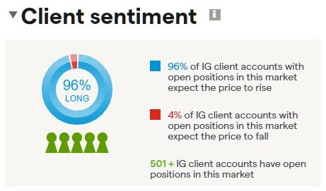
IG’s client sentiment indicator – guess what the majority of clients think the trend is.

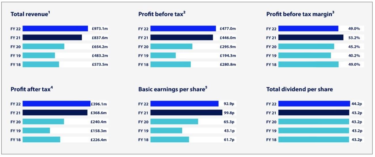
This is a snippet from IG’s annual report from last year – considering the two images above why is it you think IG is so profitable?


