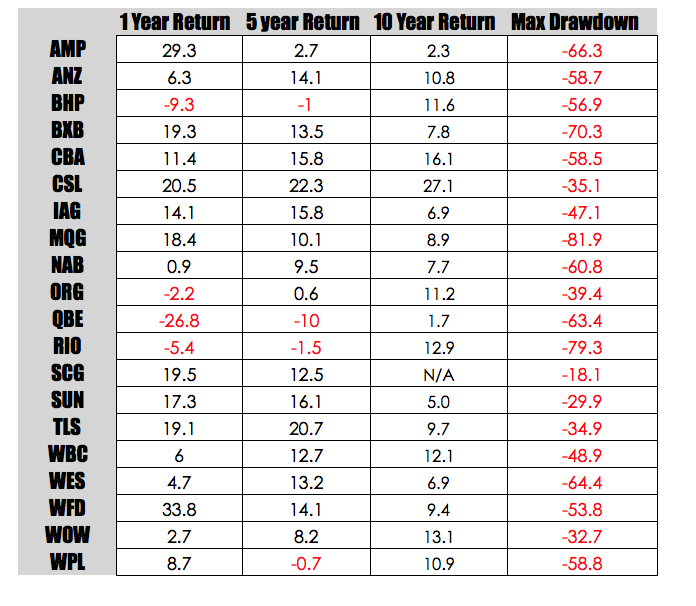
With nothing to do on a Sunday afternoon I thought I would have a bit of a play with excel and look at the returns for ASX Top 20 shares. I have split the returns into 1 year, 5 year and 10 years. I have also looked at the maximum drawdown that occurred during that 10 year period.
Returns are intriguing little metrics and there are a few things that are quite obvious.
1. Starting date is important – this is why people when quoting their returns will try to generate a start date that is favourable to them. This is why it is so hard to find long term data on fund managers – longer term data tends to blunt the lift given by preferentially selecting a favourable start date.
2. Persistence is interesting – good returns tend to persist and so do poor returns. This to me is further evidence that you keep shares that are performing and dump those that are not. Unfortunately, most professional money managers have this backwards.
3. The longer term return is probably the closest to the real return – this is simple mean reversion in action.
4. Drawdowns kill – as you would expect from this sort of data the period immediately post the GFC sucked for equities. Whilst some might opt for a buy and hold approach I doubt many could stomach drawdowns in excess of 60% which occurred with a few shares.
5. The performance of the overall market during this period has been very poor with the All Ords struggling to generate 10 annualised growth in excess of 3.4%. It would seem that if you were a fund manager than the best play in the past 5 years would have simply to hunted in the top 20 and leave the rest of the market alone.
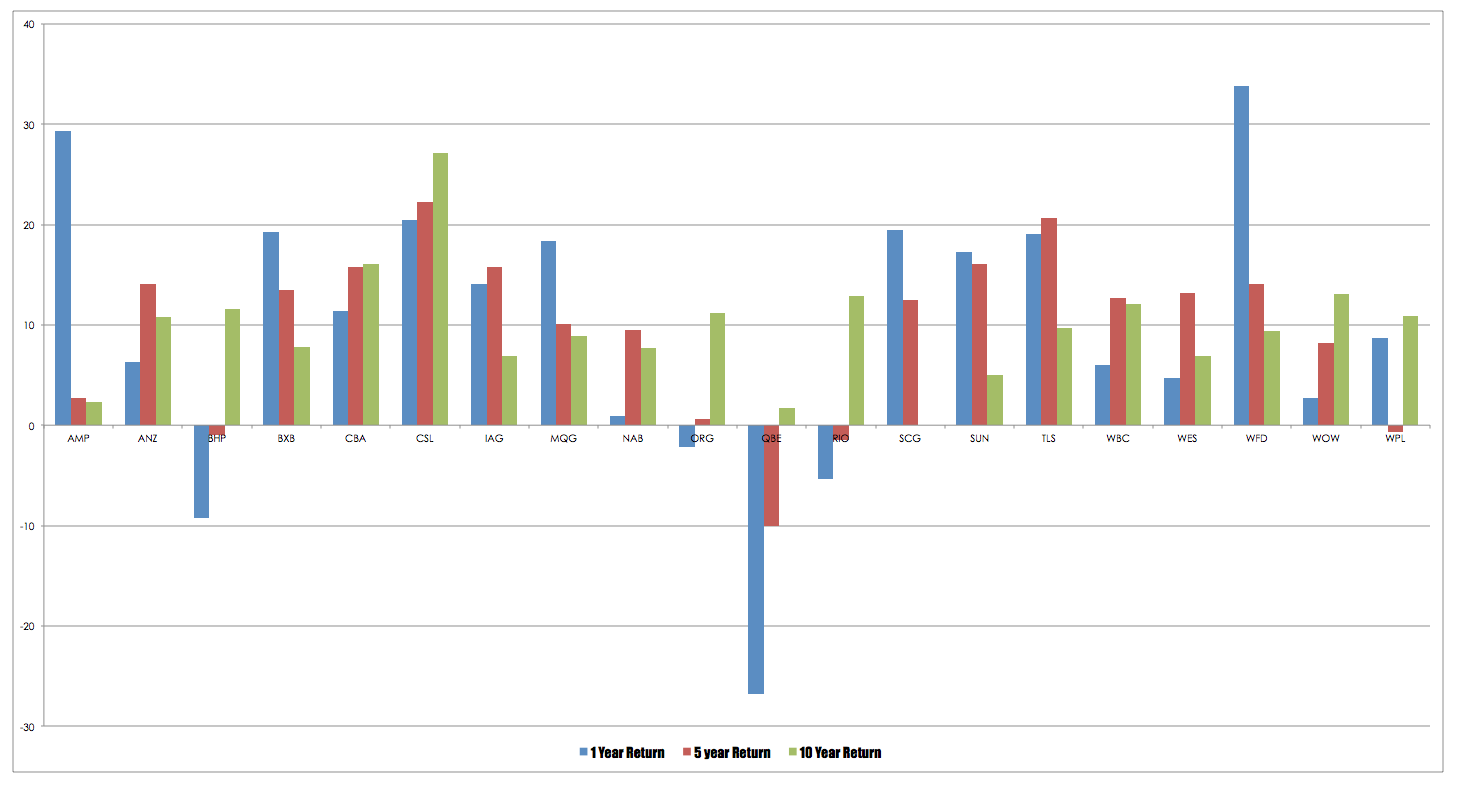
Finally a pretty chart.


