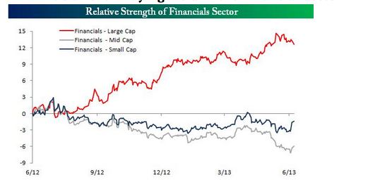
I came across this chart from Bespoke.
 When I saw this file in its orignal context it seemed to imply that a higher relative strength equalled a higher return and that there was a sharp distinction between the returns possible as a function of the size of a given instrument.
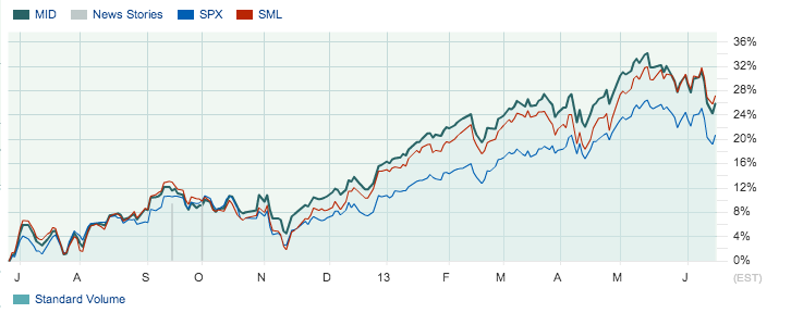
I wasn’t able to recreate Bespokes data in its original form but I wondered if I could build a rough analog based upon actual returns. One of the good things about the US market is that they have an index for everything. So I looked at the S&P range of indices and found that I could easily map a large scale index (S&P500) a mid cap index (S&P400 MidCap) and a small cap index (S&P600 SmallCap).
This approach does have some problems but if the aim is to get a quick and dirty comparison between large, mid and small caps in terms of their relative returns it serves the purpose.
You can see that it shows a different story to the chart generated by Bespoke.


Does Bespoke work for Fox?