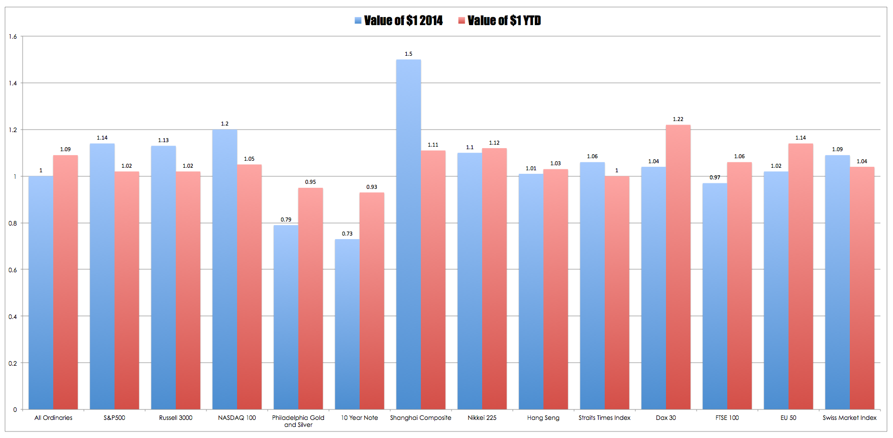
With the majority of world markets running hot I thought it would be interesting to compare last years returns for a handful of markets with their returns YTD. In the chart below I have looked at the value of $1 invested in each market for the 2014 calendar year and for the calendar YTD.
 This chart confirms what most people already know – for the majority of market the first quarter of 2015 has been very positive with some markets already eclipsing their 2014 full year returns. The US has been somewhat subdued whereas Asia and Europe have been very strong. However, presenting returns this way does tend to give only part of the story because the trajectory of those returns is unknown. For example the Swiss Market Index has been robust this year but the return was punctuated by a drawdown of almost 15%. Contrast this with the performance of the S&P500 which in the YTD performance has only drawdown about 3.6%.
Despite this limitation it interesting to watch what appears to be a rotation in performance from the US which has lead the world for the past five years or so to Asia (particularly China) and to select European markets.

 1 item(s)


