So What Does This Mean?
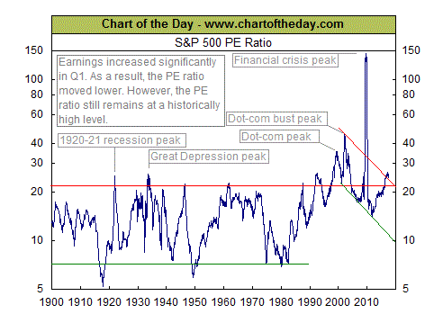
In my junk folder I have for the past upteen decades been getting random charts by a group called Chart of the Day. Surprisingly, I dont get them everyday – so the implication that you get a chart everyday that is interesting is perhaps a little bit of an oversell. This morning I go the following piece of wisdom –
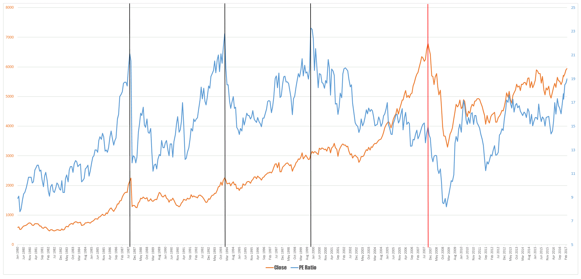
This chart as the title suggests looks at the S&P 500 PE ratio back to the turn of the century. Putting aside the obvious gaping methodological flaws such as the S&P500 was only started in 1957 I do always find these sorts of things interesting. Markets and their history should be a topic of investigation for every trader, simply because there is nothing new. Bubbles and crashes have been a feature of markets since they began and the driving force behind such things has always been the capriciousness of market participants. Curious as to what our own market looked like I dug up some data from the folks at Market Index and plotted the local PE ratio against the All Ords to see what I could see.
On the chart above I dropped a series of vertical lines – the three black ones denote a time when valuations according to the markets PE ratio could be considered extreme, the red one is the GFC. Pundits who look at valuation models work on the notion that markets or their component equities have a fair valuation and deviations from this point indicate that something is either overvalued or undervalued. Decisions are then made upon this interpretations. The first black line is easy to identify – its the 1987 crash. The second one took me a little while to remember until I remembered the tail end of the 1991/2 recession combined with the banks nearly sending themselves under after property bit the dust. The third black line is the tech wreck, The question when looking at any methodology is what value does it add to your decision making. This is an important question since our decision making is bounded by the time we have to make the decision, the amount of information we have and our cognitive ability. None of these components can be infinite so our decision making is always somewhat half arsed. However, we need to add to this the notion of decision fatigue. It is estimated that during an average day we make anywhere between 20,000 and 25, 000 conscious and unconscious decisions and each of these decisions extracts a toll. Decision making is not a free ride, everything has a cost. Therefore efficiency of decision making is of paramount importance. If you have to force a decision then you are merely adding to your own mental loading without achieving anything.
As to whether the chart above tells me anything I dont already now about market extremes is doubtful As to whether it adds anything to my overall view of the world and approach to trading I am certain it doesn’t. But your mileage may vary.


