I was reflecting on this post where I looked at the yearly return for stocks in the S&P/ASX50 and I wondered what one of the more ordinary examples would look like if I played around with missing the best and worst days of the year. I actually knew in advance what the shape of the curves would look like since it is incontrovertible that bad days have a disproportionate impact upon instrument performance than do bad days. This is due to a simple quirk in financial mathematics that a lot of people miss.
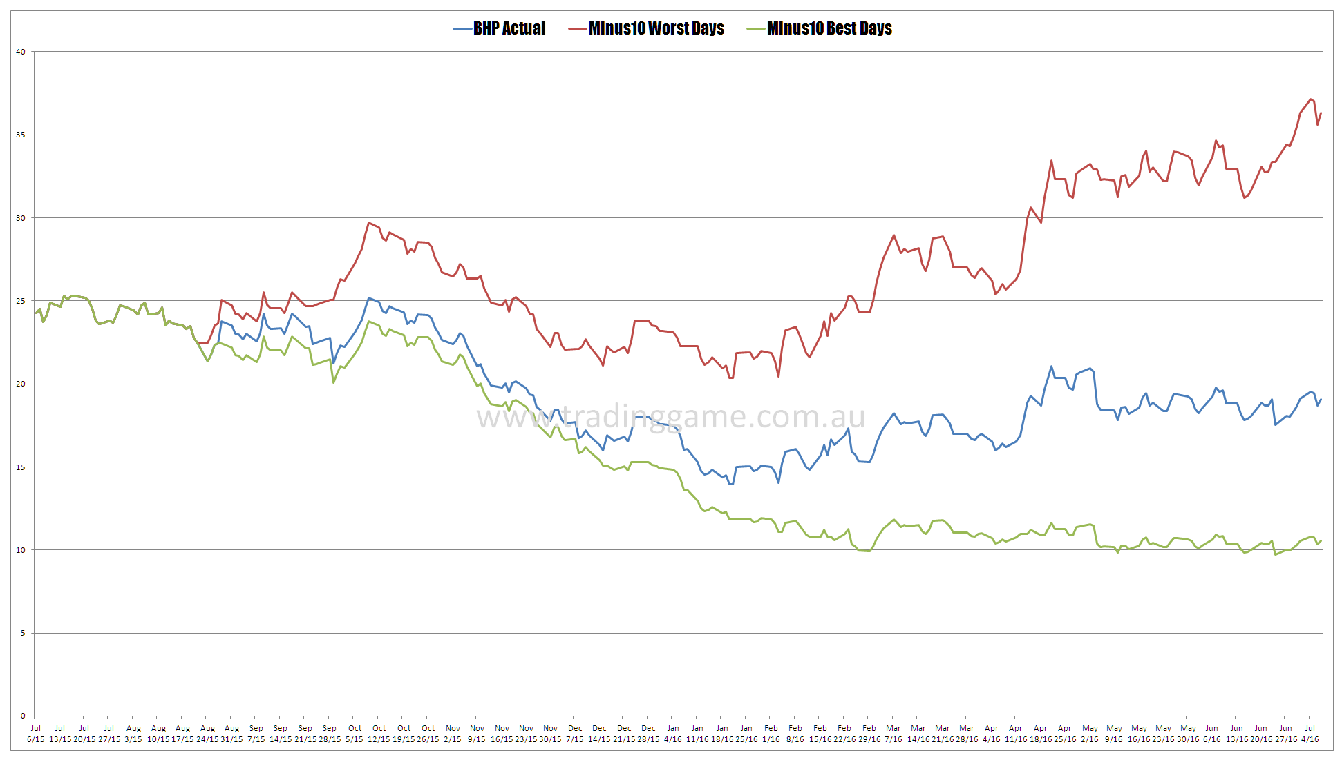
I decided to pick BHP since it is still an industry favourite and I got some spam this morning in one of my junk folders telling me how much extraordinary upside BHP had. What I did was look at the actual price performance of BHP and then proceeded to remove the 10 best and worst days from last year. The chart below shows how interesting this is.
I have done this exercise literally hundreds of times and it never ceases to amaze me the impact that controlling your losses has on your performance. If you had managed by some extraordinary feat of luck to remove the 10 worst days then BHP would have actually looked fairly reasonable.


Hindsight? How do you actually do that in real time? You’d be pretty much in and out all the time. Must be better markets to concentrate on.
Its a proof of concept that returns are much impacted by being caught in bad periods than missing the good periods. This is contrary to what the entire finance industry tells you.
The best and worse days usually happen at the same time though. Better off staying out of bear markets and missing the extreme days – good and bad.