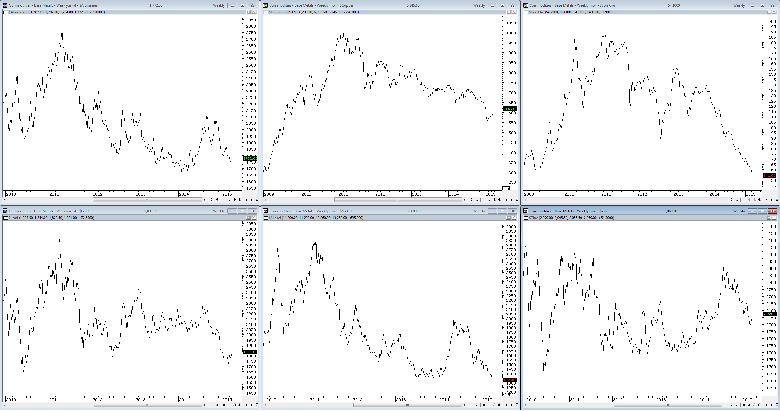
In the circuitous way you often come to things I was looking at a collection of charts on base metals. As you can see from the screenshot below there really has been nothing to get excited about over the past few years, which puts lie to the notion of our supposed mining boom. What we really had was a mining infrastructure boom which is now long gone and everyone who raced to buy properties in the middle of nowhere are probably suffering the death of a thousand cuts.
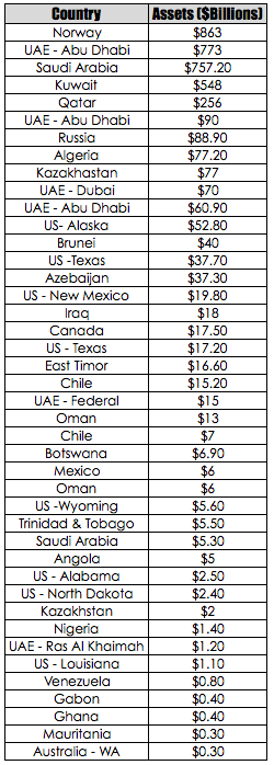
However, the parlous state of commodity prices is not the point I am chasing. Thinking about commodity prices for some reason got me thinking about sovereign wealth funds. So I decided to dig up some figures and look at the relative sizes of the major players in the sovereign wealth fund business. However, instead of simply taking a list from Google I decided to look at only those funds whose income had been derived from the management of commodity resources. As can be seen from the table below those canny Norwegians come out on top with their careful management of the royalties that have flowed from the North Sea oil fields.
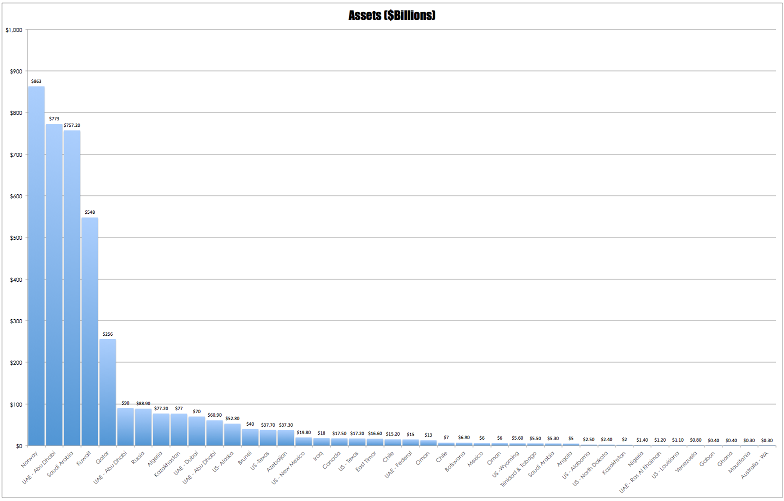
What did surprise me about this list was the presence of several US states – I was unaware that many had created their own funds based upon resources within their states. For some reason I had assumed that any attempt to do this would be viewed as communism by the general rabble and roundly defeated as an idea. What did not surprise me was the complete absence of a domestic wealth fund other than Western Australia’s fairly poor showing at the bottom of the table. The local future fund derives its income from government surpluses and its current balance sits at about $109B .To get an idea of the scope of the disparity between funds consider the chart below.
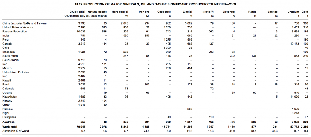
As a thought experiment it is interesting to ponder what size a domestic commodities based wealth fund would be. The table below from the ABS shows that whilst Norway produces more oil than we do, we trounce them and many others on the production of other commodities.
As interesting as it is to consider such things, unfortunately as with all things, vested interest gets in the way and the loudest squeal in Australian politics is always that of the ever so aggrieved billionaire.


A good 15min play inside a spreadsheet should produce a decent output value one could apply a tax % to. Sadly, the ABS site doesn’t spew its numbers in a nice easily manipulated format. Maybe over a coffee one morning.
Its interesting, the ABS seems to produce its data in the most unfriendly format you could think of. One simple way to generate a dirty answer would be to look at minings contribution to GDP and then take a percentage of that.
Looks in the order of $140B for 2014. At WA’s ~2% rate a healthy $2.8B pa. With profits of the top 10 ASX listed companies at $100B+ we could instead clip the ticket on them to achieve a more impressive number, but as you say, we’re not canny. That age has passed, and these guys would divert their political donations to a propaganda campaign quicker than we can say ICAC.