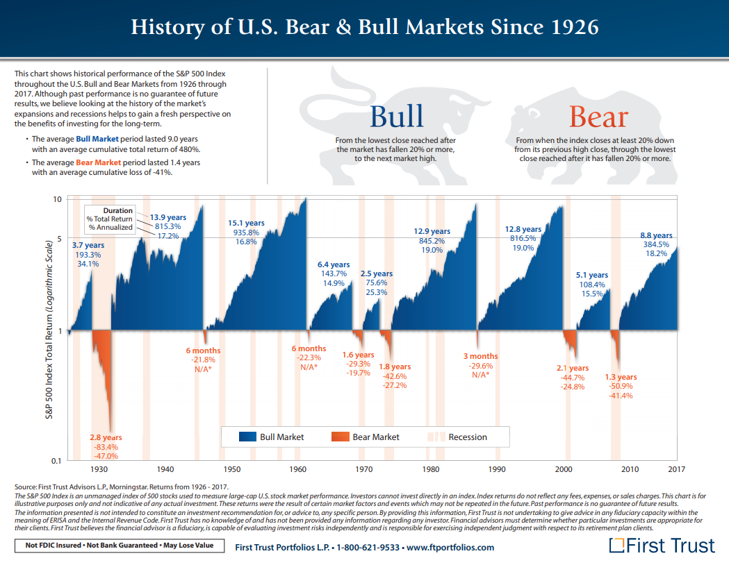
Once again I am late to the party because apparently the world is ending…..again. The current cause for these conniptions among traders is that the US markets are going down, judging by the reactions of market participants to this earth shattering event one would think that this sort of thing was now illegal. As such I decided to take an adults look at the S&P500 to get a sense of the background to the current move.All things to do with trading must be viewed in context, moves are simply not isolated events that spring up overnight there is always a history to consider. One of the major problems with most market commentators is that they fail to understand or even appreciated history as they make pronouncements and declarations that are somewhat tourettes like in delivery. I want to begin with a simple graphic.
Source – First Trust
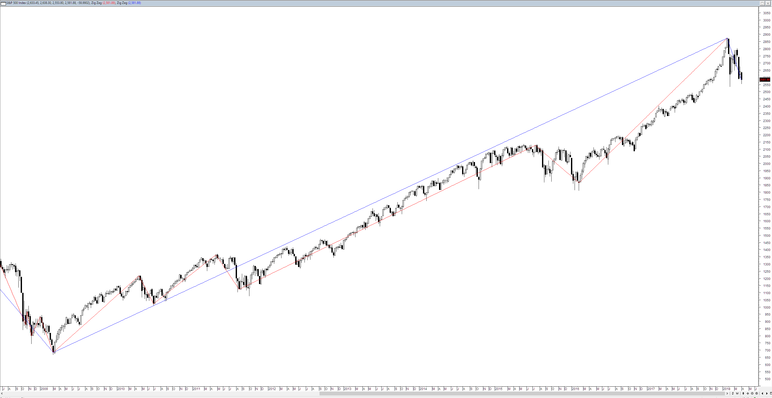
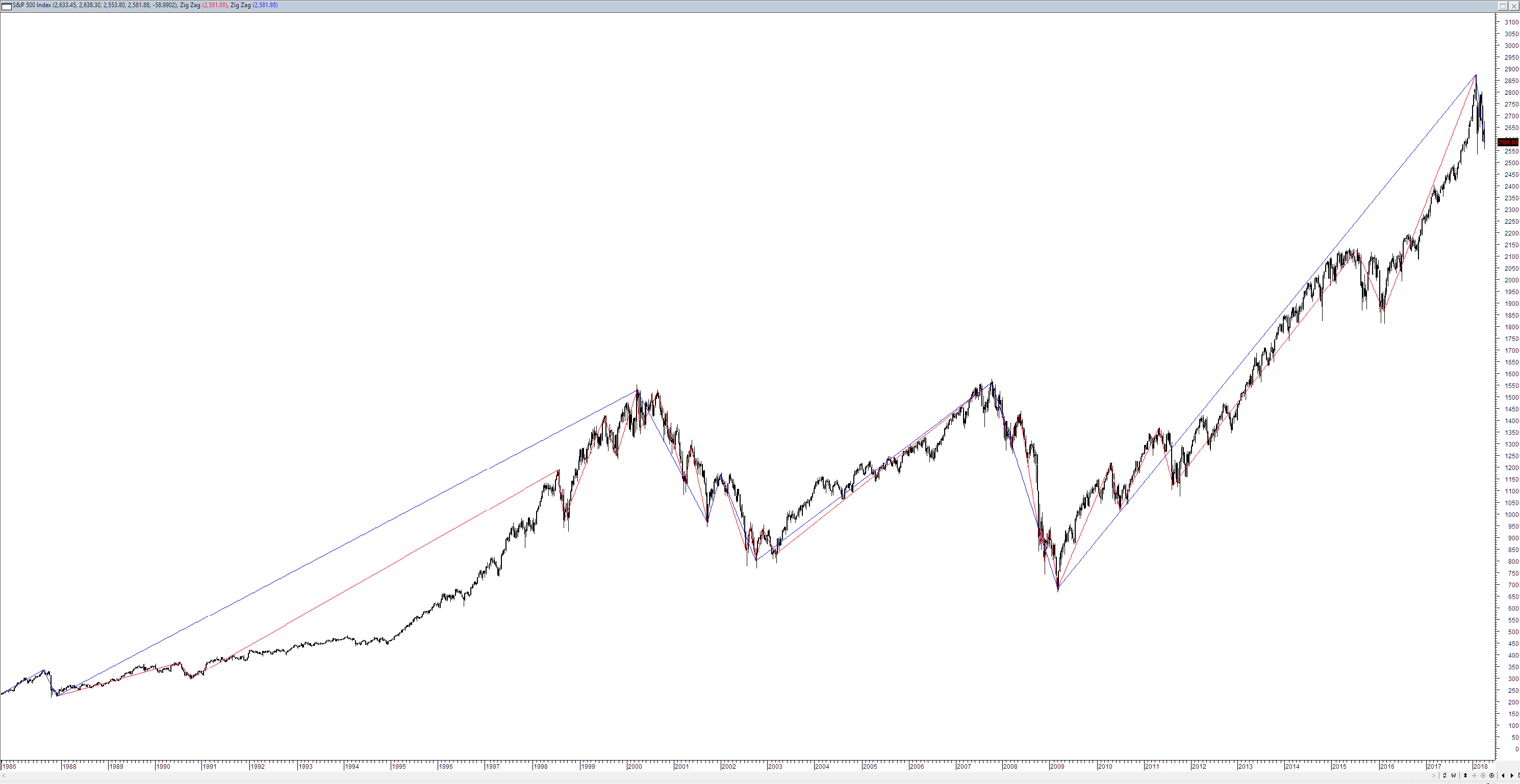
This chart conveys something very interesting that many fail to appreciate, after a period of growth the market often goes down. Let me repeat that after a period of growth the market often goes down, in fact I can be even more reductionist and say that all booms end in busts. Whilst people had been decrying the moves in Bitcoin as being an unsustainable boom they failed to see that something similar was occurring in equities markets. Equity markets in the US, have since the end of the GFC been enjoying a staggering boom. It is therefore quite natural that equity markets stop and pause – there is nothing sinister in this sort of and it is certainly not the end of the world. The intensity of the current pullback can be gauged by looking at the relative frequency of both 10% and 20% pullbacks.
As you would have expected 10% pullbacks occur with greater frequency than 20% pullbacks and since the GFC there has not been a 20% pullback. But what is once again evident is that markets wing up and then fall out the window for a period of time as seen when we go back in time.
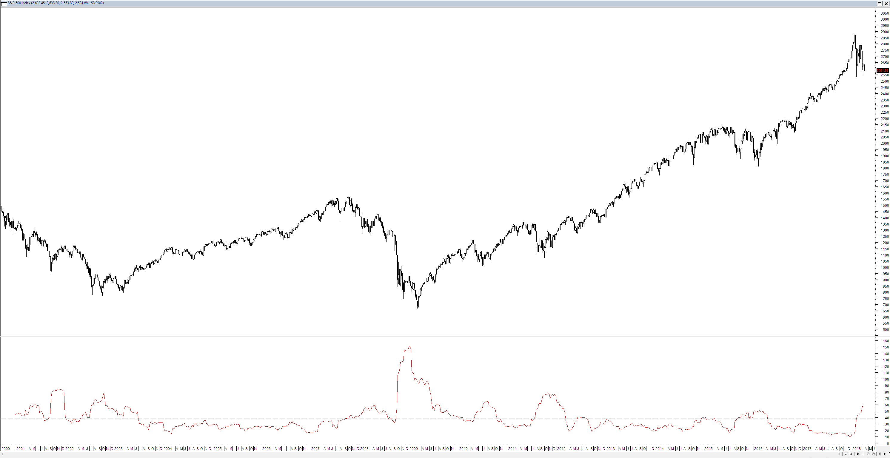
The other point I want to touch on is the recent gibbering regarding volatility as I heard a commentator at the weekend refer to unheralded levels of volatility. Once again it is best to look at the context of the current price action to see whether this is true or simply breathless hyperbole (also known as speaking out your arse). In the chart below I have plotted the 15 week historical volatility for the S&P500 – the blue line which sits at 38.8% is the long term average volatility. As you can see volatility is above average but it is not in the stratospheric regions that many imply.
In part I think that much of the misunderstanding with regard to volatility comes from an over reliance upon the VIX or so called Fear Gauge. The VIX has unfortunately been come to viewed over recent years a some sort of Holy Grail without understanding that at its base it merely represents perceptions and as we have seen with the destruction of several VIX based ETF’s in recent moves perceptions are not reality and they can change very quickly. This brings me to my final point discussions of both the market and volatility suffer from recency bias. Stated simply this just means that people presume that because ti was like this yesterday it will be like this tomorrow – they fail to understand history. Granted traders generally have very short attention spans but that does not in any way preclude you from taking a step back and looking at the bigger picture.


